react-native-loading-spinner-overlay-dxc
v0.5.2
Published
The only pure React Native Native iOS and Android loading spinner (progress bar indicator) overlay
Downloads
10
Maintainers
Readme
React Native Loading Spinner Overlay
tldr; The only pure React Native Native iOS and Android loading spinner (progress bar indicator) overlay

Index
Install
For React Native version >=0.28.x use version >=0.3.x (0.2.x is broken, sorry!):
npm install --save react-native-loading-spinner-overlay@latestFor React Native version <=0.27.x use version 0.1.x:
npm install --save [email protected]Usage
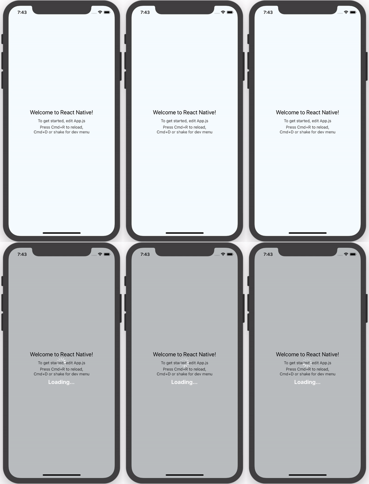
This usage shows the default styles and properties.
| Property | Type | Default | Description |
|---------------|----------------|------------|--------------|
| cancelable | boolean | false | Android: If set to false, it will prevent spinner from hiding when pressing the hardware back button. If set to true, it will allow spinner to hide if the hardware back button is pressed. |
| color | string | white | Changes the spinner's color (example values are red, #ff0000, etc). For adjusting the contrast see overlayColor prop below.|
| animation |none, slide, fade| none | Changes animation on show and hide spinner's view.|
| overlayColor | string | rgba(0, 0, 0, 0.25) | Changes the color of the overlay.|
| size | small, normal, large | large | Sets the spinner's size. No other cross-platform sizes are supported right now.|
| textContent | string | "" | Optional text field to be shown.|
| textStyle | style | - | The style to be applied to the <Text> that displays the textContent.|
| visible | boolean | false | Controls the visibility of the spinner.|
You can also add a child view to act as a custom activity indicator.
import React, { View, Text } from 'react-native';

import Spinner from 'react-native-loading-spinner-overlay';

class MyComponent extends React.Component {

  constructor(props) {
    super();
    this.state = {
      visible: false
    };
  }

  /* eslint react/no-did-mount-set-state: 0 */
  componentDidMount() {
    setInterval(() => {
      this.setState({
        visible: !this.state.visible
      });
    }, 3000);
  }

  render() {
    return (
      <View style={{ flex: 1 }}>
        <Spinner visible={this.state.visible} textContent={"Loading..."} textStyle={{color: '#FFF'}} />
      </View>
    );
  }
}
To use a custom activity indicator just pass it as child of the component:
<Spinner visible={this.state.visible}>
  <Text>This is my custom spinner</Text>
</Spinner>
Platforms
For
>= 0.3.x:
- We use
ActivityIndicatornow!
For
0.2.x:
- Do not use this version due to #22, use
>= 0.3.xplease!
For
<= 0.1.x:
- iOS: this platform uses
Modal(docs/source) to overlay andActivityIndicatorIOS(docs) for the loading spinner - Android: this platform uses
Portal(source) to overlay andActivityIndicator(docs) for the loading spinner
Notes
For
>= 0.3.x:
- We use
ActivityIndicatornow!
For
0.2.x:
- This version is broken due to a dependency issue, see issue #22
For
<= 0.1.x:
- Docs don't exist yet for
Portal, see this issue on GitHub; once those are in, then we can add a link to the source in Platforms - Until a release of React Native is shipped for this pull request, Android's
ProgressBarAndroidwill not have support for aStyleAttrvalue of"Normal"- therefore we only support asizeprop of"small"or"large"right now (defaulting to"large") - in other words, we can only support Android's inverse styling with astyleAttrof"Inverse","SmallInverse"(for asizeprop of"small"), and"LargeInverse"(for asizeprop of"large") (since there is no"Normal"support right now for"size"of"normal").
Development
- Fork/clone this repository
- Run
npm install - Make changes in
srcdirectory - Run
npm testwhen you're done - Submit a pull request
Contributors
- Nick Baugh [email protected]


