react-native-ios-stepper
v1.0.5
Published
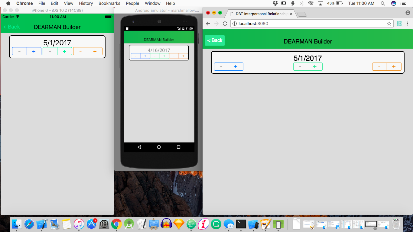
react-native component for iOS, android, and web. Looks like the actual iOS stepper unlike many of the other open source components which aren't the right size.
Downloads
12
Maintainers
Readme
react-native-ios-stepper
Even though it's called iOS Stepper, this works on for Android and iOS. It also works using react-native-web. It's called iOS Stepper because it looks like the iOS10 version of UIStepper. The other open source components I found didn't look right, and they often times didn't work with react-native-web.'

Installation
npm install --save react-native-ios-stepperUsage
import Stepper from 'react-native-ios-stepper'


render() {
    return {
        <View>
            <Stepper maxValue={10} onPress={(index)=>{
                this.setState({value:index})
            }/>
            <Text>{this.state.value}</Text>
        </View>
    }
}
Props
// Required
<Stepper maxValue={number} />
// Required
<Stepper onPress={(index)=>{
console.log(index + " Pressed")
} />// Optional, Default Value = 0. This is the current value the stepper starts at
<Stepper value={number} />// Optional, Default Value = 0
<Stepper minValue={number} />// Optional, Default Value = "rgb(0,122,255)"
// This sets the color of the component. The default value is the iOS7-10 default button color (blue)
<Stepper color={string} />// Optional, Default Value = "rgb(181,181,181)"
// This sets the color for the + and - buttons when you they're disabled. The default value is just a grey that looks good to me, but isn't an official value. This also removes fontScaling for the <Text/> components.
<Stepper allowFontScaling={false} disabledColor={string} />There is no increment value, as all steppers increment by + or - 1. You'll have to do the math yourself.
Note
This component uses a compilation of React-Native components to mimic a UIStepper. It does not actually use a USStepper though.
