
react-native-image-with-placeholder
v0.1.1
Published
Load images incrementally to provide a better UX
Downloads
126
Maintainers
 crisoforo
Readme
React Native Image Placeholder
Load images incrementally to provide a better User Experience.
If you want to download larger images but provide with a nice transition while the users are waiting for the image you can provide with a smaller version of the image (as you can see on the examples).
This is inspired on how medium loads the articles and the iron-image component
from the polymer library works
by providing the option to present the larger image and give to the user a hint of the presence of
an image, specially on slower connections.
It basically fetchs an image an tracks the progress of the image once is ready it shows the user the requeested image but during the period of loading the user can show a spinner or at least a hint of the image in a smaller version.
Examples
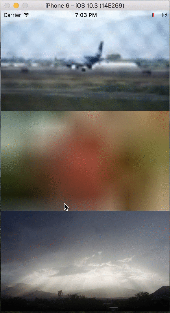
Multiple Images.
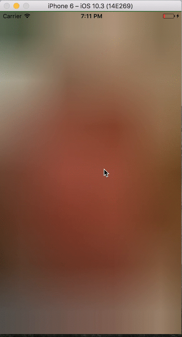
Single Image.
Installation
npm install --save react-native-image-with-placeholderGetting started
Import the file as specified on the installation steps. Then import the Component where you have plans to use it, for example:
import ImagePlaceholder from 'react-native-image-with-placeholder'And inside of the render method of your component add the component with the properties you
require.
Basic usage
<ImagePlaceholder
  style={{ flex: 1 }}
  duration={1000}
  activityIndicatorProps={{
    size: 'large',
    color: 'green',
  }}
  src='https://s3.amazonaws.com/crisoforo.com/flowers.jpg'
  placeholder='https://s3.amazonaws.com/crisoforo.com/flowers-small.jpg'
  />
);
Multiple images with different transition speed
render() {
  return (
    <View style={styles.container}>
      <ImagePlaceholder
        style={styles.item}
        src='https://s3.amazonaws.com/crisoforo.com/airplane.jpg'
        placeholder='https://s3.amazonaws.com/crisoforo.com/airplane-mini.jpg'
      />
      <ImagePlaceholder
        style={styles.item}
        duration={3000}
        src='https://s3.amazonaws.com/crisoforo.com/flowers.jpg'
        placeholder='https://s3.amazonaws.com/crisoforo.com/flowers-small.jpg'
      />
      <ImagePlaceholder
        style={styles.item}
        duration={1000}
        src='https://s3.amazonaws.com/crisoforo.com/sun.jpg'
        placeholder='https://s3.amazonaws.com/crisoforo.com/sun-small.jpg'
      />
    </View>
    )
}

const styles = StyleSheet.create({
  container: {
    flex: 1,
    justifyContent: 'center',
    alignItems: 'center',
    flexWrap: 'wrap',
  },
  item: {
    flex: 1,
  }
});
API
Props | Type | Optional | Default | Description
------------------|---------------|---------------|-------------|------------
src | String | false | null | The url of the main image to be fetched.
placeholder | String | true | null | The smaller image present before the main image is ready if is not present it will show an ActivityIndicator component instead.
style | View.propTypes.style | true | Container Style | Style applied to the image container
imageStyle | Object | true | null | The styles appliead to the main image.
placeholderStyle | Object | true | null | The styles applied to the placeholder image.
placeholderContainerStyle | Object | true | null | The styles applied to the container View of the placeholder image.
duration | Integer | true | 750 | Time in miliseconds used to transition to the original image once is ready.
showActivityIndicator | Boolean | true | true | If true an ActivityIndicator should be displayed while the placeholder image is being fetch or if is not present.
activityIndicatorProps | Object | true | null | Options to pass to the ActivityIndicator component such as size, color or style.ActivityIndicator | Component | true | null | If present it will render this instead of the ActivityIndicator component and activityIndicatorProps is no longer used and valid.