
react-native-icon-checkbox
v1.2.0
Published
react-native checkbox component implement with react-native-vector-icons
Downloads
60
Maintainers
 dmoon
dmoonReadme
react-native-icon-checkbox
react native Checkbox / RadioButton component implement with react-native-vector-icons
use Material Icons
Installation
- need to Install react-native-vector-icons first
npm install react-native-icon-checkbox --save
Usage
import React, {
View,
Component,
} from 'react-native';
import CheckBox from 'react-native-icon-checkbox';
export default class Policies extends Component {
constructor(props) {
super(props);
this.state = {
isChecked: false,
isRadioSelected: true,
};
}
handlePressCheckedBox = (checked) => {
this.setState({
isChecked: checked,
});
}
handleSelectedRadionButton = (checked) => {
this.setState({
isRadioSelected: checked,
});
}
render() {
return (
<View style={{ flex: 1, padding: 20 }}>
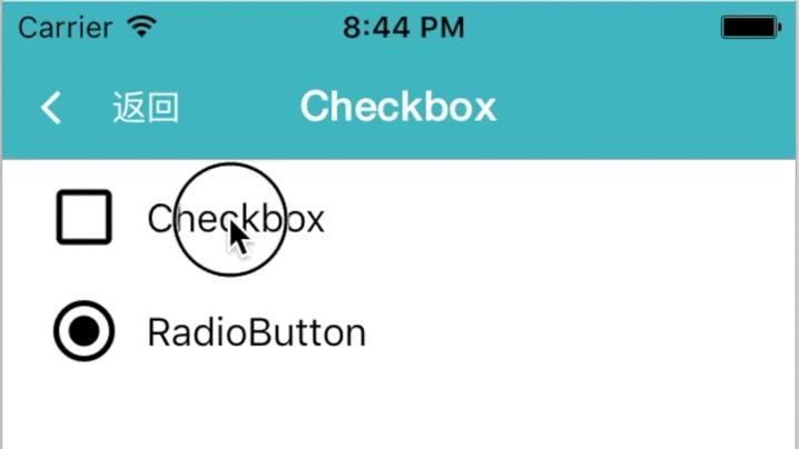
<CheckBox
label="Checkbox"
size={30}
checked={this.state.isChecked}
onPress={this.handlePressCheckedBox}
/>
{/* You can use other Icon */}
{/* Here is the example of Radio Icon */}
<CheckBox
label="RadioButton"
size={30}
checked={this.state.isRadioSelected}
onPress={this.handleSelectedRadionButton}
uncheckedIconName="radio-button-unchecked"
checkedIconName="radio-button-checked"
/>
</View>
);
}
}
Properties
| Prop | PropType | Default Value | Description | | ----------------- | -------- | ------------------------- | ---------------------------------------- | | size | number | 30 | icon size | | checked | bool | false | checked state | | uncheckedIconName | string | 'check-box' | material icons (need to replace space with '-' ) | | checkedIconName | string | 'check-box-outline-blank' | material icons (need to replace space with '-' ) | | label | string | {fontSize: 16} | label of button | | labelStyle | object | | style of label | | iconStyle | object | {marginLeft: -10} | color of the icon | | checkedIconStyle | object | | icon style when checked | | color | string | '#000' | icon color | | backgroundColor | string | 'rgba(0,0,0,0)' | background color of the button | | onPress | func | | A function called when the button is pressed. | | underlayColor | string | 'rgba(0,0,0,0)' | prop of TouchableHighlight | | activeOpacity | number | 1 | prop of TouchableHighlight | | borderRadius | number | 5 | borderRadius of button |
Other Props :
https://github.com/oblador/react-native-vector-icons#properties-1