
react-native-hype-card
v1.0.2
Published
A hype card with gradient element for react native
Downloads
2
Maintainers
 nicoaudy
Readme
Hype Card with gradient for react native 🔥

Installation
$ npm i --save react-native-hype-cardPeer Dependencies
IMPORTANT! You need install them.
"react-native-linear-gradient": "^2.5.4",Basic Usage
import { HypeCard } from 'react-native-hype-card'

<HypeCard />
Advanced Usage
You can check the example for the advanced usage
import { HypeCard } from 'react-native-hype-card'
<HypeCard
key={id}
style={{ margin: 10 }}
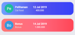
leftComponent={<UserAvatar size="50" name="Peliharaan" />}
title="Peliharaan"
subtitle="Cat food"
centerTitle="22-08-2019"
centerSubtitle="400.000"
centerSubtitleStyle={{
fontSize: 12,
marginLeft: 8,
textAlign: "center",
color: "white"
}}
gradientColors={
type_id == 1
? ["#70a1ff", "#5352ed", "#3742fa"]
: ["#ff7675", "#ff6b81", "#ff4757"]
}
onPress={() => // do what you want}
/>Configuration - Props
| Property | Type | Default | Description | | ------------------- | :-------: | :------------------: | ----------------------------------------------------- | | start | {x,y} | { x: 0, y: 0 } | change the direction of the gradient | | end | {x,y} | { x: 1, y: 0 } | change the direction of the gradient | | gradientColors | [color] | check the example | change the gradient's color array | | style | style | null | add any style to the whole container | | shadowStyle | style | check the example | set your own shadow style | | shadowColor | color | #595959 | change the shadow color | | outerContainer | style | style | set your own outer container style (NOT recommended!) | | height | number | 70 | change the card's height | | width | number | device width * 0.95 | change the card's width | | borderRadius | number | 20 | change the card's border radius | | innerContainer | style | style | set your own inner container style (NOT recommended!) | | leftComponent | component | null | set your own component | | title | string | null | change the title string with your data | | subtitle | string | null | change the subtitle string with your data | | centerTitle | string | null | change the center title string with your data | | centerSubtitle | string | null | change the center subtitle string with your data | | titleStyle | style | style | set your own style for title component | | subtitleStyle | style | style | set your own style for subtitle component | | centerTitleStyle | style | style | set your own style for center title component | | centerSubtitleStyle | style | style | set your own style for center subtitle component | | centerComponent | component | text based component | set your component for the center part | | rightComponent | component | null | set your own component for the right component |
Author
NicoAudy, [email protected]
License
React Native Hype Card Library is available under the MIT license. See the LICENSE file for more info.