react-native-custom-pin-code
v1.0.3
Published
Custom pin code for React-Native
Downloads
36
Maintainers
Readme
React Native Custom Pin Code
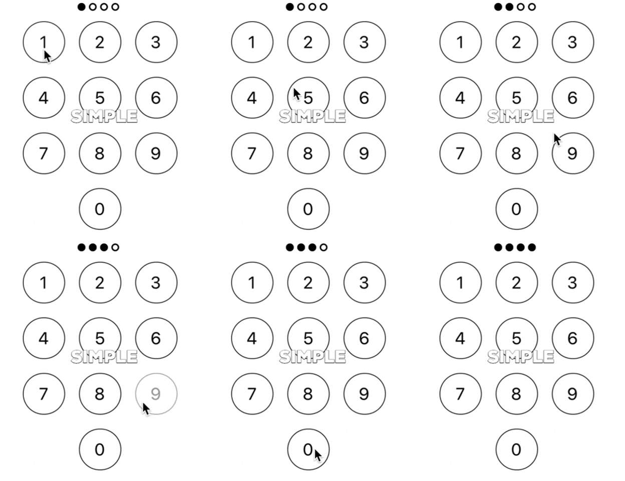
Simple realization with some custom styles (left element, right element near the zero button and some bottom button, for example 'Exit'), complete/clear callback, etc.

Installation
$ npm install --save react-native-custom-pin-codeUsage
import { CustomPincode } from 'react-native-custom-pin-code';
All parameters are optional.
Basic Usage
<CustomPincode
  completeCallback={(inputtedPin, callbackClear) => {
   if (inputtedPin === actualPin) {
    return goToFinish()
  }

  // If you want clear your pincode data
  callbackClear()
 }}
/>
Props
| Prop | Type | Default | Description | Required |
| ------------------------ | --------- | ------- | ----------------------------------------------------------------------------------------------------- | -------- |
| completeCallback | function | () => {} | Callback is triggered when your pinLength === number of clicks buttons from 0 to 9 (or when all points are active :D) first argument - your pin code, second argument - method to clear points and state this lib (pin values) | No |
| pinLength | number | 4 | Pin length your pin code (default 4). Buttons (0...9) pressed length === Pin length, then completeCallback | No |
| pointsLength | number | 4 | Points length (default 4). If this prop is not passed, then points have length from pinLength prop | No |
| pointsStyle| object | {} | Styles for points container | No |
| pointStyle| object | {} | Styles for point | No |
| pointActiveStyle| object | {} | Styles for active points | No |
| keyPoints| string | pin-buttons | Key for map array of points (0...pointsLength) for some cases | No |
| isPinError | boolean | false | Responsible for displaying error points styles | No |
| errorPointStyles| object | {} | Styles for every point with isPinError (true) prop | No |
| leftElement | element | null | JSX left element in the last row | No |
| leftElementCallback | function | () => {} | Callback for left element | No |
| isLeft | boolean | false | Responsible for displaying left element | No |
| leftButtonStyle| object | {} | Styles for left button | No |
| leftContainerStyle| object | {} | Styles for left container | No |
| rightElement| element | null | JSX right element in the last row | No |
| rightElementCallback | function | () => {} | Callback for right element | No |
| rightContainerStyle| object | {} | Styles for right container | No |
| isRight | boolean | false | Responsible for displaying right element | No |
| rightButtonStyle| object | {} | Styles for right button | No |
| bottomElement | element | null | JSX bottom element | No |
| bottomCallback| object | {} | Styles for bottom button | No |
| bottomElementStyle| object | {} | Styles for bottom button | No |
| isBottom | boolean | false | Responsible for displaying bottom element | No |
| pinButtonStyle| object | {} | Styles for buttons (pins) 0...9 buttons | No |
| isDeleteButton | boolean | false | Responsible for displaying delete button (Priority higher than isLeft or isRight props) | No |
| buttonDeleteElement | element | null | JSX button delete element in the last row | No |
| buttonDeletePosition | string | null | Position delete button in the last row | No |
| pinContainerStyles| object | {} | Styles for pin code container without bottom element | No |
| containerStyles| object | {} | Styles for pin code container with bottom element (Higher than pin code container styles) | No |
| zeroButtonStyle| object | {} | Styles for the zero (0) button | No |
| keyButtons| string | pin-buttons | Key for map array of buttons (0...9) for some cases | No |
Built With
License
This project is licensed under the MIT License - see the LICENSE.md file for details
