react-metric-card
v1.0.5
Published
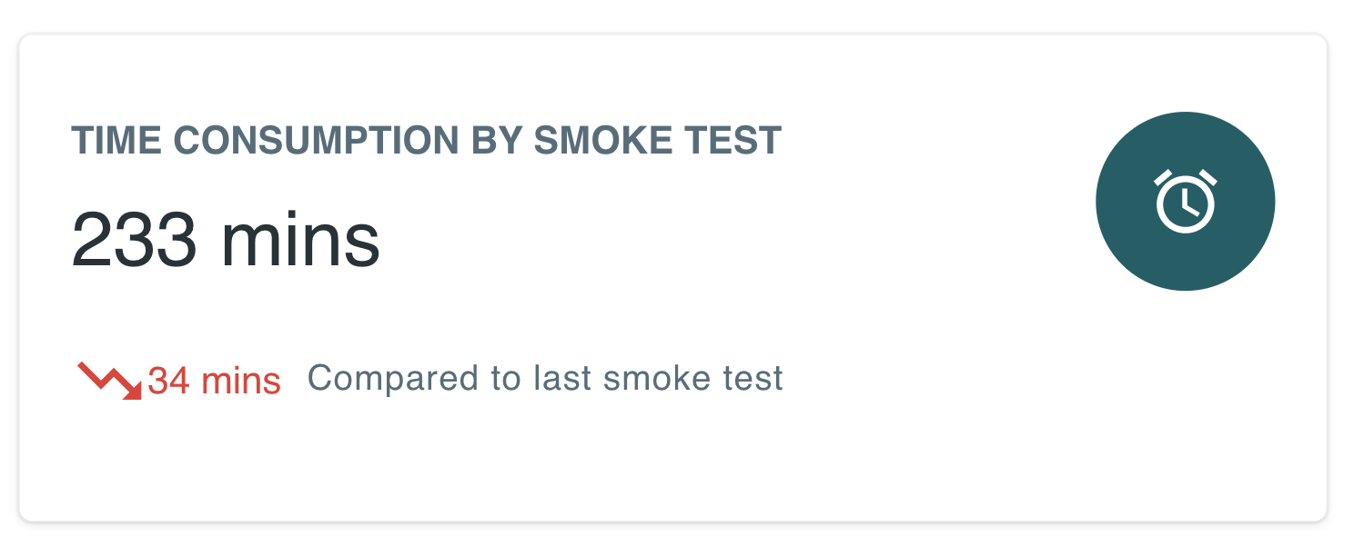
A metric card component that provides data display with icons, loaders and comparisons, along with custom text segments
Downloads
166
Maintainers
Readme
react-metric-card
A metric card component that provides metric data with icons, spinning loaders and comparisons. A separate representation is available for errors occuring when fetching data for this component.
Installation
npm install --save react-metric-cardLive Demonstration
For live demos of this component, please visit the below link.
http://keetmalin.github.io/react-metric-card
What is this Component

This is a basic component that can be used in dashboards for disaplying various types of metrics related to the dashboard data. This is mainly built from components in Material UI, and I have made this component more flexible for anyone to use with different styling and flexibility.
Constrol the width of this component, by adjusting the width of the container. Sample usage on a dashboard is given below.

Usage
A simple usage example is given below
import React, { Component } from 'react'

import MetricCard from 'react-metric-card'
import 'react-metric-card/dist/index.css'

class Example extends Component {
  render() {
    return (
      <MetricCard
          value={'89.04%'}
          trend={{
            slope: 1,
            description: 'Compared to last week',
            value: '0.5%'
          }}
          title='SERVICE SUCCESS RATE PERCENTAGE'
          fetching={false}
          error={null}
      />
    );
  }
}
API Documentation
This section exaplains the supported props and how to use each prop to make use of the component in a flexible manner.
To see demonstrations with code for how to use each of the following props, visit the following link. http://keetmalin.github.io/react-metric-card
Supported Props
fetching (boolean): shows a loader when this is set to true. Fetching prop takes precendence over every other prop.errorMessage (string): this will be displayed as an error message.errorTooltip (string): this is a tooltip that will be displayed over the error message on mouse hover.value (string): This is the primary value that will be displayed in the center of the cardvalueColor (string): This decides the color of the text. (Eg: 'red', '#ffff00')valueFontFamily (string): This decides the font family of the text. (Eg: serif)valueFontSize (string): This decides the font size of the text. (Eg: 25px)spinnerColor (string): This is a custom color of the spinner. (Eg: 'red', '#ffff00')spinnerSize (number): This is the size of the spinner that accepts a number like '25'spinnerThickness (number): This is the thickness of the spinner that accepts a number like '25'title (string): This is the title shown at the top of the card. This will be displayed always, even when fetching is true or errorMessage is there.titleColor (string): This decides the color of the text. (Eg: 'red', '#ffff00')titleFontFamily (string): This decides the font family of the text. (Eg: serif)titleFontSize (string): This decides the font size of the text. (Eg: 25px)trend (object): This is an object that descibes the trend that is shown at the bottom of the card. This object needs to have the following three properties. (slope(Eg: -1 or 1),description(Eg: any text) andvalue(Eg: any text))icon (string): You can pass an actual icon component from MaterialUI or any other preferred component (Eg: )iconBgColor (string): Icon background color. (Eg: 'red', '#ffff00')iconColor (string): Icon background color. (Eg: 'red', '#ffff00')iconBorderRadius (string): Icon Border radius. (Eg: 50%)iconHeight (string): The height of the icon element (Eg: 50px)iconWidth (string): The width of the icon element (Eg: 50px)cardBgColor(String): The prop for setting a background color for the entire card. (Eg: 'red', '#ffff00')cardClick(Boolean): This will enable the click functionality on the metric card componentcardClickFunction(Function): This is the function that will be executed when the card is clicked. For the card to be clickable, thecardClickprob should be set totrue
License
All contributions are welcome.
MIT © keetmalin


