react-media-query-blocks
v1.2.7
Published
>
Downloads
32
Readme
react-media-query-blocks
Install
npm install react-media-query-blocks
 or
yarn add react-media-query-blocks
Usage
import React from 'react'
import {
  PhoneOnly,
  TabletPortaitOnly,
  TabletLandscapeOnly,
  DesktopOnly
} from "react-media-query-blocks";

function App() {
    return (
      <div className="App">
        <PhoneOnly>
          <OnlyVisibleOnPhone />
        <PhoneOnly/>

        <TabletPortaitOnly>
          <OnlyVisibleOnTabletPT />
        <TabletPortaitOnly/>

        <TabletLandscapeOnly>
          <OnlyVisibleOnTabletLS />
        <TabletLandscapeOnly/>

        <DesktopOnly>
          <OnlyVisibleOnDesktop />
        <DesktopOnly/>
      </div>
    )
}
API
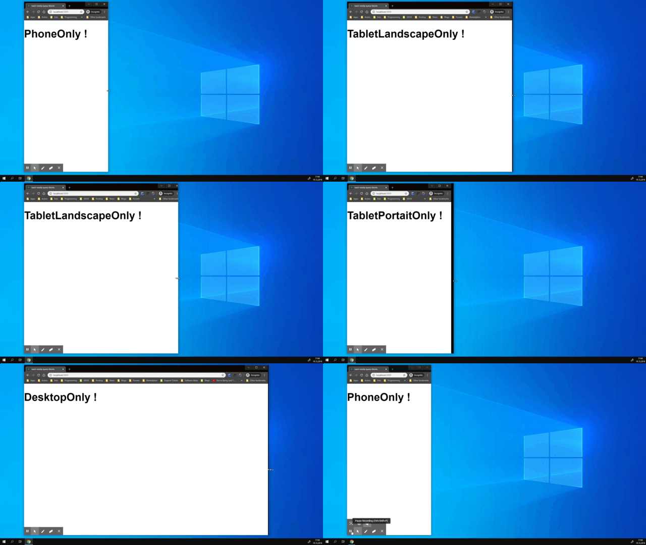
If no custom breakpoints are specified the default breakpoints will be used, (recommended) because I think the default breakpoints are working very well in most cases. If you need a custom size range where your components need to be visible feel free to use the props available to customize your component.
| Components | Custom breakpoints | Default | Default | | ------------------- | ---------------------- | ------- | ------- | | PhoneOnly | visibleTo | 0 | 599 | | TabletPortaitOnly | visibleFrom, visibleTo | 600 | 899 | | TabletLandscapeOnly | visibleFrom, visibleTo | 900 | 1199 | | DesktopOnly | visibleFrom, visibleTo | 1200 | 1799 |
Example with custom breakpoints below. You can also use the same component multiple times with different breakpoints, below you can see 2 PhoneOnly components one with default breakpoints the other one with custom breakpoints.
{/* PhoneOnly */}
        <PhoneOnly visibleTo={900}>
          <OnlyVisibleOnPhone />
        <PhoneOnly/>
        <PhoneOnly>
          <OnlyVisibleOnPhone />
        <PhoneOnly/>
{/* PhoneOnly */}

        <TabletPortaitOnly>
          <OnlyVisibleOnTablet />
        <TabletPortaitOnly/>

        <DesktopOnly>
          <OnlyVisibleOnDesktop />
        <DesktopOnly/>
License
MIT © ivanjeremic


