
react-media-carousel
v1.0.39
Published
A react material ui media carousel.
Downloads
119

Readme
React Media Carousel
A media carousel that supports video, photo & audio combination, a title, and story. Keyboard left, right, arrows and spacebar for pause/playback. Auto slide show when video and audio playback completes. CSS animation for transitions.
Currently this depends on React 18 and up and Material UI 5.15.
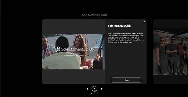
Preview:
Installation:
npm install react-media-carousel

or

yarn add react-media-carousel
Usage Example:
import useMediaCarousel from "react-media-carousel";

const data = [
  {
    story: "My Story",
    title: "Today I went swimming",
    src: "https://images.unsplash.com/photo-1438029071396-1e831a7fa6d8?q=80&w=3500&auto=format&fit=crop&ixlib=rb-4.0.3&ixid=M3wxMjA3fDB8MHxwaG90by1wYWdlfHx8fGVufDB8fHx8fA%3D%3D",
    mediaType: "photo",
    audioSrc:"https://d9olupt5igjta.cloudfront.net/samples/sample_files/171110/2fae439df204976114e6126cca1b7545dbfa9467/mp3/_impact_water.mp3?1670416639",
  }
];

const [mediaCarousel, openMediaCarousel] = useMediaCarousel({slides: data});

return (
    <div>
    <div onClick={() => {
        openMediaCarousel();
    }}>Click Here</div>
    {mediaCarousel}
    </div>
)
Props
slides: array of objects (each object is a Slide defined below)
theme: string ("dark" or "light")
slideShow: boolean (true will automatically move to next slide in 5000 ms.)
slideDuration: number (override the default 5000 ms with your own slide duration.)
showNextButton: boolean (true will show a Next Button below the story.)
nextButton: object (This is a way to override the next button.  Create a div of 45px to your own style.  No need to implement on click for next slide.  Just style the button.)
nextButtonText: string (This is a way to override the text of the Next button.  Maybe for a translation.)
swipeThreshold: number (override the default 50 px threshold for sliding to the next or previous slide.)
fontSize: number (override the story font size of 16.)
fontWeight: string (override the css font weight of the story.)
fontFamily: string (override the css font family of the story.)
opacity: number (override the default css opacity for the Backdrop. Range [0 to 1])
desktopSlideWidth: number (override the default width of a desktop slide.)
desktopSlideHeight: number (override the default height of a desktop slide.)
title: object (React object to add a title to the carousel just above the main slide.)
showClose: boolean: (Set to false to hide the close X in the upper right hand corner.  True by default.)
customAudioPlayer: boolean: (Set to true to display a customized audio player rather than the default browser audio player.)
disableSwipe: boolean (Set to true to disable swipe events.)
enableMarkdown: bool (markdown supported)
Slide fields
story: string,
title: string,
src: string (url of the photo or video),
mediaType: string ("photo" or "video"),
audioSrc: string (url of the audio for the slide.  Optional),
Supported story special characters
\n : Will generate a new line with <br/>,
• : Will generate a bullet point with • injected into the DOM.