react-mapbox-minimap
v1.0.18
Published
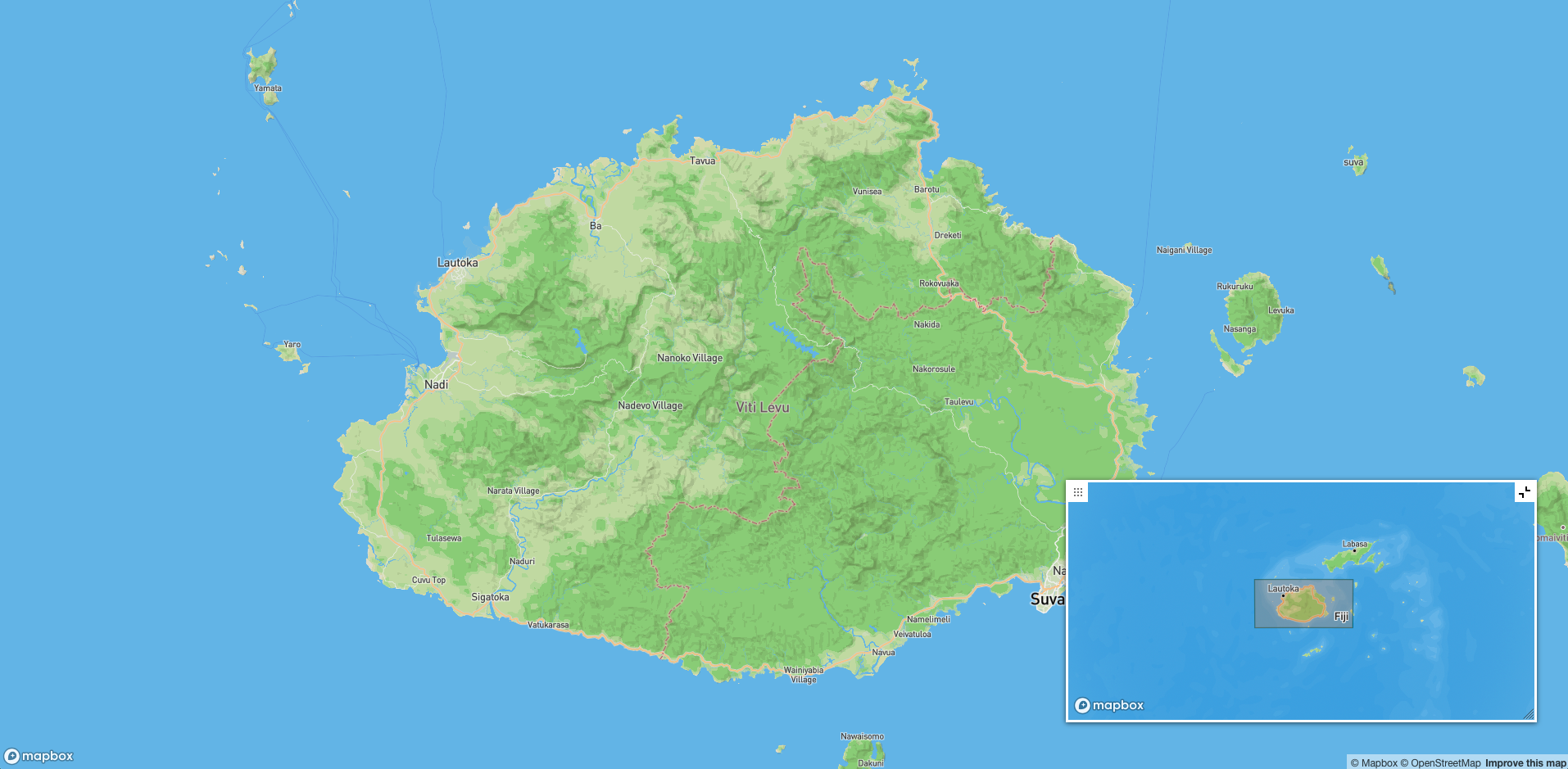
This package provides a minimap control for Mapbox GL or Maplibre GL maps. The minimap displays a smaller version of the main map, highlighting a portion of the view with a tracking rectangle. The minimap can be customized, moved, and resized based on you
Downloads
80
Maintainers
Readme
Mapbox Minimap Control
This package provides a minimap control for Mapbox GL or Maplibre GL maps. The minimap displays a smaller version of the main map, highlighting a portion of the view with a tracking rectangle. The minimap can be customized, moved, and resized based on your needs.

Live Demo
You can check out the live version of this package here:
Next.js Minimal Mapbox with minimap - Live Demo
Installation
npm i react-mapbox-minimapUsage
In your Mapbox or Maplibre GL project, you can add the minimap control as follows:
import Minimap from 'react-mapbox-minimap';

// Assuming 'map' is your main Mapbox GL map instance
const minimap = new Minimap(mapboxgl, {
  width: "320px",
  height: "180px",
  zoomLevelOffset: -3,
  lineColor: "#136a7e",
  fillColor: "#d77a34",
  toggleDisplay: true,
  enableResize: true,
  enableMove: true,
});

map.addControl(minimap);
Options
Here are the available options you can use to customize the minimap:
id(string): The HTMLidof the minimap container. Default is"mapgl-minimap".width(string): The width of the minimap. Default is"320px".height(string): The height of the minimap. Default is"180px".style(object): The style object for the minimap. It follows the Mapbox GL style format, similar to the main map.center(array): Initial center coordinates for the minimap. Default is[0, 0].zoomLevelOffset(number): Adjusts the zoom level of the minimap compared to the main map. Default is-3.lineColor(string): The color of the tracking rectangle's outline. Default is"#136a7e".lineWidth(number): The thickness of the tracking rectangle's outline. Default is1.lineOpacity(number): The opacity of the tracking rectangle's outline. Default is1.fillColor(string): The fill color of the tracking rectangle. Default is"#d77a34".fillOpacity(number): The opacity of the fill color in the tracking rectangle. Default is0.25.toggleDisplay(boolean): Adds a button to collapse/expand the minimap. Default isfalse.dragPan(boolean): Enables or disables drag panning in the minimap. Default isfalse.scrollZoom(boolean): Enables or disables zooming via scroll in the minimap. Default isfalse.boxZoom(boolean): Enables or disables box zoom in the minimap. Default isfalse.dragRotate(boolean): Enables or disables map rotation via dragging in the minimap. Default isfalse.keyboard(boolean): Enables or disables keyboard controls in the minimap. Default isfalse.doubleClickZoom(boolean): Enables or disables zooming via double-click in the minimap. Default isfalse.touchZoomRotate(boolean): Enables or disables touch gestures in the minimap. Default isfalse.disableMinimapMoveOnDrag(boolean): Iftrue, dragging the tracking rectangle from the minimap does not update the main minimap's bounds until the mouse is released. Default isfalse.enableResize(boolean): Allows the user to resize the minimap. Default isfalse.enableMove(boolean): Allows the user to move the minimap by dragging it. Default isfalse.
Example
map = new mapboxgl.Map({
    container: mapContainer.current as HTMLDivElement,
    style: "mapbox://styles/mapbox/outdoors-v12",
    center: [lng, lat],
    zoom: zoom,
});

map.on("load", function () {
    const minimap = new Minimap(mapboxgl, {
        center: [lng, lat],
        style: "mapbox://styles/mapbox/outdoors-v12",
        toggleDisplay: true,
        zoomLevelOffset: -4,
        scrollZoom: true,
        disableMinimapMoveOnDrag: true,
        enableResize: true,
        enableMove: true,
    });

    map.addControl(minimap, "bottom-right");
});
Credits
This project is heavily inspired by the original work of Laura Mosher (@lauramosher). The core functionality of this minimap control is based on this excellent work, to which I have added a few additional features and customization options, such as the ability to resize and move the minimap.
