
react-konva-editor-copy
v0.1.3
Published
An image editor which is built by konva and react.
Downloads
14

Readme
react-konva-editor
A fundamental image editor component based on react and konva.You can use it with react-konva-editor-kit which supplies some tools about transforming and styling of text and image on canvas.
Installation
$ npm install react-konva-editoror
$ yarn add react-konva-editorUsage
<KonvaCanvas
  backgroundStyle={{
    backgroundColor: '#F1F3F7',
    display: 'flex',
    justifyContent: 'center',
    alignItems: 'center',
  }}
  onChangeSelected={store.setSelected}
  width={store.width}
  height={store.height}
  backgroundColor={store.backgroundColor}
  addItem={addedItem}
  selectedItemChange={changedItem}
  maxStep={10}
  setWithdraw={setWithdraw}
  setRedo={setRedo}
  bindRef={store.setCurrentRef}
  stepInfo={stepInfo}
  onChangeStep={onChangeStep}
/>
Props
| propName | type | required | description |
| ------------------ | ------------------------- | -------- | --------------------------------------------------------------------------------------------------------- |
| backgroundStyle | Object | √ | canvas component background style |
| width | number | √ | canvas width |
| height | number | √ | canvas height |
| backgroundColor | string | - | canvas background color |
| addItem | ItemProp | - | when you need to add something on canvas,you should change addItem |
| onChangeSelected | (ItemProp)=>void | √ | return selected item data when you click a layer on canvas |
| selectedItemChange | Object | - | when you need to change the selected item,you should put a object with properties in selectedItemChange |
| maxStep | number | - | max length of withdraw/redo queue (default is 10) |
| stepInfo | Array<ItemProp> | √ | A series of ItemProp which had been shown on your canvas |
| bindRef | (ReactRef)=>void | √ | A function bind React Ref |
| setWithdraw | ()=>void | - | A callback when you withdraw operation |
| setRedo | ()=>void | - | A callback when you redo operation |
| onChangeStep | (Array<ItemProp> )=>void | √ | A callback when you change anything on canvas,it will return ItemProps which means infomations on canvas |
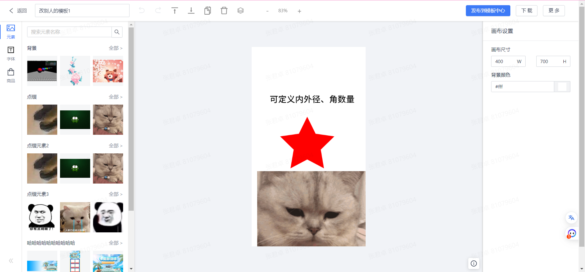
StepInfo
example
[
  {
    "type": "shape",
    "value": "star",
    "fill": "red",
    "id": 1001,
    "scaleX": 1,
    "scaleY": 1,
    "rotation": 0,
    "skewX": 0,
    "skewY": 0,
    "x": 195,
    "y": 345
  },
  {
    "type": "text",
    "value": "可定义内外径、角数量",
    "fontFamily": "默认",
    "id": 1002,
    "scaleX": 1.1925926495341033,
    "scaleY": 1.192592649534104,
    "rotation": 0,
    "skewX": 0,
    "skewY": 0,
    "x": 63,
    "y": 168,
    "fontSize": 25
  },
  {
    "type": "image",
    "value": "https://image.yonghuivip.com/jimu/1/1638943345035942610",
    "elementName": "上传人",
    "id": 1003,
    "x": 19,
    "y": 436,
    "width": 400,
    "height": 400,
    "scaleX": 1,
    "scaleY": 1,
    "rotation": 0,
    "skewX": 0,
    "skewY": 0
  }
]
ItemProp
API
| API name | type | description |
| ------------------- | ------------------------------------------------------------------------- | --------------------------------------------------------------------- |
| exportToImage | (fileName:string,options?:ImageExportProps)=>void | export image can be customized |
| exportToBASE64 | ()=>void | export BASE64 of the canvas |
| withdraw | ()=>void | withdraw action |
| redo | ()=>void | redo action |
| canvasScale | (ratio:number)=>void | zoom ratio of the canvas (ratio is (0,2.75]) |
| deleteItem | ()=>void | delete selected item on canvas |
| moveLayerLevel | (i: number)=>void | When i is less than 0, the selected layer will move to the next layer |
| moveLayer | (direction: 'right' \| 'left' \| 'top'\| 'bottom', delta: number)=>void | move delta unit on canvas on specific direction |
| setSelectedIndex | (id:number)=>void | Select the selected layers in order |
| clearSelected | ()=>void | Unselected layer |
| toggleMultiSelected | (state:boolean)=>void | switch multi-selected mode |
| toogleLock | (index:number)=>void | toggle the lock state of specific layer |
| madeGroup | (layers:Array\<ItemProp>)=>void | Group the selected layers |
| divideGroup | (groupId:string)=>void | Ungroup by a specific groupId |
| propName | type | required | description | | -------- | --------------------------- | -------- | ------------------------------------------------- | | scale | number[0.1-3] | - | Scale ratio of output image (default is 1) | | quality | number [0.1-1] | - | quality of export image(default is 1) | | fileType | 'image/png' | 'image/jpeg' | - | filetype of export image(default is 'image/png' ) |
Tips
- How to switch on multi-select Mode?
const handler = useCallback((e: KeyboardEvent) => {
  if (e.keyCode === 16) {
    // 开启多选模式
    KonvaCanvas.toggleMultiSelected(true);
    store.setMultiSelected(true);
  }
}, []);

useEffect(() => {
  window.addEventListener('keydown', handler);
  return () => {
    window.removeEventListener('keydown', handler);
  };
}, []);
Timeline
23-2-20 支持多选图层,拆组和解组-可配合 toolkit 使用
reference
Todos
| 序号 | 内容 | 完成情况 | | ---- | -------------- | -------- | | 1 | js 环境调通 | √ | | 2 | ts type 规范化 | delay | | 3 | ts 环境调通 | √ | | 4 | 依赖库配置 | delay | | 5 | 使用文档 | ing | | 6 | 线上示例 | - |