react-json-form-factory
v1.3.1
Published
A simple JSON to form convertor for reactJS
Downloads
13
Maintainers
Readme
React Form Builder
A dynamic form builder component for React applications. This component allows you to create customizable forms with various input types and validations.
Features
- Supports multiple input types: text, password, checkboxes, radio, dropdown, date, datetime-local, file input, number, textarea.
- Customizable form title and submit button.
- Validations for required fields, regex patterns, min/max values, and max checked items.
- Displays error messages for validation failures.
Installation
npm install react-json-form-factoryUsage
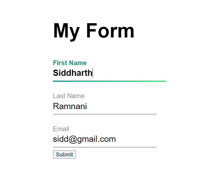
import FormBuilder from "react-json-form-factory"

const formFields=[
    {
        "type": "text",
        "name": "firstName",
        "label": "First Name",
        "value": "",
        "placeholder": "Enter your first name",
    },
    {
        "type": "text",
        "name": "lastName",
        "label": "Last Name",
        "value": "",
        "placeholder": "Enter your last name",
    },
    {
        "type": "email",
        "name": "email",
        "label": "Email",
        "value": "",
        "placeholder": "Enter your email",
    }
]

function App() {
  return <FormBuilder fields={formFields} title={{"text": "My Form"}}/>
}
Supported Parameters for Forms
| Parameter | Type | Significance | |:-----|:--------:|------:| | styles | Object | used to change default colors and sizes | | gridColumns | String | maximum number of columns in a form | | gap | String | Gap in px, rem or other units between each field | |fields|List of Objects|List of fields in the order you want to display them| |title|Object|Object with the title text and classes to be applied to it| |submit_btn|object|Object with the submit button text and classes| |onSubmit|Function or String|Function to be called while submitting (fields is passed to it), If a string then a POST request will me made to the URL, and if null then the values will be console logged|
Supported Parameters for Field
|Parameter|Type|For|Significance| |:----:|:----:|:----:|:----:| |type|String|All|Used to describe the type of input field| |name|String|All|Used to describe the name of the input field must be unique| |gridSpan|Integer|All|Number of grid cells a field must take| |label|String|All|Used to give label to the field| |placeholder|String|All|Used to give placeholder to the field| |value|String|All|Default value of the field| |required|Bool|All|Makes the field required| |regex|Regex|All|Custom validations| |min|Integer|number, date, datetime-local|Used to give min value to the field| |max|Integer|number, date, datetime-local|Used to give max value to the field| |step|Integer|number, date, datetime-local|Used to give step size to the field| |minChecked|Integer|Checkboxes|Defines the minimum number of checkboxes a user must select| |maxChecked|Integer|Checkboxes|Defines the maximum number of checkboxes a user can select| |customValidation|Function|All|Custom validations using function. The value is passed to the function and it must return true or false|
