
react-image-pan-and-zoom-with-commenting
v0.3.7
Published
React Image Pan and Zoom with Commenting
Downloads
213

Readme
React Image Pan And Zoom With Commenting
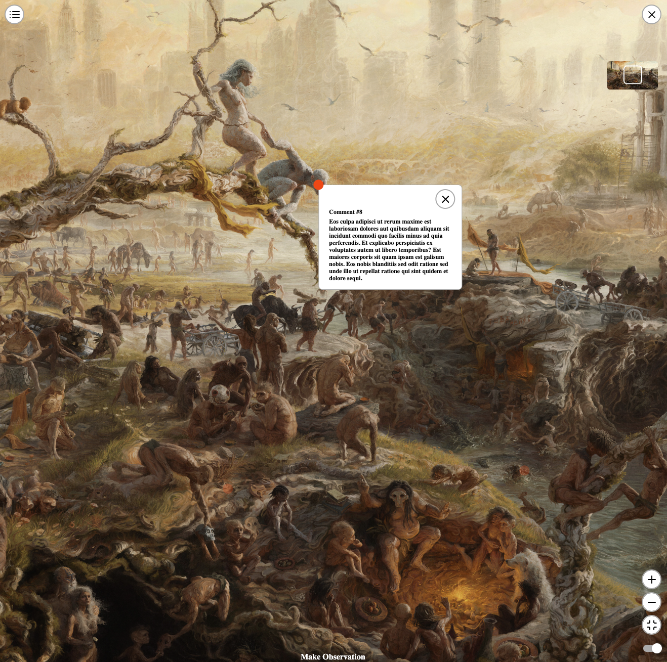
Nifty Gateway has developed a React component for image pan and zoom, allowing users to comment on any part of an image. This component was recently utilized in a project with Sam Spratt called the Monument Game. It enables users to zoom and pan around a 20,000-pixel-wide image, creating a more interactive and immersive user experience.
The component can function independently as a standalone image pan and zoom viewer. However, if you aim to support commenting, the component offers the necessary properties for integration with your custom backend. Moreover, if commenting is enabled, and comments are persisted to your backend, you can deep-link to a specific comment via query parameters in the URL (?x=0.6016064257028112&y=0.6058201058201058). Simply provide the x and y coordinates, and the component will load the pan and zoom experience, highlighting the specified comment at those coordinates.
Why Do I Need to Provide A Src and SmallerSrc?
For desktop use, if you're employing an image with a width equal to or less than 10,000 pixels, props.smallerSrc can be left undefined. However, for larger images, providing an image for props.smallerSrc may enhance zoom performance. The image specified for props.smallerSrc will only be displayed when a user zooms in and if the current zoom width of an image is less than or equal to the intrinsic width of props.smallerSrc. During development, we discovered that the Chrome browser struggles to provide a smooth zooming experience for images beyond 10,000 pixels in width. To address this issue, we introduced the option to supply a lower resolution image for display during zoom, significantly improving performance in Chrome browsers.
For mobile use, it's advisable to limit the maximum width of an image to 10,000 pixels. During development, we found that using an image exceeding 10,000 pixels could randomly crash the browser or refresh the page. You can leave props.smallerSrc undefined, especially for images equal to or less than 5,000 pixels in width, but results may vary.
In the future, we plan to explore a version that supports image tiling. If you'd like to initiate work on this feature, feel free to open a pull request!
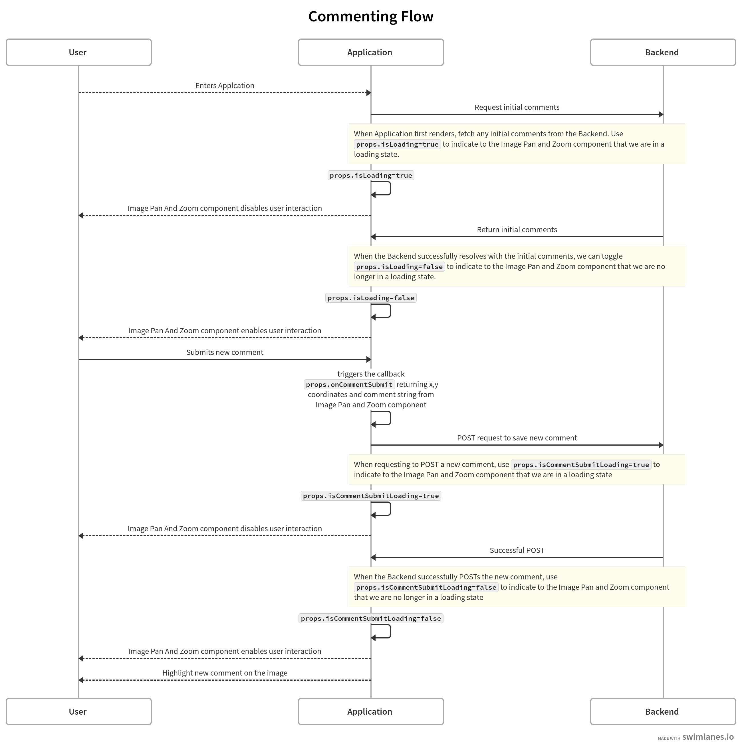
Data Flow Diagram on Commenting Flow
You can also take a look at the usage example below titled, Advanced Usage Showing How You can Tie in With A Custom Backend To Persist Comments
React Props
| Prop Name | Description | Is Required? | Default Value | Type | | ---------------------------------------- | ---------------------------------------------------------------------------------------------------------------------------------------------------------------------------------------------------------------------------------------------------------------- | ------------ | --------------------------------------------------------------------------------------- | ------------------------------------------------------- | | src | URL of main image to use for pan and zoom | Yes | | string | | smallerSrc | URL of the main image on a smaller scale, used for pan and zoom. Displayed during zoom and after zoom if the current zoom width is <= intrinsic width of the provided image | Optional | undefined | string OR undefined | | previewBoxSrc | URL of the image displayed in the pan and zoom preview box. Image width should be no larger than 100 pixels | Yes | | string | | comments | List of comments and their coordinates | Optional | undefined | { x: number, y: number, comment: string}[] OR undefined | | isLoading | Flag to indicate whether we are some loading state | Optional | FALSE | boolean | | panAndZoomEnabledOnMount | Flag to indicate whether pan and zoom should be enabled on initial mount | Optional | FALSE | boolean | | isCommentSubmitLoading | Flag to indicate whether we are in loading state for submitting a new comment | Optional | FALSE | boolean | | enableCommentDrop | Flag to toggle whether we allow comments to be dropped when pan and zoom is active | Optional | TRUE | boolean | | enablePanAndZoomControls | Flag to toggle display of pan and zoom controls (ie. zoom in/out button and reset zoom button) | Optional | TRUE | boolean | | enablePanAndZoomPreview | Flag to toggle the display of a smaller version of the image indicating your current pan location location | Optional | TRUE | boolean | | persistCommentDrawerWhenOpen | Flag to toggle whether the Comment Drawer stays open while the user interacts with pan and zoom. Recommended to set to false for better mobile user experience | Optional | TRUE | boolean | | addingCommentsToTheFront | Flag to indicate whether new comments are being added to the front of the comments array or at the end | Optional | FALSE | boolean | | zoomToPercent | Numeric value between 25-50 to indicate what percent value to set when a user clicks on a comment within the Comment Drawer | Optional | 50 | number | | dotSize | Numeric value to indicate comment dot size in pixels | Optional | 20 | number | | buttonEnablePanZoomText | Text on button to enable pan and zoom | Optional | Observe | string | | makeObservationText | Text when pan and zoom is enabled and commenting is allowed to indicate a user can leave a comment | Optional | Make Observation | string | | commentDialogHeadingText | Text for Comment Dialog heading | Optional | What Do You See? | string | | commentDialogSecondaryHeadingText | Text for Comment Dialog secondary heading | Optional | Make an observation. | string | | commentDialogConfirmHeadingText | Text for Comment Dialog confirmation heading | Optional | Confirmation | string | | commentDialogConfirmSecondaryHeadingText | Text for Comment Dialog confirmation secondary heading | Optional | As a last step please confirm your submission. Once it's submitted, it can't be undone. | string | | commentDialogConfirmCheckboxText | Text to accompany Comment Dialog checkbox | Optional | I understand this can't be undone | string | | commentDialogTextAreaPlaceholderText | Placeholder text for Comment Dialog textarea | Optional | | string | | commentDialogCancelButtonText | Text for Comment Dialog Cancel button when user is in pre-confirmation state | Optional | Cancel | string | | commentDialogBackButtonText | Text for Comment Dialog Back button when user is in confirmation state | Optional | Back | string | | commentDialogReviewButtonText | Text for Comment Dialog Review button when user is in pre-confirmation state | Optional | Review | string | | commentDialogSubmitButtonText | Text for Comment Dialog Submit button when user is in confirmation state | Optional | Submit | string | | primaryColor | Primary color (hex or rgba) | Optional | #fff | string | | secondaryColor | Secondary color (hex or rgba) | Optional | #000 | string | | tertiaryColor | Tertiary color (hex or rgba) | Optional | #aaa | string | | dotColor | Comment dot color (hex or rgba) | Optional | red | string | | activeDotColor | Active comment dot color (hex or rgba) | Optional | orange | string | | imgLoader | React component or string to display when main image is loading | Optional | undefined | React.ReactElement OR string OR undefined | | zoomSupportLoader | React component or string to display when zoom support image is being loaded. This will only come into play if you are using a very large image (10,000+ pixels in width) for props.src | Optional | undefined | React.ReactElement OR string OR undefined | | errorDisplay | React component or string to display when an error is encountered during main image load | Optional | undefined | React.ReactElement OR string OR undefined | | onCommentSubmit | Callback function called when a new comment is submitted | Optional | undefined | Function OR undefined | | onImageLoad | Callback function called when the main image has loaded | Optional | undefined | Function OR undefined | | onTogglePanAndZoom | Callback function called when pan and zoom is toggled on/off | Optional | undefined | Function OR undefined |
Demo
https://gemini-oss.github.io/react-image-pan-and-zoom-with-commenting/
Installation
yarn add react-image-pan-and-zoom-with-commentingnpm i react-image-pan-and-zoom-with-commentingBasic Usage Image Pan And Zoom With Commenting
import ImagePanAndZoom from 'react-image-pan-and-zoom-with-commenting';

const App = () => {
    return (
        <ImagePanAndZoom src='LINK_TO_IMAGE' previewBoxSrc='LINK_TO_PREVIEW_IMAGE' />
    )
}

export default App
Basic Usage Image Pan And Zoom Only
import ImagePanAndZoom from 'react-image-pan-and-zoom-with-commenting';

const App = () => {
    return (
        <ImagePanAndZoom src='LINK_TO_IMAGE' previewBoxSrc='LINK_TO_PREVIEW_IMAGE' enableCommentDrop={false} />
    )
}

export default App
Advanced Usage Showing How You can Tie in With A Custom Backend To Persist Comments
import ImagePanAndZoom from 'react-image-pan-and-zoom-with-commenting';

const App = () => {
  const [isCommentSubmitLoading, setIsCommentSubmitLoading] =
    React.useState(false);
  const [isLoading, setIsLoading] = React.useState(true);
  const [comments, setComments] = React.useState<CommentDotProps[]>([]);

  const handleCommentSubmit = (comment: CommentDotProps) => {
    setIsCommentSubmitLoading(true);

    // Simulate a POST request to save a new comment
    setTimeout(() => {
      setComments([...comments, { ...comment }]);
      setIsCommentSubmitLoading(false);
    }, 3000);
  };

  React.useEffect(() => {
    // Simulate a GET request to retrieve existing comments
    setTimeout(() => {
      setComments([
        {
          x: 0.6016064257028112,
          y: 0.6058201058201058,
          comment: "Lorem ipsum dolor sit amet. Et quod alias qui sequi labore est nostrum debitis sed officiis laborum qui ipsam consequuntur in rerum unde et recusandae quibusdam. Cum iste repudiandae sit sint placeat sed quia velit et quidem doloribus qui doloremque unde est asperiores similique.",
        },
        {
          x: 0.7653844927601894,
          y: 0.4520125762495482,
          comment:
            "Ut ipsum numquam qui expedita dolorem cum quaerat consequatur ut natus laudantium aut aspernatur laboriosam et asperiores assumenda. Ea voluptatem neque non quia laborum ut consequatur voluptatum in voluptas debitis et quisquam quidem. Ut ipsum numquam qui expedita dolorem cum quaerat consequatur ut natus laudantium aut aspernatur laboriosam et asperiores assumenda. Ea voluptatem neque non quia laborum ut consequatur voluptatum in voluptas debitis et quisquam quidem.",
        },
        {
          x: 0.45380107538609804,
          y: 0.6221498059102408,
          comment: "Rem aliquam galisum sed ducimus velit aut natus magni vel illum tempora est voluptatem vero et quam culpa eos sequi nostrum. Sed aliquam nihil ut fugit amet aut rerum dolorem et tempora voluptas et vitae repellendus et itaque dolor.",
        },
      ]);
      setIsLoading(false);
    }, 2000);
  }, []);

  return (
    <ImagePanAndZoom
      src='LINK_TO_IMAGE'
      previewBoxSrc='LINK_TO_PREVIEW_IMAGE'
      comments={comments}
      isLoading={isLoading}
      isCommentSubmitLoading={isCommentSubmitLoading}
      onCommentSubmit={handleCommentSubmit}
    />
  );
};

export default App
ClassNames You Can Target
| Component | Description | ClassName | | ----------------------- | ----------------------------------------------- | ----------------------- | | Active Comment | Component used to display an active comment | .active-comment | | Comment Dialog | Component used to allow comment entry | .comment-dialog | | Comment Display Switch | Component used to toggle comment display | .comment-display-switch | | Comment Drawer | Component used to display list of comments | .comment-drawer | | Comment Drawer Backdrop | Component used to backdrop for list of comments | .comment-drawer-tint | | Dot Container | Container component to house comment dots | .dot-container | | Dot Container Dots | Component used for a comment dot | .button--dot | | Image Pan And Zoom | Component used for image pan and zoom | .image-pan-and-zoom |