react-image-editor-pro
v1.2.0
Published
react image cropper editor zoom rotate crop photo modal
Downloads
554
Maintainers
Readme
react-image-editor-pro
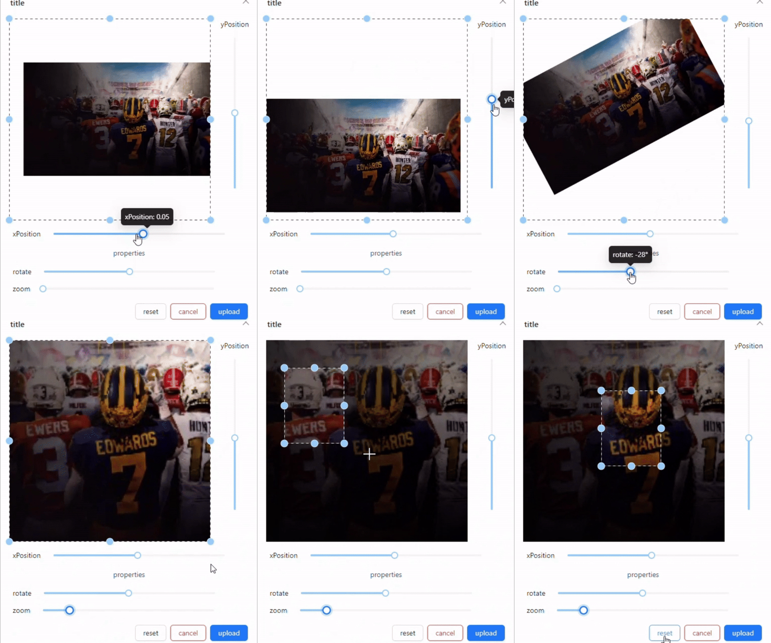
react-image-editor-pro is a React component designed for uploading, cropping, and editing images with a user-friendly interface. It leverages Ant Design for the modal interface and includes a modal for image cropping with various options.
Features
- Crop and edit images in a modal.
- Preview cropped images before finalizing.
- Supports scaling and rotation of images.
Installation
To install react-image-editor-pro, use npm or yarn:
npm install react-image-editor-pro

or

yarn add react-image-editor-pro
Github Repo
View repo for updates and code improvements
https://github.com/nikhilsurfingaus/react-image-editor-pro
Demo Video
Usage Example
The user clicks on the upload area, which triggers the Upload component. The customRequest function handles the file selection, updates state variables, and opens the cropping modal. Crop and Edit Image:
The cropping modal (ImageCropperModal) allows users to crop, zoom, and rotate the image. The final cropped image is displayed as a preview and can be set using the provided setter functions. Styling The component uses custom styling through styled components. Ensure you include the required CSS files and apply any additional styles as needed.
To use the ImageCropperModal component for image uploading and cropping, follow the example below:
export function ImageUpload({
  setImage,
  imageUrl,
  setImageUrl,
}: ImageUploadProps) {
  const [croppedImageUrl, setCroppedImageUrl] = useState<string | null>(null);
  const [originalImageFile, setOriginalImageFile] = useState<File | null>(null);
  const [modalVisible, setModalVisible] = useState(false);
  const [scaledImageUrl, setScaledImageUrl] = useState<string | null>(null);

  //Display intial existing images
  useEffect(() => {
    if (imageUrl !== null) {
      setCroppedImageUrl(imageUrl);
    }
  }, [imageUrl]);

  const props = {
    maxCount: 1,
    showUploadList: false,
    customRequest(options: unknown) {
      const { file } = options as CustomUploadRequestOption;
      setOriginalImageFile(file); // Store the original image file
      setImage(file);
      getBase64(file, (url: string | null) => {
        if (url !== null) {
          setImageUrl(url);
          setScaledImageUrl(null); // Reset the scaled image URL
          setModalVisible(true);
          parseScaledImageFile(url).then((file) => {
            const newUrl = URL.createObjectURL(file);
            setScaledImageUrl(newUrl);
          });
        }
      });
    },
  };

  const getBase64 = (img: File, callback: (url: string | null) => void) => {
    const reader = new FileReader();
    reader.addEventListener("load", () =>
      callback(reader.result as string | null)
    );
    reader.readAsDataURL(img);
  };

  return (
    <div style={{ width: "100%" }}>
      <Upload {...props}>
        <UploadWrapper>
          {croppedImageUrl ? (
            <ImageUploadStyle src={croppedImageUrl} alt={fieldName} />
          ) : (
            <AddImageTitle />
          )}
        </UploadWrapper>
      </Upload>
      <ImageCropperModal
        title={"Custom Title"}
        rotate={"Rotation Slider"}
        setImage={setImage}
        imageUrl={imageUrl}
        setCroppedImageUrl={setCroppedImageUrl}
        setScaledImageUrl={setScaledImageUrl}
        originalImageFile={originalImageFile}
        scaledImageUrl={scaledImageUrl}
        setImageUrl={setImageUrl}
        setModalVisible={setModalVisible}
        modalVisible={modalVisible}
      />
    </div>
  );
}
Parse Scaled Image File
// /**
//  * This function takes an image URL, loads the image, and scales it to fit within a
//  * 300x300 preview while maintaining the image's aspect ratio. The image is centered
//  * within the preview area, and any extra space is filled with a white background.
//  * A new image file is then created from the canvas and returned as a JPEG.
//  **/

const DEFAULT_PREVIEW_WIDTH = 400;
const DEFAULT_PREVIEW_HEIGHT = 400;

export const parseScaledImageFile = (imageUrl: string): Promise<File> => {
  return new Promise((resolve) => {
    const image = new Image();
    image.src = imageUrl;
    image.onload = () => {
      const canvas = document.createElement("canvas");
      const ctx = canvas.getContext("2d");

      const imgAspect = image.width / image.height;
      const previewAspect = DEFAULT_PREVIEW_WIDTH / DEFAULT_PREVIEW_HEIGHT;

      let canvasWidth, canvasHeight;
      let offsetX = 0,
        offsetY = 0;

      // Calculate the dimensions of the image to fit inside the preview
      if (imgAspect > previewAspect) {
        // Image is wider than the preview
        canvasWidth = DEFAULT_PREVIEW_WIDTH;
        canvasHeight = DEFAULT_PREVIEW_WIDTH / imgAspect;
      } else {
        // Image is taller or has the same aspect ratio as the preview
        canvasWidth = DEFAULT_PREVIEW_HEIGHT * imgAspect;
        canvasHeight = DEFAULT_PREVIEW_HEIGHT;
      }

      // Center the image in the canvas
      offsetX = (DEFAULT_PREVIEW_WIDTH - canvasWidth) / 2;
      offsetY = (DEFAULT_PREVIEW_HEIGHT - canvasHeight) / 2;

      canvas.width = DEFAULT_PREVIEW_WIDTH;
      canvas.height = DEFAULT_PREVIEW_HEIGHT;

      // Set the background color to #ffffff
      ctx!.fillStyle = "#ffffff";
      ctx!.fillRect(0, 0, canvas.width, canvas.height);

      ctx!.drawImage(
        image,
        0,
        0,
        image.width,
        image.height,
        offsetX,
        offsetY,
        canvasWidth,
        canvasHeight
      );
      canvas.toBlob((blob) => {
        if (blob) {
          const file = new File([blob], "scaled-image.jpg", {
            type: "image/jpeg",
          });
          resolve(file);
        }
      }, "image/jpeg");
    };
  });
};
ImageUploadCropperModal Props
| Prop | Type | Description |
| -------------------- | ---------------- | -------------------------------------------------------- |
| title? | string | The title of the modal. |
| reset? | string | The text for the reset button. |
| cancel? | string | The text for the cancel button. |
| upload? | string | The text for the upload button. |
| yPosition? | string | The label for the Y position control. |
| xPosition? | string | The label for the X position control. |
| properties? | string | The label for the properties control. |
| rotate? | string | The label for the rotate control. |
| zooming? | string | The label for the zoom control. |
| setImage | File \|null | A function to handle the uploaded image file. |
| imageUrl | string \| null | The URL of the image to display (if available). |
| setCroppedImageUrl | string \| null | A function to handle the URL of the cropped image. |
| setScaledImageUrl | string \| null | A function to handle the URL of the scaled image. |
| originalImageFile | File \| null | The original image file being edited. |
| scaledImageUrl | string \| null | The URL of the scaled image (if available). |
| setImageUrl | string \| null | A function to handle the image URL for display purposes. |
| setModalVisible | boolean | A function to handle the modal visibility. |
| modalVisible | boolean | The visibility state of the modal. |
Additional Notes
Ensure you have antd and react-image-crop installed as peer dependencies. The ImageCropperModal component handles the cropping logic and should be customized to fit your needs.
License
This `README.md` includes the usage example code and parameters table properly formatted within code blocks for easy copying and pasting.

