react-form-toaster
v1.0.12
Published
React form toast library
Downloads
9
Readme
React-Form-Toaster


🎊 React-Form-Toaster is a powerful and flexible library designed for creating dynamic forms in React with ease. Users can quickly generate complex forms by simply defining input types, buttons, and other elements, without needing to create each element separately.
$ npm install --save react-form-toaster
$ yarn add react-form-toaster
Features
- Easy Setup: Get started in less than 10 seconds! Quickly integrate and begin creating dynamic forms without hassle.😎
- Dynamic Form Creation: Simply define the type of fields, labels, form title, and required attributes, and the library handles the rest.
- Highly Customizable: Customize every aspect of your form, including classes, messages, and more, to fit your specific needs.
- TypeScript Support: Built with TypeScript, ensuring strong typing and safer code development.🤯
- Tailwind CSS Integration: Optimized for Tailwind CSS, allowing for efficient and modern styling right out of the box.
- Default Form UI: Comes with a beautifully designed default form UI that you can use as-is or customize further to match your design requirements.
- Form Validation and Error Handling: Easily define required fields and validate user input with built-in error handling and custom validation functions.🍃
- Responsive Design: Fully responsive, making it easy to create forms that look great on any device.
- Zod Validation: Easily apply Zod validation in your Form🔐.
- Fully Customizable Forms: Provides the flexibility to design forms with custom classes and styles, ensuring they match your application's theme.😱
Quick Setup
import React from "react";
import ReactDOM from "react-dom/client";
import App from "./App.tsx";
import "./index.css";
import reportWebVitals from "./reportWebVitals";
const root = ReactDOM.createRoot(document.getElementById("root"));
root.render(
  <React.StrictMode>
    <App />
  </React.StrictMode>
);
Note: It is important to import index.css after App.tsx to ensure that all styles are correctly applied. This ensures that any global styles are loaded after the component has been imported.
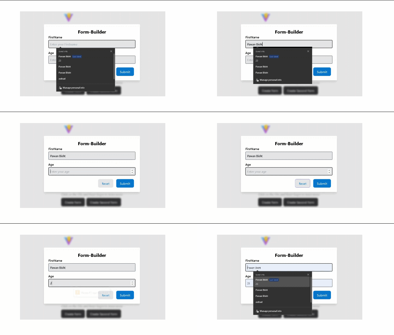
User-Forms
import Formbox from "react-form-toaster";
import "react-form-toaster/dist/dist/tailwind.css";
<Formbox
  formtoogle={setfirstform}
  formtitle={[
    {
      title: "Form-Builder",
      className: ["text-2xl font-bold "],
    },
  ]}
  textfield={[
    {
      name: "firstname",
      placeholder: "Enter your Firstname",
      label: "FirstName",
      required: false,
      // type: "text"
    },
    {
      name: "age",
      placeholder: "Enter your age",
      label: "Age",
      type: "number",
    },
  ]}
  buttons={[
    {
      name: "Submit",
      type: "submit",
      label: "Submitbutton",
      function: handlesubmit,
    },
    {
      name: "Reset",
      type: "reset",
      label: "Submitbutton",
      function: handlesubmit,
    },
  ]}
  validationSchema={validationSchema}
/>;
const handlesubmit = (data: any, e: React.MouseEvent) => {
e.preventDefault();
console.log(data);
};Zod Validation
const validationSchema = z.object({
  firstname: z
    .string()
    .min(4, { message: "First name must be at least 4 characters" }),
  age: z.number().min(18, { message: "You must be at least 18 years old" }),
});
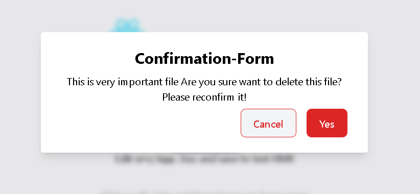
Confirmation-Forms
 <Formbox
 formtoogle={setsecondform}
 formtitle={[{
 title: "Confirmation-Form",
 }]}
 message={[{
 message: "This is very important file Are you sure want to delete this file? Please reconfirm it!"
 }]}
 buttons={[{
 name: "Ok",
 label: "Confirm",
 type: "ok",
 function: () => handleConfirm(true,200),
 className: ["bg-red-600"]
 },{
 name: "Cancel",
 label: "Cancel",
 type: "cancel",
 function: () => handleConfirm(false,200),
 className: ["text-red-600 border-1 border-red-600 bg-gray-100 hover:border-red-600 "]
 }]}
 />
const handleConfirm = (confirm: boolean, productId: number) => {
console.log(confirm, productId);
if (confirm && productId) {
console.log(" We got both of them. Hurrah! 🏆 ");
}
setsecondform(false);
};Contribute
Show your ❤️ and support by giving a ⭐. Any suggestions are welcome! Take a look at the contributing guide. You can also find me on Github 277pawan.
Free Library, Happy Coding😎😎!
