react-floating-action-button
v1.0.5
Published
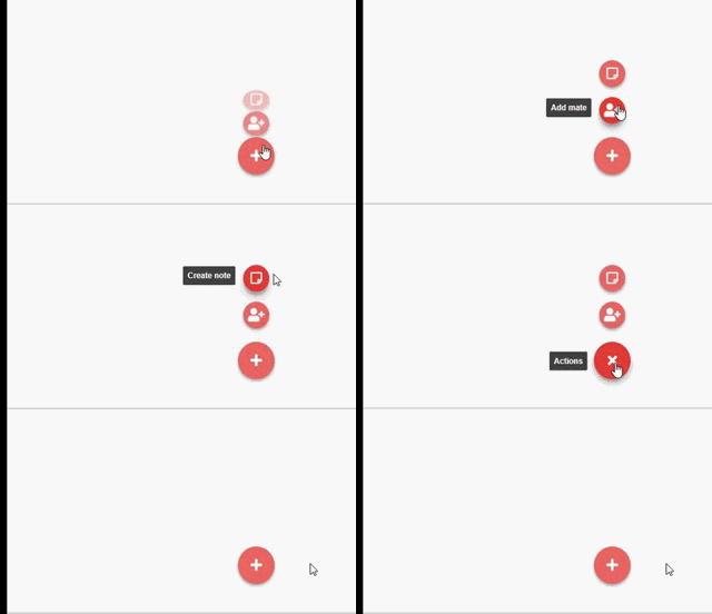
A simple Android like FAB Component for React
Downloads
3,051
Maintainers
Readme
React-Floating-Action-Button
A dead simple React component that works similar to Android's Action Button

Getting Started
- First, You need to install It, just like You would do with most any NPM packages:
npm i --save react-floating-action-button- Then, You need to import the library component within your own component
import React from 'react'
import { Container, Button, Link } from 'react-floating-action-button'- You can now start using the FAB components!
export default const YourAwesomeComponent = () => {
    return (
        <Container>
            <Link href="#"
                tooltip="Create note link"
                icon="far fa-sticky-note" />
            <Link href="#"
                tooltip="Add user link"
                icon="fas fa-user-plus" />
                className="fab-item btn btn-link btn-lg text-white"
            <Button
                tooltip="The big plus button!"
                icon="fas fa-plus"
                rotate={true}
                onClick={() => alert('FAB Rocks!')} />
        </Container>
    )
}
About Components
- Container - It's simply a nav element that contains fab-container in its class list. You must involve your fab-items inside a Container, so the default styles are applied properly. Note that the last child will be recognized as the bigger button that is always visible and triggers the menu opening on hover.
- Button - A special button element that has the class fab-item and an "i" element as its first child. You can add a function the its click by passing an "onClick" just like you would with a regular button.
- Link - Works just like the Button component, but instead of a "onClick", You need to pass a "href" prop to It.
NOTE: All components support props.children rendering, which in combination with custom styles, can give You a lot of customization options.
Extra Styling
- Container - You can add custom classes using the "className" property, and also add custom styles by passing a "styles" property with an object just like you would do with the regular style.
- Button and Link - Supports all mentioned for the Container, plus gives You the option to add custom icon classes by passing an "icon" string property, and also custom icon styles by passing an object property "iconStyles"
Material Colors
React-floating-action-button also exports two objects: lightColors and darkColors. These objects contain a few preset material colors that You can use when passing custom styles to the components, and help You to keep the overall design concise.
Usage
...
import { Container, Button, lightColors, darkColors } from 'react-floating-action-button'
...
<Container>
    <Button
     tooltip="The big plus button!"
     styles={{backgroundColor: darkColors.lighterRed, color: lightColors.white}}
     />
</Container>
Light Colors
| Color name | Hex value | | ------------- |:-------------:| | red | #ffcdd2 | | pink | #f8bbd0 | | purple | #e1bee7 | | lightBlue | #81d4fa | | cyan | #80deea | | teal | #80cbc4 | | blue | #bbdefb | | green | #dcedc8 | | yellow | #fff9c4 | | orange | #ffe0b2 | | brown | #d7ccc8 | | grey |#e0e0e0 | | darkerGrey | #bdbdbd | | black | #212121 | | white | #f5f5f5 |
Dark Colors
| Color name | Hex value | | ------------- |:-------------:| | lighterRed | #f44336 | | red | #c62828 | | pink | #ad1457 | | purple | #6a1b9a | | lightBlue | #01579b | | cyan | #00838f | | teal | #00695c | | blue | #0d47a1 | | green | #1b5e20 | | yellow | #f9a825 | | orange | #e65100 | | brown | #4e342e | | grey |#424242 | | black | #212121 | | white | #fafafa |
