react-finderselect
v1.0.5
Published
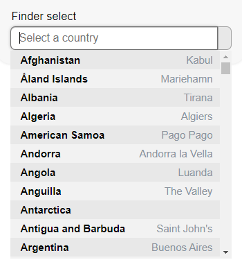
A nice and cute select which will let the user to search inside the select options writing what he want to find
Downloads
52
Maintainers
Readme
React Finder Select
This is a small project whose objective is to supply an effective and easy to use solution for the common problems about the normal html select's, which are a little boring and don't let you search inside the options, so if the select has too many options, finding the desired option will be tedious.
The Finder Select lets you set "onClick" and "onChange" functions so you will be able to use the Finder Select as you like. The main Finder Select characteristic is that it provides the user a way to make effective searches inside the select options only writing on the select.
If you want to see how the Finder Select looks/works and compare it with a normal select, you can visit this URL. There we are taking the data asynchronously from an API and then sending them to the select. The example app code is on this repository; in the example folder.
To install the Finder Select in your app
npm install --save react-finderselect
To use the Finder Select in your app
import React, { Component } from 'react'

import FinderSelect from 'react-finderselect'
import 'react-finderselect/dist/index.css'

const Example = () => {
    return <FinderSelect data={data} label={label} value={value}/>
}
Props:
| prop | required | type | description |
|:------------:|:--------:|:----------------:|:------------------------------------------------------------------:|
| data | true | array of objects | data that will be used for the options |
| label | true | string | how is named the label key in the data |
| value | true | string | how is named the value key in the data |
| extraInfo | false | string | how is named the extraInfo key in the data |
| name | false | string | which will be the valueInput name |
| className | false | string | which will the labelInput class |
| placeholder| false | string | which will the labelInput placeholder |
| onClick | false | function | function that will be executed when the user press the labelInput |
| onChange | false | function | function that will be executed when the user leaves the labelInput |
Use example:
const data = [
    {
        name: 'Venezuela',
        capital: 'Caracas',
        code: 'VE'
    },{
        name: 'Peru',
        capital: 'Lima',
        code: 'PE'
    },{
        name: 'Argentina',
        capital: 'Buenos Aires',
        code: 'AR'
    },
    // ...
]

<FinderSelect
    data={data}
    label='name'
    value='code'
    extraInfo='capital'
    name='country'
    className='anyClass'
    placeholder='Select a country'
    onClick={() => console.log('entering')}
    onChange={() => console.log('leaving')}
/>
Example preview:
Recommended CSS (modifiable):
input,
select {
    display: block;
    width: 100%;
    padding: 0.375rem 0.75rem;
    border-radius: 7px;
    border: 1px solid;
    border-color: #00000050;
    background: #fff;
    font-size: 1rem
}
input:focus, select:focus {
    border-color: #00000090;
    box-shadow: 0 1px 1px #00000040 inset,
        0 0 4px #00000040;
    outline: 0 none;
}
input:disabled, select:disabled {
    background: #f1f1f1
}
License
MIT © fabiosaac12

