react-errorr
v1.1.5
Published
A react popup error fully customizable
Downloads
10
Maintainers
Readme
React-Errorr
A simple fully customizable popup error for react.
Included
This package provides:
ErrorrThe main Component, used to create pop-up errors.ErrorrContext / ErrorrContextProviderThe context that allows remote firing of the pop-up errors.UseEffectOnceThis is a hook that simulates useEffect, but only executes once. It is used for the internal usage of the package, but I've included an export in case you want to use it.
Usage
To begin using the Errorr component, you need to add the ErrorrContextProvider to your DOM tree. This context ensures you can engage this errors from wherever, as long as the activator is inside the context provider. You can use as many different providers as you want, as long as they are not nested.
First import the ErrorrContextProvider
import { ErrorrContextProvider } from "react-errorr";Add it to your tree, for example in index.ts (you can scope it wherever you like).
<ErrorrContextProvider>
  <App />
</ErrorrContextProvider>
Then Wrap the component that VISUALLY generates the error (let's say, for example a form input). Even if the error is processed elsewhere:
<Errorr name="example">
  <input type="text" id="exampleId" />
</Errorr>
Then, in the component that actually generats the error, import the activateErrorr function from the ErrorrContext:
const { activateErrorr } = useContext(ErrorrContext);Call this function whenever you want an error to appear. Make sure you call it with the correct error name.
activateErrorr("example");Customization
Props:
ErrorrContextProvider: AccpetsoptionsErrorr: Needsname| Accpetsmessage, content, styleData, options and children(The children is the wrapped component).
Options
Both the ErrorContextProvider and each individual Errorr can be called with an options object. There are some globally default options which you can see bellow, but, if a Provider is instanciated with an options object, these options override the global ones, same for the Errorr options.
- Global options.
- Provider options (override global options in the Provider scope).
- Errorr options (override Provider options, but just for the individual Errorr).
These are the global options:
animation: {
    durationInMs: 200,
    type: "fadeOut",
  },
  positioning: {
    block: "after",
    inline: "start",
  },
  offsets: {
    offsetY: 0,
    offsetX: 0,
  },
  activeTime: 2000,
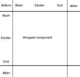
debug: false,AnimationThe options for the error animations: type is one of: "fadeIn" | "fadeOut" | "fadeInOut | "instant". And the duration of the animation in ms.PositioningThe position of the error message relative to the component it's wrapped around, that's why it's imporant to wrap the component that visually generates the error.Inlinedeclares the position in the X axis andblockdeclares it in the Y axis. This acts as a grid, so any combination of the 2 will result in a different position. The position options for each axis are as folllows: (No one action controls the 2 axis, these are individually set for each axis)beforeAligns the bottom/right of the error before the wrapped component.startAligns the top/left of the error with the top/left of the wrapped component.centeredCenters the error at the center of the wrapped component.centerAligns the bubble origin* of the error to the center of the wrapped component (The little triangle indicating where the bubble comes from. Thjis is specially usefull for small errorr origins like checkboxes or smallñ buttons).endAligns the top/left of the error with the bottom/right of the wrapped component.afterAligns the top/left of the error after the wrapped component.

OffsetsThe X and Y offsets are the number in pixels of the desired offset applied AFTER the positioning is applied. So you can trully put the error wherever you want.activeTimeIs the time that the error is visible when activated.debugIs a little boolean that makes the error stay active indefiently. I've added this so you can customize your errorr without having to generate it.
All these options can be changed at runtime.
Apperance
The Errorr component includes a default error apperance. The message of the error can be passed on each Errorr through the message prop. The pop-up can be customized to your liking through the styleData:
interface StyleData {
  height?: number | string;
  width?: number | string;
  backgroundColor?: string;
  color?: string;
  fontSize?: number | string;
  fontWeight?: number;
  grow?: boolean;
}
The defaults are:
heightandwidth: fit-contentbackground-color: whitecolor: redfont-size: 14pxfont-weight: 500grow: false
The grow boolean will make the width of the container 100% so it streches the parent container. This can also be used similar to flex:1; but only affecting the width.
If you want to implement your own version of the errorr youn can use every pice of functinality, but with your own component. Simply pass your component or JSX in the content prop. This will deactivate the default message/pop-up and use your own jsx.
Methods
The ErrorrContext has a couple of methods:
activateErrorThe method to activate and show the pop-up error. It needs thenameof the error that needs to be activated.forceRemoveErrorrThis method deactivates and hides the error regardles of if the time has passed. This is particualarly usefull to get the error out of sight if the cause has been solved before the activeTime runs out (For excample, if the error was caused by an unchecked checkbox, call this method when it's checked so the error becomes visually solved).
