react-dynamic-badge
v2.0.1
Published
A dynamic badge for React
Downloads
48
Maintainers
Readme
React-Dynamic-Badge

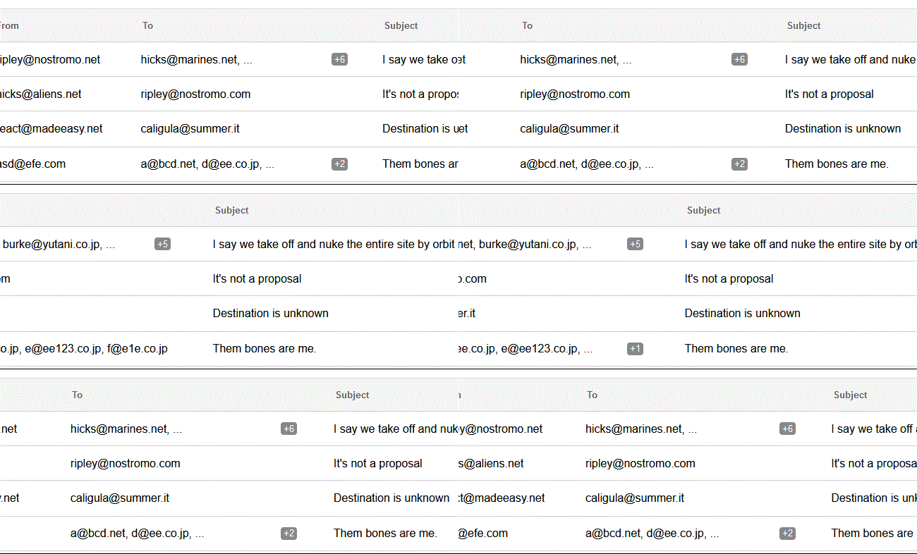
A responsive component that shows a badge if an array of strings overflows the parent element.
<DynamicBadge
    items={[
        "Item 1",
        "Item 2",
        "Item 3",
        "Item 4",
    ]}
/>
Technical Documentation
Installing
$ npm install react-dynamic-badgeExports
The default export is <DynamicBadge>.
Here's how to use it:
import { DynamicBadge } from 'react-dynamic-badge';
<DynamicBadge>
A <DynamicBadge> element will calculate the width of the parent element and show only the items that can fit. If an item overflows it will be hidden and a badge will be shown. If there is only one item and it overflows ellipsis is used. The font is inherited from the containing element.
DynamicBadge Usage
import React from 'react';
import ReactDOM from 'react-dom';
import { DynamicBadge } from 'react-dynamic-badge';

class App extends React.Component {

  render() {
    return (
      <div style={{ width: "50%", border: "1px dashed" }}>
        <DynamicBadge
            items={[
                "Item 1",
                "Item 2",
                "Item 3",
                "Item 4",
            ]}
        />
      </div>
    );
  }
}

ReactDOM.render(<App/>, document.body);
<DynamicBadge> Props:
| Name | Type | Required | Default | Description | |-----------------|------------------|----------|--------------|-----------------------------------------------------------------------------------------------------------------------| | badgeClass | string | no | "bdg-badge" | It's possible to use a custom class for the badge. | | items | array of strings | yes | [] | The items to be displayed. If not set, it falls back to an empty array (nothing is shown). | | minWidth | int | no | | Sets the minimum width for the text to be shown; defaults at 1/2 characters depending on the font and character. | | onlyBadge | bool | no | false | If set to true it will display only the badge and no text. | | resizeDebounce | int | no | 1 | The debounce value for the resize event in ms. The smaller the value the quicker the badge will be updated on resize. |
License
MIT
