react-date-time-picker-tz
v1.0.4
Published
React component library for handling date, time, and dateTime pickers with zone handling and customizable formats.
Downloads
14
Maintainers
Readme
React-Time-Date-Picker-TZ
Introducing React-Time-Date-Picker-TZ, a React component library that simplifies the handling of date, time, and dateTime picker. Unlike conventional solutions, this library offers unparalleled flexibility by providing full control over styling and formats, independent of the system settings.
Features
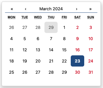
- Date Picker: Select dates from a calendar interface.
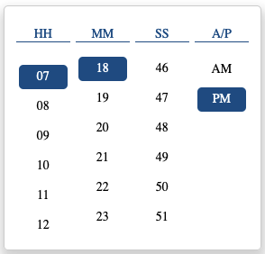
- Time Picker: Pick times using an intuitive interface.
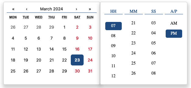
- Datetime Picker: Combine date and time selection for specific datetime needs.
- Customization: Easily customize the appearance and behavior of the pickers to match your application's design.
- Responsive: Designed to work seamlessly across different screen sizes and devices.
Installation
You can install the package via npm or yarn:
npm install react-date-time-picker-tz
# or
yarn add react-date-time-picker-tz
Usage
Import InputPicker from react-date-time-picker-tz;
import { ReactDateTimePicker, TimePicker } from "react-date-time-picker-tz";Add ReactDateTimePicker like this:
<ReactDateTimePicker
  type="date"
  value={selectedDate}
  onChange={(newValue) => {
    setSelectedDate(newValue);
  }}
/>
Add TimePicker like this:
<TimePicker
  value={"2024-03-30 04:06:16 PM Asia/Calcutta"}
  onChange={(v) => {
    console.log(v);
  }}
  format="yyyy-LL-dd hh:mm:ss a z"
  outputZone="Europe/Moscow"
/>
InputPickerProps
| Prop | Type | Description | | ---------------------- | -------------------------- | ---------------------------------------------------------------------------------------- | | type | "date", "time", "dateTime" | Select picker type. | | value | string | Input value. | | onChange | (value: string) => void | Fuction triggered when the value changes. Receives the new value as an argument. | | format | string | Format the displayed value.(Input and output format will be the same.) | | onHide | () => void | Fuction triggered when the picker is hidden. | | onShow | () => void | Fuction triggered when the picker is shown. | | mainContainerClassName | string | Class name(s) that will be added along with "main-box" to the main picker element. | | mainContainerStyles | CSSProperties | Inline styles for the main container element. | | selectedStyle | CSSProperties | Styles for the selected element. | | outputZone | string | Specifies the output value based on the zone |
Date Picker

Time Picker

Date-Time Picker

