react-custom-slider
v1.0.9
Published
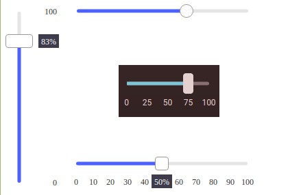
a very easy to use customizable slider for React
Downloads
109
Maintainers
Readme
react-custom-slider
a very easy to use customizable slider for React
- easy to use
- no dependencies
- flexible (few required parameters but highly customizable)

Install
npm install --save react-custom-sliderUsage
import React from 'react'

import Slider from 'react-custom-slider';

const App = () => {
  const [ value, setValue ] = React.useState(0);

  return(
    <div>
      <Slider
        value={value}
        markersSize={20}
        trackLength={250}
        markers={11}
        onChange={(value) => setValue(value)}
        valueRenderer={(value) => `${value}%`}
      />
    </div>
  )
};

export default App;
Props
| Prop | Type | Description |
|------|------|-------------|
| value | number (required) | continuously updated value |
| defaultValue | number (required) | initial value |
| showValue | true, false, 'active' | displays current value on a label |
| valueLabelColor | string | |
| valueLabelActiveColor | string | |
| valueLabelPadding | number | |
| valueLabelStyle | object | user custom style for value label |
| min | number | min slider value |
| max | number | max slider value |
| stepSize | number | interval between 2 steps (default is 1) |
| disabled | boolean | |
| disabledColor | string | color used when the slider is disabled |
| onChange | function (callback) | called every time value changes ( value as argument) |
| onRelease | function (callback) | called once slider is released ( value as argument) |
| valueRenderer | function (callback) | used by value label (to display a unit such as %) |
| trackLength | number | track's height or width (depending on the orientation) |
| trackColor | string | |
| trackThickness | number | |
| trackShape | 'squared', 'rounded' | |
| trackStyle | object | user custom styling for track |
| fillTrack | boolean | |
| fillColor | string | |
| handlerSize | number | sets handler diameter (both width and height) |
| handlerWidth | number | |
| handlerHeight | number | |
| handlerShape | 'squared', 'rounded' | |
| handlerColor | string | |
| handlerBorderColor | |
| handlerActiveColor | string | handler color when slider is being used |
| handlerStyle | object | user custom styling for handler |
| fontSize | number | used by markers |
| fontColor | string | used by markers |
| markers | number | numbers of markers to display |
| markersSize | number | markers container's height or width (depending on the orientation) |
| showMarkers | true, false, 'hidden', 'active', 'inactive' | 'active' displays the markers only when slider is beeing used, 'inactive' the opposite |
| grabCursor | boolean | when true shows a grabbing cursor as slider is beeing used |
| vertical | boolean | slider's layout horizontal or vertical |
| invertMarkers | boolean | switch slider and markers positions |
| style | object | user custom style for slider's root container |
License
MIT © jonisapp


