
react-colour-wheel
v1.0.7
Published
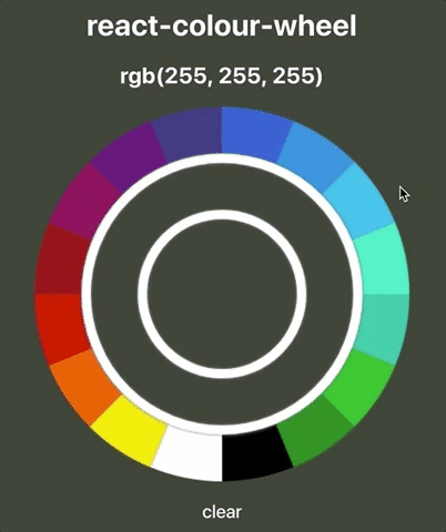
A circular colour-picker React component; built with HTML5's canvas & context-api
Downloads
15

Readme
react-colour-wheel
A circular colour-picker React component; built with HTML5's canvas & context-api. Full customisation & control through
props.
Demo
Check out this CodeSandbox example.
Quick-start guide
Installation
npm install react-colour-wheelyarn add react-colour-wheel...and wherever you need the component:
import ColourWheel from 'react-colour-wheel'Start by giving your ColourWheel a radius, lineWidth, and utilise the rgb-value sent through onColourSelected:
<ColourWheel
  radius={200}
  lineWidth={50}
  onColourSelected={(rgb) => this.setState({ selectedColour: rgb })}
/>However, a more typical implementation might look like:
<ColourWheel
  radius={200}
  padding={10}
  lineWidth={50}
  onColourSelected={(rgb) => this.setState({ rgb })}
  onRef={ref => (this.colourWheel = ref)}
  spacers={{
    colour: '#FFFFFF',
    shadowColour: 'grey',
    shadowBlur: 5
  }}
  preset
  presetColour={this.state.rgb}
  animated
/>
Customisation
The ColourWheel component has many options available for customisation through props:
radius
Customise the radius of the ColourWheel, all the way to the outer-edge.
- pixels,
px propTypes: number, isRequired
radius={200}
lineWidth
Customise the width of the outer- and inner-wheels.
- pixels,
px propTypes: number, isRequired
lineWidth={50}
onColourSelected
Method that returns an rgb-value; typical use case might be to setState({ rgb }) on the parent-component.
propTypes: func
onColourSelected={(rgb) => ... )}
padding
Sets the space between the outer-wheel, inner-wheel, and the center-circle.
- pixels,
px propTypes: number
padding={10}
spacers
Allows you to customise the styling of the padding that was set:
- Need to specify an object with
colour,shadowColour, andshadowBlurproperties. propTypes: object
  spacers={{
    colour: '#FFFFFF',
    shadowColour: 'grey',
    shadowBlur: 5
  }}
colours
Allows you to define an array of colours that will populate the outer-wheel of the colour-wheel.
- By default, an array of 16 hex-strings is provided to help you get started.
coloursaccepts hex-strings, rgb-strings & objects, names and other variations.- This is based on tinycolor2's core
.toRgb()method.
- This is based on tinycolor2's core
propTypes: arraydefaultProps: A comprehensive array of 16 colours.
  colours={[
    'blue',
    'rgb(200, 200, 200)',
    '#FFFFFF'
  ]}
shades
Choose the number of shades that will be produced when any particular colour is chosen.
- The array of shades produced & rendered will scale evenly from 10% - 90% luminosity of the selected colour.
propTypes: numberdefaultProps:16
shades={12}dynamicCursor
Determines whether or not the cursor-style should update dynamically depending on where it is hovering.
propTypes: booldefaultProps:true
presetColour
If you want the colour-wheel to render w a colour already provided, use the presetColour prop:
propTypes: string- Important: You must set the
presetprop totruewhen apresetColouris set.
animated
Specifies whether the inner-wheel will animate when an outer-wheel colour is selected.
propTypes: booldefaultProps:true
How do I clear the colour-wheel programmatically?
- Create a
refto the colour-wheel component in your parent component:
<ColourWheel
 ...
 onRef={ref => (this.colourWheel = ref)}
 ...
/>- Call the colour-wheel's
.clear()method from your parent component where you need it:
  clearColourWheel = () => {
    this.colourWheel.clear(() => ...)
    // NOTE: Optional callback which you can use to do stuff after the wheel has been cleared.
  }
Issues
- [ ] The ColourWheel won't animate if a
spacersprop isn't provided.