
react-cheetah-grid
v0.4.2
Published
[](https://badge.fury.io/js/react-cheetah-grid)


Readme
CheetahGrid for React
React wrapper of ultra speed table component - CheetahGrid
type Record = {
personid: number;
fname: string;
lname: string;
email: string;
};
const records: Record[] = [
{
personid: 1,
fname: "Sophia",
lname: "Hill",
email: "[email protected]",
},
{
personid: 2,
fname: "Aubrey",
lname: "Martin",
email: "[email protected]",
},
:
];
<CheetahGrid
style={{ flexGrow: 1 }}
data={records}
theme={"BASIC"}
>
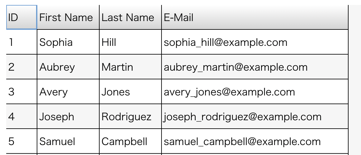
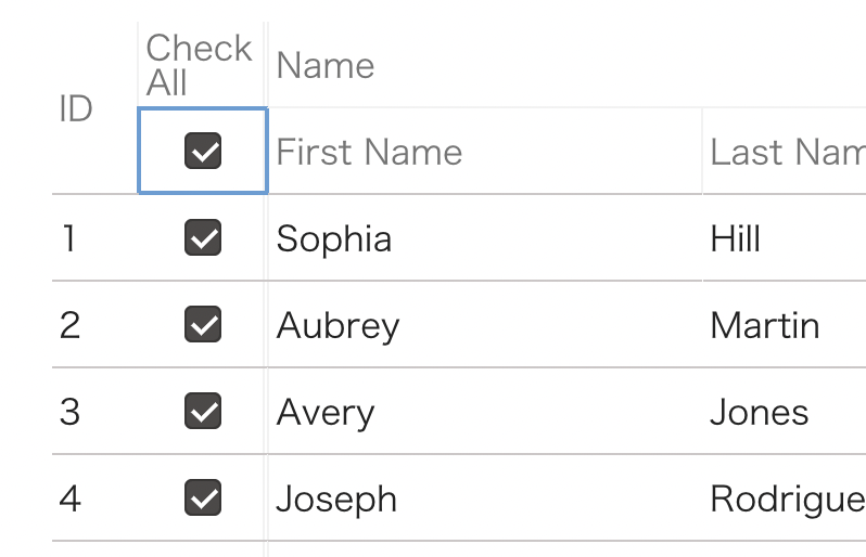
<Column field="personid" width={50}>
ID
</Column>
<Column field="fname" width={100}>
First Name
</Column>
<Column field="lname" width={100}>
Last Name
</Column>
<Column field="email" width={300}>
E-Mail
</Column>
</CheetahGrid>Table
Attributes
style: CSS style to specify table size
{
  width: string | number;
  height: string | number;
  flexGrow: number;
  flexShrink: number;
  flexBasis: number;
}children: Child components (columns, layouts)frozenColCount: number: Fix column countdefaultRowHeight: number: Default row heightheaderRowHeight: number: Header row heighttheme: ThemeDefine | string
Theme is described at here. You can use custom theme or preset theme(MATERIAL_DESIGN(default), BASIC)
Data Sources
data props is required to accept data source.
One of the following props are required.
data: Array data of table orDataSourceinstance to supply table data to CheetahGrid. This is described at here.
If you modify records data directly out side of <CheetahGrid> (for example, modify data from event handlers), call its instance's invalidate() method.
Column Types
Supported column types:
<Column><NumberColumn><MultilineTextColumn><ImageColumn><IconColumn><ButtonColumn><CheckColumn><RadioColumn><MenuColumn><PercentCompleteBarColumn><BranchGraphColumn>
Basic Column Props
width: number or string:minWidth: number or string:maxWidth: number or string:field: string: Object's key to show in this column.style: Column's style. This is described at here.
Some column type supports extra props:
<NumberColumn>format:Intl.NumberFormatto specify number's format
<IconColumn>content: The content to show repeatedly
<ButtonColumn>buttonCaption: string: Button's caption textbuttonBgColor: string: Background color
<MenuColumn>options: {label: string; value: any }[]: Menu's value optionmenuOptions: {label: string; value: any }[]: Menu's option
<PercentCompleteBarColumn>formatter: (v: string) => string: Label format functionmin: number, max: number: Specify data range to show in the cell
<BranchGraphColumn>detialstart: "top" or "bottom"cache: boolean
Column's Interactions (events, edit data)
To enable editing, add editable to column. editable and onClick event are exclusive.
| Column Type | editable | onClick: (row: T) => void | disabled |
| :----------------------------------------------- | :-------------------------------------- | :-------------------------- | :--------- |
| <CheckColumn>, <RadioColumn>, <MenuColumn> | ✔︎ | ✔︎ | ✔ |
| <Column>, <NumberColumn>, <IconColumn> | true/false or "inline" or "popup" | ✔︎ | ✔ |
| <ButtonColumn> | | ✔︎ (required) | ✔ |
| Other columns | | ✔︎ | ✔︎ |
{ /* Sample */ }
<CheckColumn field="selected" editable>Check<CheckColumn>
<CheckColumn field="selected" onClick={(rec: Record) => { alert(`Data is ${JSON.stringify(rec)}`)} }>Check<CheckColumn>
<Column field="name" editable>Name (editable with inline editor)<CheckColumn>
<Column field="name" editable="inline">Name (editable with inline editor too)<CheckColumn>
<Column field="name" editable="popup">Name (editable with popup editor)<CheckColumn>
<ButtonColumn onClick={(rec: Record) => { alert(`Data is ${JSON.stringify(rec)}`)}>See Content</ButtonColumn>
{ /* Errors: You can't use both 'editable' and 'onClick' at the same time */}
<CheckColumn field="selected" editable onClick={(rec: Record) => { alert(`Data is ${JSON.stringify(rec)}`)} }>Check<CheckColumn>
{ /* Errors: ButtonColumn requires onClick */ }
<ButtonColumn>No Action</ButtonColumn><CheetahGrid>'s events
<CheetahGrid> has the following events:
onCellClick: (e: MouseCellEvent) => voidonCellDoubleClick: (e: MouseCellEvent) => voidonCellDoubleTap: (e: TouchCellEvent) => voidonCellMouseDown: (e: MouseCellEvent) => voidonCellMouseUp: (e: MouseCellEvent) => voidonCellSelect: (e: SelectedCellEvent) => voidonKeyDown: (e: KeydownEvent) => voidonCellMouseMove: (e: MouseCellEvent) => voidonCellMouseEnter: (e: MousePointerCellEvent) => voidonCellMouseLeave: (e: MousePointerCellEvent) => voidonCellMouseOver: (e: MousePointerCellEvent) => voidonCellMouseOut: (e: MousePointerCellEvent) => voidonCellInput: (e: InputCellEvent) => voidonCellPaste: (e: PasteCellEvent) => voidonCellContextMenu: (e: MouseCellEvent) => voidonColumnResize: (e: ColumnResizeEvent) => voidonScroll: (e: ScrollEvent) => voidonCellEditableInput: (e: CellAddress) => boolean or voidonModifyStatusEditableInput: (e: ModifyStatusEditableinputCellEvent) => voidonValueChange: (e: ChangedValueCellEvent<T>) => voidonHeaderValueChange: (e: ChangedHeaderValueCellEvent) => voidonFocus: (e: FocusEvent) => voidonBlur: (e: FocusEvent) => void
Advanced Features
Access CheetahGrid's internal state
CheetahGrid.props.instance:refobject to access CheetahGrid instance features:
Now there are few features:
selectionattribute: Get current selection informationinvalidate()method: Trigger redraw after changing internal data
import {
  CheetahGrid,
  useCheetahGridInstance,
  Column,
} from "react-cheetah-grid";
import {
  useCallback
} from "react";

function App() {
  const [instance, instanceRef] = useCheetahGridInstance();
  const onClick = useCallback(() => {
    // Access cheetah-grid's instance attribute/method via instanceRef
    alert(`Select: ${JSON.stringify(instance.selection)}`);
  }, [instance]);
  return (
    <>
      <button>
      <CheetahGrid data={props.records} instance={instanceRef}>
        <Column field="id">ID</Column>
        <Column field="name">Name</Column>
      </CheetahGrid>
    </>
  );
}
Cell Message
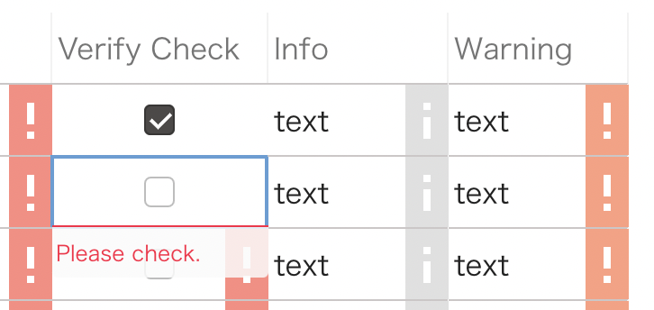
message props adds message to cells.
string: Fields name of record.function: Run logic to specify warning message.
The function can return object. It includes message and severity.
<Column field={"text1"} width={150} message="msg">
  Msg from data
</Column>
<Column
  field={"text2"}
  width={150}
  editable
  message={(rec) => {
    return rec.text2.match(/^[a-zA-Z]*$/)
      ? null
      : "Please only alphabet.";
  }}
>
  Alphabet Check
</Column>
The function can return object instead of string. "error", "warning", "info" are supported as a type:
(rec) => {
  return {
    type: "warning",
    message: "Warning Message.",
  };
};
Sort
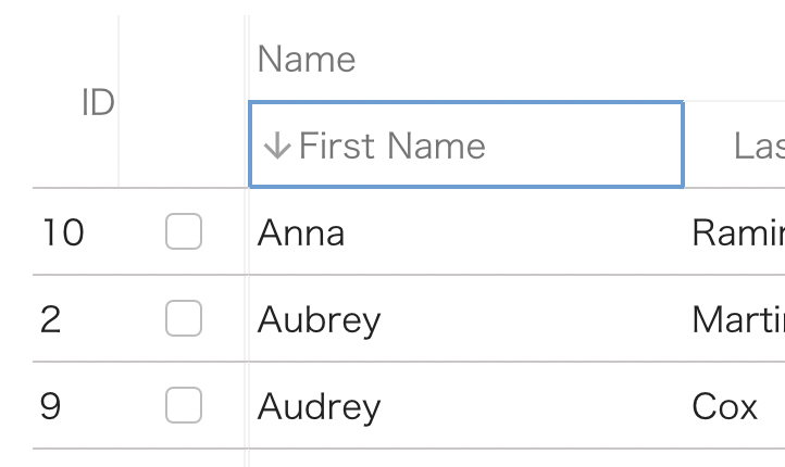
sort props add sorting feature. Just add sort props enables sorting feature that uses JavaScript standard comparison. Also you can specify sort function as well.
<Column
  width={40}
  sort={(order, col, grid) => {
    const compare =
      order === "desc"
        ? (v1: number, v2: number) =>
            v1 === v2 ? 0 : v1 > v2 ? 1 : -1
        : (v1: number, v2: number) =>
            v1 === v2 ? 0 : v1 < v2 ? 1 : -1;
    records.sort((r1, r2) => compare(r1.personid, r2.personid));
    console.log("sorted:", records);
    grid.data = records;
  }}
  field="personid"
>
  ID
</Column>
<Column field="name" sort>Name</Column>
More detail information is here.
Header Type and Action
You can customize header types and actions in addition to body cells types and actions.
headerType can accept the following values:
sortcheckmultilinetext.
headerAction can accept the following values:
sortcheck
const [instance, instanceRef] = useCheetahGridInstance();
const onChangeHeaderValue = useCallback(
(v: ChangedHeaderValueCellEvent) => {
console.log(v);
for (const record of records) {
record.check = v.value;
}
instance?.invalidate();
},
[instance]
);
<CheetahGrid
instance={instanceRef}
style={{ flexGrow: 1 }}
data={records}
frozenColCount={2}
onHeaderValueChange={onChangeHeaderValue}
>
<Column width={60} headerType="multilinetext" field="name_and_org">
{"Name and\nOrganization"}
</Column>
<Check headerType="check" headerAction="check" field="check"></Check>
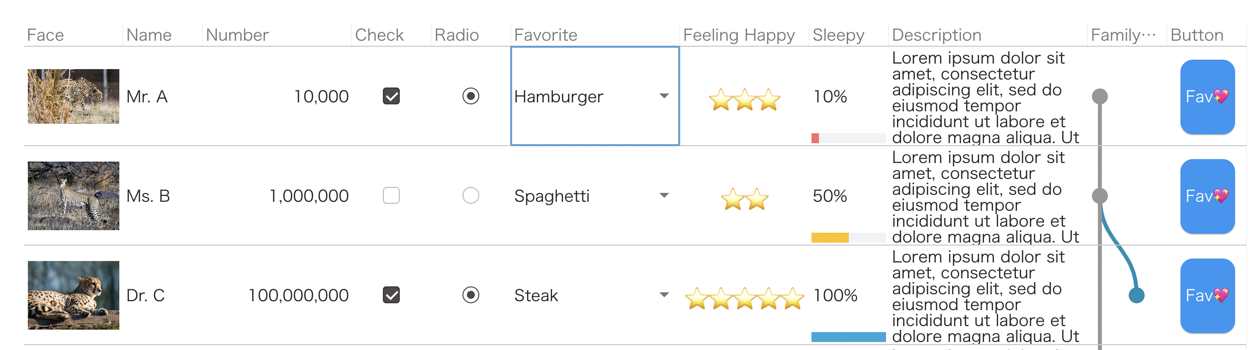
</CheetahGrid>;Complex Layout
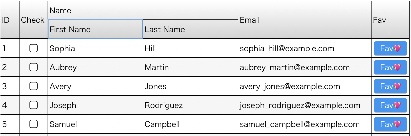
It supports complex layout like multi row headers and bodies.
If header and body's cells have different structure, use the following components:
<HeaderLayout><BodyLayout>
Under the <HeaderLayout>, use <Header> component instead of column's components. <Header> is a simple version of column components that supports only width related props and sort, header type's and header actions's props.
The <Line> component enables to support multi row header and body. rowSpan and colSpan props of <Header> and columns components to control layout.
<CheetahGrid
  style={{ flexGrow: 1 }}
  data={records}
  frozenColCount={2}
  theme={"BASIC"}
>
  <HeaderLayout>
    <Line>
      <Header width={40} rowSpan={2}>
        ID
      </Header>
      <Header width={60} rowSpan={2}>
        Check
      </Header>
      <Header colSpan={2}>Name</Header>
      <Header rowSpan={2} width={280}>
        Email
      </Header>
      <Header rowSpan={2}>Fav</Header>
    </Line>
    <Line>
      <Header width={200}>First Name</Header>
      <Header width={200}>Last Name</Header>
    </Line>
  </HeaderLayout>
  <BodyLayout>
    <Column field={"personid"} />
    <CheckColumn field={"check"} />
    <Column field={"fname"} />
    <Column field={"lname"} />
    <Column field={"email"} />
    <ButtonColumn
      onClick={(data: Record) => {
        alert(`click: ${data.personid}`);
      }}
      buttonCaption="Fav💖"
    ></ButtonColumn>
  </BodyLayout>
</CheetahGrid>
License
MIT License
Contribution
How to run and build:
# launch dev server
$ npm run dev

# test
$ npm test

# build
$ npm run build