react-chat-window-pro
v1.1.0
Published
A chatbot window for React lets you connect with a chatbot and customise the appearance of the chat
Downloads
4
Maintainers
Readme
Chat window for React Js
A chatbot window for React Js lets you connect with a chatbot and customise the appearance of the chat with mutiple themes and various type of responses.
Table of Contents:
Getting Started
How To Install
In React Js
To use the chat window in a react js project, first install the package using npm:
npm install react-chat-window-proImport Package
To use the TypeScript definition files within a Node.js project, simply import aws-sdk as you normally would.
In a TypeScript file:
// import chat window package
import ChatWindow from 'react-chat-window-pro'
What's New
- Read Receipt
- Stacked Quick Reply
- Chat Window Sizing (small, medium, large)
- IsConnected Loader
Get Chat Window
Chat window support mutiple type of responses and themes
Add Chat window component:
<ChatWindow
        theme="blue"
        title="Chat help"
        messages={messageData}
        isConnected={isConnected}
        handleUserResponse={handleUserMessage}
        handleClose={handleChatClose}
        windowSize={"large"} />
Available Themes
- blue
- green
- orange
- brown
Various Responses
- Text
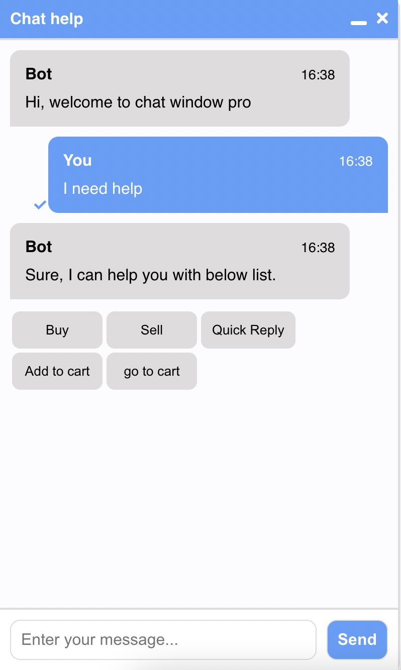
- Quick Replies
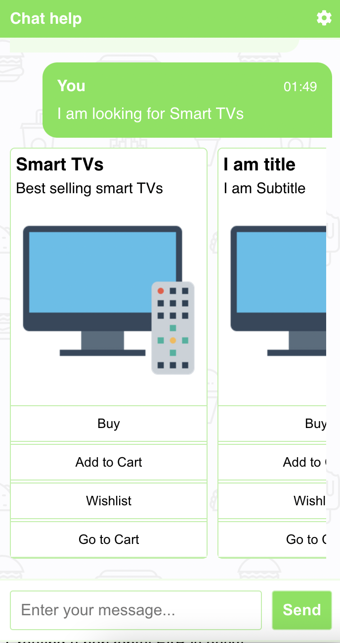
- Message with buttons
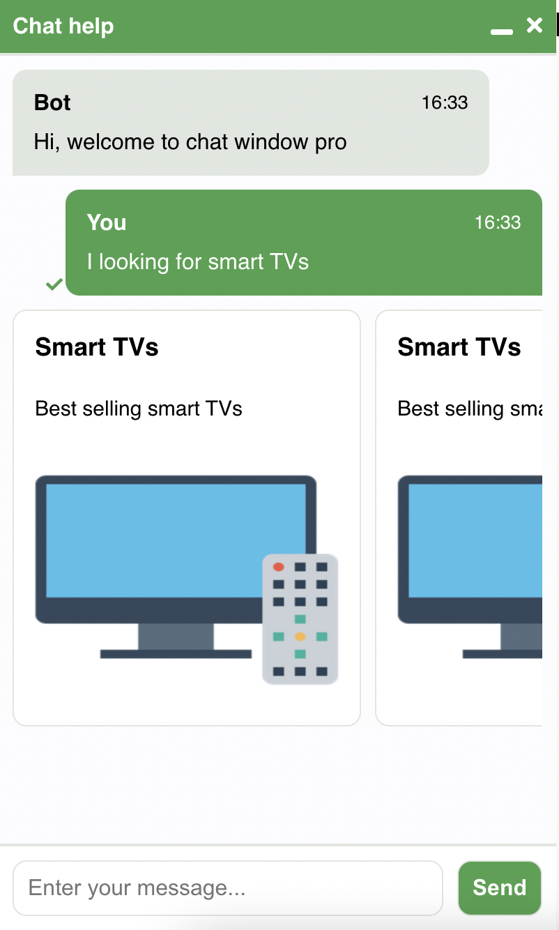
- Image Card
- Card Carousel
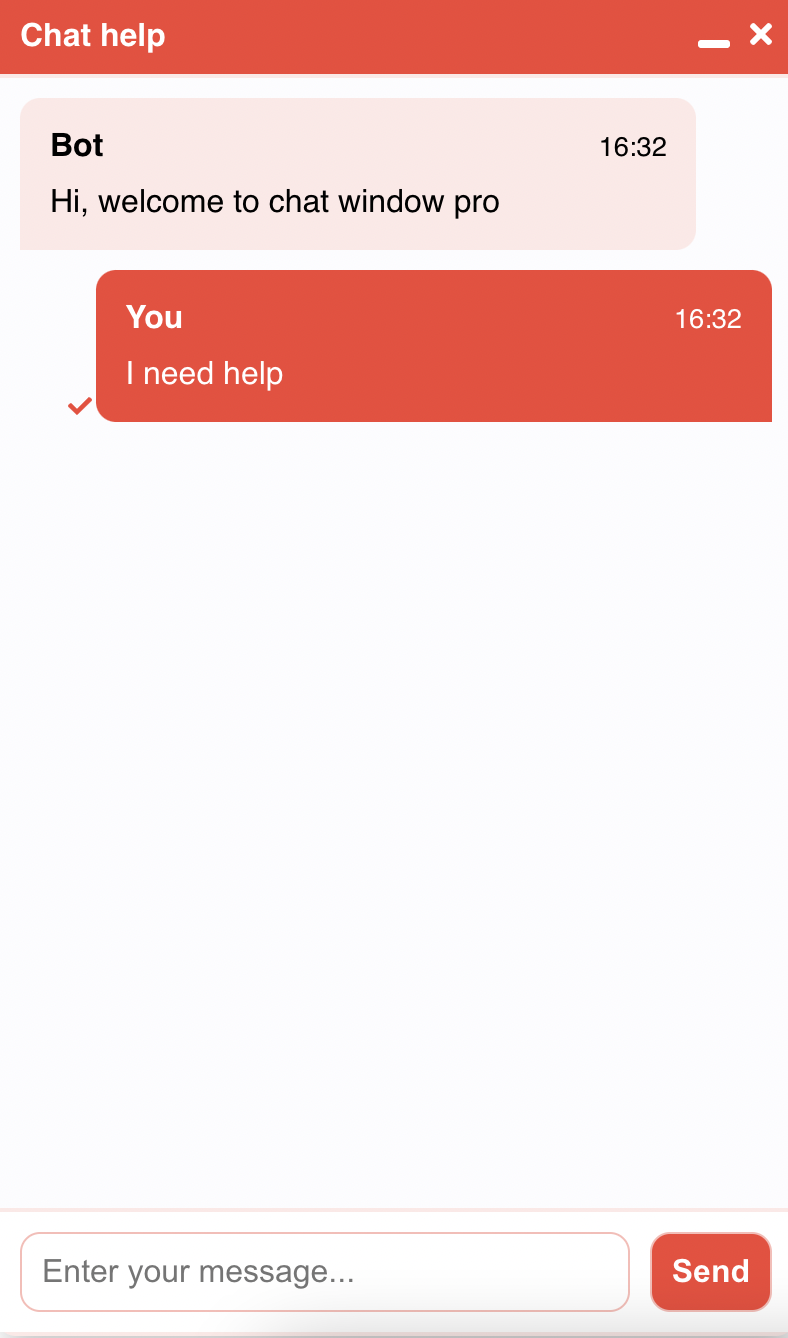
Text
Simple text message from agent or bot
{
  sender: "Bot", //Sender Name
  timestamp: "12:00", //Message Time stamp
  type: "text", //Type of message
  isMe: false,
  data: {
    text: "Hi, welcome to react chat window prod!"
  },
}
Quick Replies
Quick replies list with message to perform quick messaging with user
{
  sender: "Bot", //Sender Name
  timestamp: "12:00", //Message Time stamp
  type: "quickreplies", //Type of Message
  isMe: false,
  //Message before quick replies
  data: {
    text: "I am quick reply."
  },
  isClicked: false,
  //List of quick replies
  quickReplies: [
    {
      title: 'Buy',
      response: 'buy'
    },
    {
      title: 'Sell',
      response: 'Sell'
    },
    {
      title: 'Quick Reply',
      response: 'I am quick reply'
    },
    {
      title: 'Add to cart',
      response: 'add to cart'
    },
    {
      title: 'go to cart',
      response: 'go to cart'
    },
  ]
}
Stacked Quick Replies
{
	sender: "Bot", //Sender Name
  	timestamp: "12:00", //Message Time stamp
  	type: "card", //Type of Message
  	isMe: false,
  	isClicked: false,
	data: {
		title: "I am Stacked Quick Reply", //This message show in bold
		subititle: "I am Subtitle", //This message shows in normal
		//List of buttons with link
		buttons: [
			{
				action: "quickreply",
				title: "Buy",
				response: "Buy"
			},
			{
				action: "quickreply",
				title: "Add to Cart",
				response: "Add to cart"
			}
		]
	}
}
Message with buttons
Message with buttons will redirect user to given url
{
	sender: "Bot", //Sender Name
  	timestamp: "12:00", //Message Time stamp
  	type: "card", //Type of Message
  	isMe: false,
  	isClicked: false,
	data: [{
		title: "I am title", //This message show in bold
		subititle: "I am Subtitle", //This message shows in normal
		//List of buttons with link
		buttons: [
			{
				action: "link",
				title: "Buy",
				tooltip: "Buy this product with 20% discount",
				url: "http://myurl"
			},
			{
				action: "link",
				title: "Add to Cart",
				tooltip: "Add this product to cart",
				url: "http://myurl"
			}
		]
	}]
}
Image Card
Show message and image in chat window
{
	sender: "Bot", //Sender Name
  	timestamp: "12:00", //Message Time stamp
  	type: "card", //Type of Message
  	isMe: false,
  	isClicked: false,
	data:[
	{
		title: "I am title", //This message show in bold
		subititle: "I am Subtitle", //This message shows in normal
		//Media object with Image type and url
		media: {
			type: "image",
			url: "https://image.flaticon.com/icons/svg/145/145867.svg",
		},
  }]
},
Card Carousel
Show carousel of cards so use can choose from mutiple options
{
	sender: "Bot", //Sender Name
  	timestamp: "12:00", //Message Time stamp
  	type: "card", //Type of Message
  	isMe: false,
  	isClicked: false,
	data:[
	{
		title: "I am Card 1",
		subititle: "I am Subtitle",
		media: {
			type: "image",
			url: "https://image.flaticon.com/icons/svg/145/145867.svg",
		},
		buttons: [
			{
				action: "link",
				title: "Buy",
				tooltip: "Buy this product with 20% discount",
				url: "http://myurl"
			}
		]
	},
	{
		title: "I am Card 2",
		subititle: "I am Subtitle",
		media: {
			type: "image",
			url: "https://image.flaticon.com/icons/svg/145/145867.svg",
		},
		buttons: [
			{
				action: "link",
				title: "Buy",
				tooltip: "Buy this product with 20% discount",
				url: "http://myurl"
			}
		]
	}]
}
Sample
React chat window pro have mutiple feature to interact with user efficiently
- Simple Text with brown theme

- Card carosel with buttons, text and image in green theme

- Image Card carosel

- Quick replies with blue theme

- Chat connection loader
Upcoming
Adding new features to chat window
- Typing Indicator
- Delays in messages
- Mutiple Chat bubble
- Print Chat
- High Important
- Chat bubble positions
- More Theme options
- Emojis
- Video card with inline video player
- Map Cards
- Graph Cards
- Attachement options
