
react-accessibility-package
v1.0.0
Published
The React Accessibility Enhancer is a powerful tool designed to improve the visual representation and accessibility of React applications. With this component, you can effortlessly enhance the user experience for individuals with diverse needs, ensuring y
Downloads
49

Readme
Accessibility Component
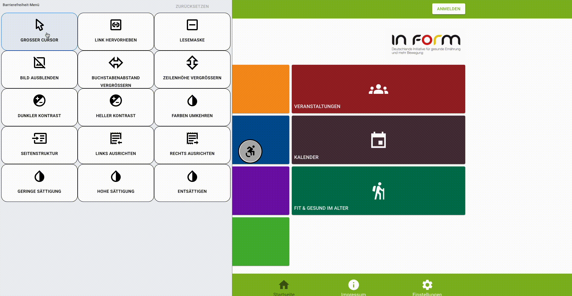
The React Accessibility Enhancer is a screen overlay for react applications. This has a few features to make react web applications more accessible.
Disclaimer: It will not solve all accessibility issues in the application. Only give a few extra options intended to make the experience a little bit better. For the accessibility guidelines for your applications, check out this link.
Repository
Requirements
"@mui/material": "^5.0.0" or "bootstrap": "^5.0.0" and "react-bootstrap": "^2.8.0""react": "^17.0.0"
Getting Started
Installation
- Either add
"react-accessibility-package": "^1.0.0"inpackage.jsonand in terminal runnpm install - Or in the terminal run
npm install react-accessibility-package - Or if you are using yarn run
yarn add react-accessibility-package
Usage
- Import the package by adding
import { Accessibility } from 'react-accessibility-package' - Wrap the entry point component like in the example below:
    <Accessibility lang="de" excludedFeatures={[]}>
      <AppHeader />
        <main/>
      <AppFooter />
    </Accessibility>
Props
lang: This prop determines which language should be used in the component. We currently support setting "en" for English (default), "de" for German, and "pt" for Portuguesetheme: Set "bootstrap" for Bootstrap themed component and "mui" for Mui (default) based component. Unlessreact-bootstrapis being used do not set the theme as "bootstrap".excludedFeatures: This is an array and any string corresponding to the features those will not be rendered in the component. Example:excludedFeatures={['BIG_CURSOR']}. Here the big cursor feature will be excluded from the component. The list of strings we can use to exclude desired features are given below:- 'BIG_CURSOR'
- 'READING_MASK'
- 'HIGHLIGHT_LINK'
- 'HIDE_IMAGE'
- 'INCREASE_LETTER_SPACE'
- 'INCREASE_LINE_HEIGHT'
- 'DARK_CONTRAST'
- 'LIGHT_CONTRAST'
- 'INVERT_COLOR'
- 'PAGE_STRUCTURE'
- 'LEFT_ALIGN'
- 'RIGHT_ALIGN'
- 'LOW_SATURATION'
- 'HIGH_SATURATION'
- 'DESATURATE',
- 'MAGNIFY'
maxFontSize: set a number for which you want to set the max fontsize for the application after theMagnify Textis applied. Default24px.
Other settings
dark-contrast-border: When the app is inDark Contrast, if you want any component to have white border add this class to the classname of the component.light-contrast-border: When the app is inLight Contrast, if you want any component to have black border add this class to the classname of the component.
Authors and acknowledgment
Acknowledgment
This project is inspired by the work done in https://www.unimed.coop.br/site/
Contact us
Your feedback is very valuable to us. Please email us in one of the emails. Looking forward to hearing your concerns and new ideas.
Evaluation
Please take a little bit time to do an evaluation here.
License
Copyright (C) 2024 Nahid Islam and Adeline Silva Schäfer
This program is free software: you can redistribute it and/or modify it under the terms of the GNU Affero General Public License as published by the Free Software Foundation, either version 3 of the License, or (at your option) any later version.
This program is distributed in the hope that it will be useful, but WITHOUT ANY WARRANTY; without even the implied warranty of MERCHANTABILITY or FITNESS FOR A PARTICULAR PURPOSE. See the GNU Affero General Public License for more details.
You should have received a copy of the GNU Affero General Public License along with this program. If not, see http://www.gnu.org/licenses/.
Project Status
This project is currently under development and has been not released yet