rdmkit-vrt
v1.0.9
Published
VRT creates a vertical grid over your web page. This is meant to be a tool for web typography nerds that want to work with a baseline grid.
Downloads
14
Readme
VRT - Vert
VRT is a function that creates a vertical grid over your web page. This is meant to be a tool for web typography nerds that want to work with a baseline grid."
Install
npm i rdmkit-vrt --save-devYou will need to specify a line-height and font-size on the :root selector in order for this to work. This grid is configured to work on a site that is correctly configured for good typography.
:root {
    line-height: 1.5;
    font-size: 20px;
  }
Now call VRT from your frontend js file.
// index.js
vrt();
Options
You can also change the gridline colors and the shortcut key to open and close the grid. So, use the colors that work with your backgrounds and the keys that you prefer.
// index.js

// You must specify this before you call the `vrt()` function. This is because the vrt function has it's own defaults, so it doesn't need to wait for options object if it hasn't been assigned before the function fires.
const options = {
  belowColor: "cyan",
  aboveColor: "indigo",
  aboveKey: "38,38", //  upArrow
  belowKey: "40,40", //  downArrow
  closeKey: "88"     //  x
}
// Just pass this options object in to the vrt function.
vrt(options);
Usage
- Display VRT grid BELOW your web page -> Press
,, - Display VRT grid ABOVE your web page -> Press
.. - Close VRT grid press ->
/
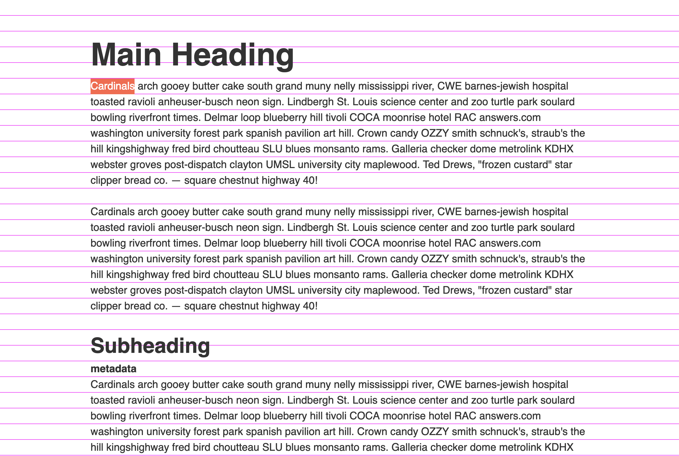
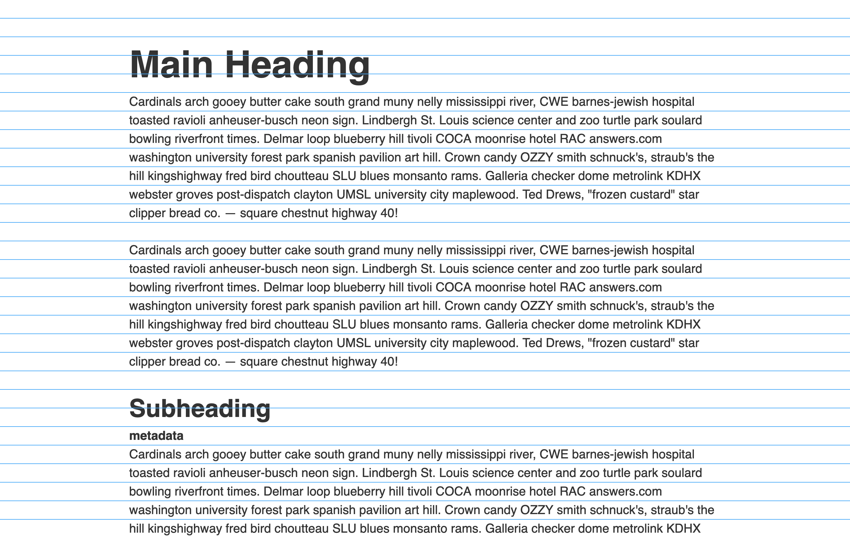
There is an ABOVE and BELOW display option for solving two issues with vertical grids. Putting the grid below is great, but you can't see it if you have a background color or image set on any elements. Displaying the grid ABOVE the web page is good, but then you can't select any of the elements below the grid. So, you kind of need both to get the job done reliably.
The BELOW vertical grid is displayed in magenta

The ABOVE vertical grid is displayed in blue

This is intended to be used for development purposes during the "design-to-code" phase.
Background
Let me start by saying that you don't need the challenge of following a strict vertical grid. Millions of websites are made without following this old practice from the print world. Besides, designing to a vertical grid in a web page is tough anyway.
The benefit of following a baseline grid is that it helps you figure out the vertical height and spacing for all the elements in your site. And for a medium that has a vertical nature, a vertical grid maintains a pleasing vertical rhythm as you scroll through the site.
If we choose to take on the challenge of following a strict vertical rhythm, then we need a grid that we can follow. Instead of making a grid that is independent of our stylesheets, this one only works once you set line-height and font-size on the :root selector in your stylesheet. This forces us to use good typographical practices in our stylesheets.
Once a line-height and font-size are set on the :root selector, a baseline height is created for our web page. In this case above, the baseline height equals 30px. This is determined by multiplying line-height by font-size. Now, you wont notice much of a change in your web page without the grid tunred on, but you will quickly find that all the padding and margin settings thoughout the site might need to be redone. Having a vertical grid to follow will help you figure out the corret spacing.
Now, a common mistake is trying to make ALL text fall on a baseline. You don't need to do this. We are only trying to have the main text content fall on the baseline. So, it's the paragraphs and lists of the main content that we are tyring to address. And we want to make sure that the media we add to the web page doesn't disrupt this baseline alignment.
I tested using fractional numbers in Chrome and you might be surprised to know that only quarters performed as expected. Thus widths/heights sets at 100.25px, 100.5px, and 100.75px renderd in the browser as expected. However, any other fractional number did not like 100.1px, 100.2px, 100.3px, 100.4px, 100.6px, 100.7px, 100.8px and 100.9px. I made a JSBIN to demonstrate this.
This is why I use even numbers for base font sizes and 1.5 for line-height. This keeps all the math to whole numbers or perfect quarters which seems to yield consistent results. Otherwise, rounding issues kill all of your efforts to maintain vertical rhythm.
Another thing to notice is that the basline isn't showing at the bottom of the text. It's showing inbetween lines of text. The web works in a different nature than print does. Everything in HTML creates a bounding box. A paragraph tag is a box that holds text. Every word and character on the page is bound by a text box too. As a result, our text is always going to fit squarely inside that box. So this VRT grid seeks to handle the baseline as it applies to the web and not as it applies to print.
This will be enough to get you going, but eventually, you will find that images and responsive settings make folling a strict vertical grid impossible. For that problem I've created another module to resize images to the nears multiple of the baseline unit. Thus, enabling us to keep the rhythm that we want. Look at using the RDM module to help with that.
Articles on Vertical Rhythm
- Compose to a Vertical Rhythm
- The Elements of Typographic Style Applied to the Webgs
- BASELINE
- Responsive Vertical Rhythm with CSS Custom Properties and CSS Calc
- 8-Point Grid: Vertical Rhythm
- RHYTHM IN WEB TYPOGRAPHY
- 4 Simple Steps to Vertical Rhythm
- Setting Type on the Web to a Baseline Grid
- Seeing Typographic Details
- A Visual Type Scale
Props:
- How to get height of entire document with JavaScript?
- How to get CSS values in JavaScript
- Create a div using loop
- for...of vs for...in Loops in JavaScript
- How to get original image size (width & height) in JavaScript
- Aspect Ratio Boxes
- CSSPlus
- Round number up to the nearest multiple of 3
- What is the difference between 'remove' and 'removeChild' method is javascript?
- Remove all child elements of a DOM node in JavaScript
