
raven-multiselect
v0.2.1
Published
An Angular component for selecting multiple values from a list.
Downloads
2
Maintainers
 thomashigginbotham
Readme
Raven Multiselect for Angular 6+
An Angular component for selecting multiple values from a list.
Features
- Add values not present in the list
- Filter the list as you type
- Keyboard/touch accessible
- Compatible with template driven and reactive forms
- Easily styled with CSS variables
Installation
Install into your Angular project using NPM.
npm install raven-multiselect --save
Import the MultiselectModule into your module, and import the FormsModule or ReactiveFormsModule depending on which you'll be using (FormsModule is used for these examples).
import { MultiselectModule } from 'raven-multiselect';
import { FormsModule } from '@angular/forms';
// ...

@NgModule({
  imports: [
    MultiselectModule,
    FormsModule
    // ...
  ],
  // ...
})
export class AppModule { }
Usage
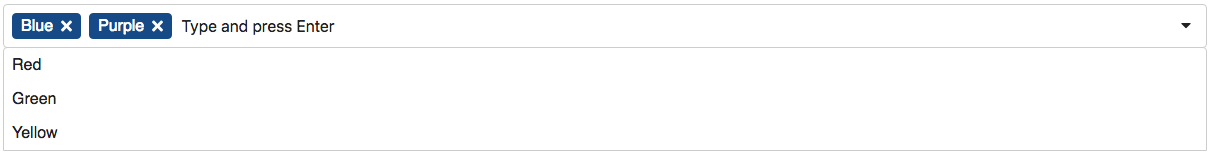
Add a <raven-multiselect> element to your template, and use <option> tags to create text/values for the multiselect list.
import { Component } from '@angular/core';

@Component({
  selector: 'app-root',
  template: `
    <raven-multiselect [(ngModel)]="selectedValues"
                       [enableCustomValues]="true"
                       placeholder="Type or select a color">
      <option value="red">Red</option>
      <option value="green">Green</option>
      <option value="blue">Blue</option>
      <option value="yellow">Yellow</option>
    </raven-multiselect>`,
  styles: []
})
export class AppComponent {
  selectedValues = 'red,blue';
}
Options
| Option | Type | Description | Default Value
| :----------------- | :------ | :------------------------------------- | :-------------------
| icons | object | Provide custom SVG icons. | Default SVG icons
| enableCustomValues | boolean | Allows user to type in a custom value. | false
| placeholder | string | Placeholder text for text box. | Type and press Enter
How to Use Custom Icons
To use custom icons, you will need to pass strings of SVG content (including the <svg> tags) to the icons parameter. For example:
@Component({
  selector: 'app-root',
  template: `
  <raven-multiselect formControlName="color" [icons]="icons">
    <option value="1">Option 1</option>
    <!-- ... -->
  </raven-multiselect>`,
  // ...
})
export class AppComponent implements OnInit {
  icons: any;
  // ...

  constructor() {
    // Use custom icons
    this.icons = {
      arrowDown: '<svg xmlns="http://www.w3.org/2000/svg" viewBox="0 0 448 512"><path fill="currentColor" d="M413.1 222.5l22.2 22.2c9.4 9.4 9.4 24.6 0 33.9L241 473c-9.4 9.4-24.6 9.4-33.9 0L12.7 278.6c-9.4-9.4-9.4-24.6 0-33.9l22.2-22.2c9.5-9.5 25-9.3 34.3.4L184 343.4V56c0-13.3 10.7-24 24-24h32c13.3 0 24 10.7 24 24v287.4l114.8-120.5c9.3-9.8 24.8-10 34.3-.4z"></path></svg>',
      close: '<svg xmlns="http://www.w3.org/2000/svg" viewBox="0 0 512 512"><path fill="currentColor" d="M256 8C119 8 8 119 8 256s111 248 248 248 248-111 248-248S393 8 256 8zm0 448c-110.5 0-200-89.5-200-200S145.5 56 256 56s200 89.5 200 200-89.5 200-200 200zm101.8-262.2L295.6 256l62.2 62.2c4.7 4.7 4.7 12.3 0 17l-22.6 22.6c-4.7 4.7-12.3 4.7-17 0L256 295.6l-62.2 62.2c-4.7 4.7-12.3 4.7-17 0l-22.6-22.6c-4.7-4.7-4.7-12.3 0-17l62.2-62.2-62.2-62.2c-4.7-4.7-4.7-12.3 0-17l22.6-22.6c4.7-4.7 12.3-4.7 17 0l62.2 62.2 62.2-62.2c4.7-4.7 12.3-4.7 17 0l22.6 22.6c4.7 4.7 4.7 12.3 0 17z"></path></svg>'
    };
  }

  // ...
}
Styling
CSS variables are used for styling. Example:
raven-multiselect {
  --rms-choice-color-text: #222;
  --rms-choice-color-bg: #eee;
}
Available CSS Variables
| Variable | Description | Default Value | :--------------------------- | :------------------------------------------------------------------------- | :------------ | --rms-control-height | Height of the main box. | 4rem | --rms-control-space-multiplier | Affects the amount of padding applied (use 0.5 – 1.5 for best results). | 1 | --rms-control-color-text | Text color of the box. | #555 | --rms-control-color-bg | Background color of the box. | #fff | --rms-control-color-border | Border color of the box. | #ccc | --rms-control-border-radius | Border radius for the box. | 0 | --rms-choice-color-text | Text color of selected values. | #fff | --rms-choice-color-bg | Background color of selected values. | #333 | --rms-choice-color-border | Border color of selected values. | #333 | --rms-choice-border-radius | Border radius for selected values. | 0 | --rms-dropdown-color-text | Text color of drop-down box. | #000 | --rms-dropdown-color-bg | Background color of drop-down box. | #fff | --rms-dropdown-color-border | Border color of drop-down box. | #ccc | --rms-dropdown-border-radius | Border radius for drop-down box. | 0 | --rms-dropdown-color-hover | Background color of hover/focused items. | #eee
Development
To contribute to the development of this component, clone this repository and run npm install. Then run ng serve -o to start a development server and to open a sample page in your browser.
License
MIT license.