qh-rn-bottom-sheet
v1.0.4
Published
Bottom Sheet component for React Native Apps
Downloads
3
Maintainers
Readme
React Native Bottom Sheet Component
A customizable and easy-to-use bottom sheet component for React Native apps.
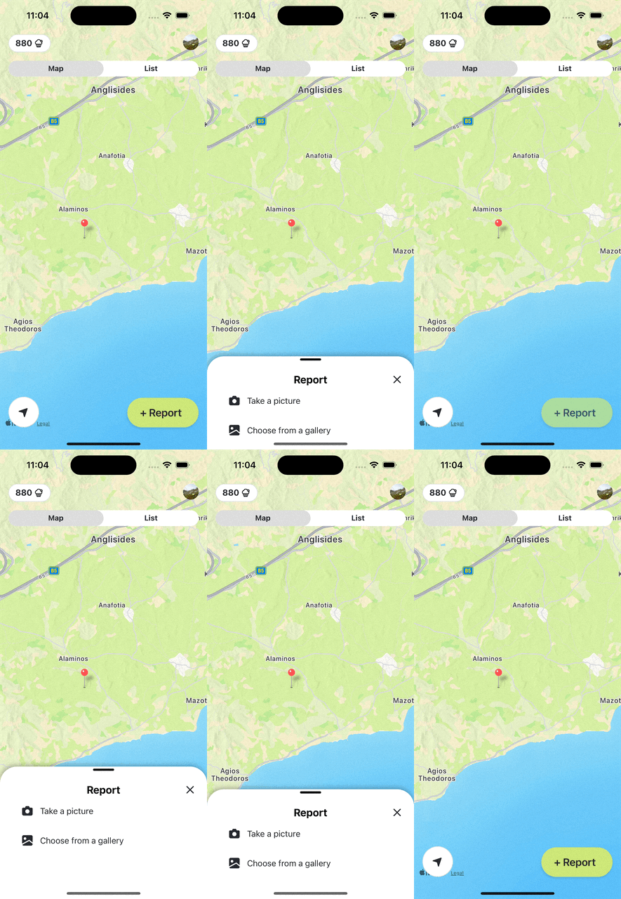
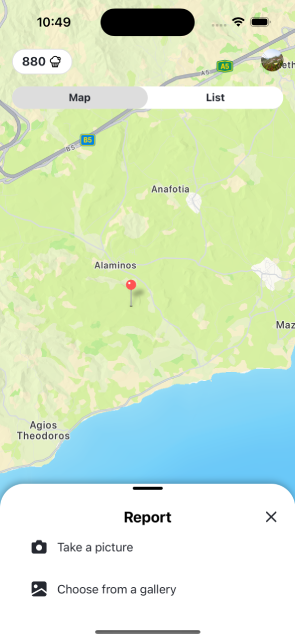
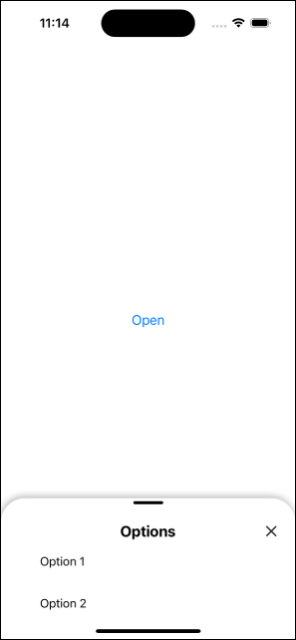
Demo


Features
- Smooth animations and gestures.
- Customizable: styles and animation timings.
- Optional close icon and title.
- Drag-to-dismiss functionality.
Installation
npm install qh-rn-bottom-sheetor
yarn add qh-rn-bottom-sheetUsage
Import the BottomSheet component in your React Native app and use it as shown in the example below:
import React, { useState } from 'react';
import { View, Text } from 'react-native';
import BottomSheet from 'qh-rn-bottom-sheet';

const YourComponent = () => {
  const [bs, setBs] = useState(false);
  return (
    <View>
      {bs && <BottomSheet
        close={()=>setBs(false)}
        title="Example Sheet"
        // Additional props as needed
      >
        <Text>Content of the Bottom Sheet</Text>
      </BottomSheet>}
    </View>
  );
};

export default YourComponent;
Props
| Prop | Type | Description | Default Value |
| -------------------- | -------- | --------------------------------------------- | ------------- |
| close | Function | Function to handle the close action. | Required |
| children | Node | Content to be displayed inside the bottom sheet. | None |
| title | String | Title text for the bottom sheet. | Empty String |
| hideCloseIcon | Boolean | If true, the close icon will not be displayed. | false |
| dragIconStyle | Object | Custom style for the drag icon. | {} |
| draggableAreaStyle | Object | Custom style for the draggable area. | {} |
| headerStyle | Object | Custom style for the header. | {} |
| titleContainerStyle| Object | Custom style for the title container. | {} |
| titleStyle | Object | Custom style for the title. | {} |
| initialY | Number | Initial Y position of the bottom sheet. | 400 |
| dragThreshold | Number | Threshold for drag-to-dismiss. | 100 |
| animDuration | Number | Duration of the animation in milliseconds. | 200 |
Customization
The component can be customized with various props. For example, you can change the styles of the drag icon, header, or title. You can also adjust the initial position, drag threshold, and animation duration as needed.
Contributing
Contributions are welcome!
License
This project is licensed under the ISC License.
