
prism-theme-one-light-dark
v1.0.4
Published
Prism Theme - One Light and One Dark
Downloads
33
Maintainers
 kenchandev
Readme
Prism Theme - One Light and One Dark
This package provides light and dark themes based on Atom's One Light and One Dark themes, respectively.
Note: Due to some limitations of Prism's syntax highlighting, there will be slight differences in syntax highlighting between these themes and the originals provided by Atom.
Installation
$ npm install --save prism-theme-one-light-darkIf the web application uses the Webpack loaders style-loader and css-loader, then the themes can be imported like a module.
Import One Dark theme.
import 'prism-theme-one-light-dark/prism-onedark.css';Import One Light theme.
import 'prism-theme-one-light-dark/prism-onelight.css';Toggle Between Themes (Webpack-Based Projects)
If the web application supports toggling between light and dark themes, then to inject the corresponding Prism theme, use raw-loader, a Webpack loader for importing a file as a raw text string.
Note: Since Webpack is one of the core software packages that powers Gatsby, Gatsby automatically provides raw-loader to developers.
// Assumption: `theme` argument can only be set to "dark" or "light."
function togglePrismTheme(theme) {
  let prismTheme;

  try {
    prismTheme = require(`!raw-loader!prism-theme-one-light-dark/prism-one${theme}.css`);
  } catch(e) {
    console.error(e);
  }

  return prismTheme;
}
Customization
To customize the themes:
- Fork this repository here.
- Place the custom SCSS code in
src/overrides.scss. - Execute
npm run buildto generate the customized themes.
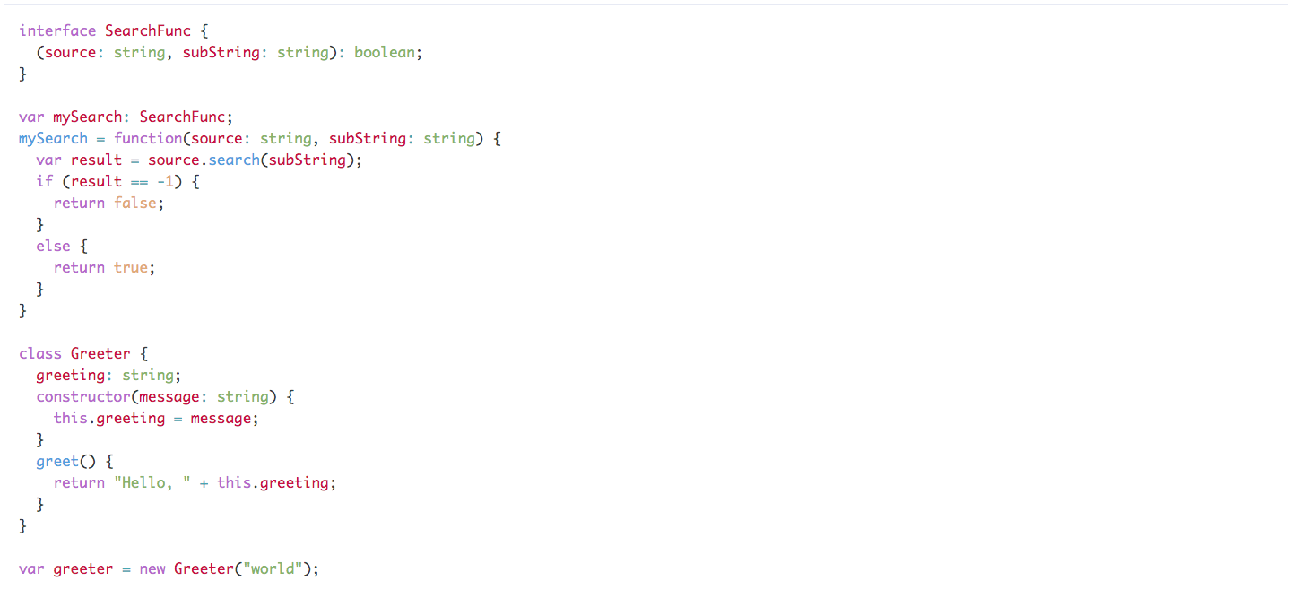
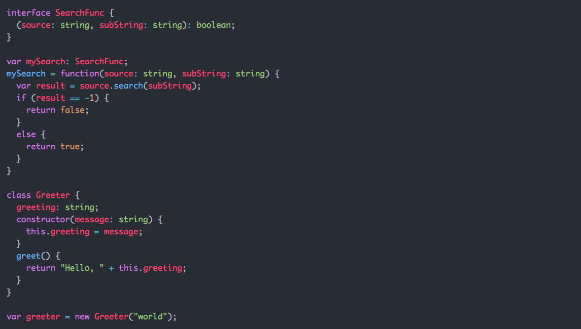
Preview
Below are screenshots of each theme applied to a snippet of TypeScript code.
For additional previews of other code snippets (Markup, SCSS and JavaScript), download and open the demo files in the demo folder.
TypeScript
License
MIT