
pretty-interaction-icons
v1.1.5
Published
pretty interaction icons for React
Downloads
11

Readme
Pretty Interaction Icons
This is my attempt to create a npm package containing interaction icons that look cool w mo.js
npm install pretty-interaction-iconsInspired by this Medium post
Credit to Codrops + Ohans Emmanuel
Table of Content
PropTypes & Default Props HERE
Colors
Used palette from Marvel (Working on letting users specify hex as props)
// light shades
white: "#FFFFFF",
snow: "#F9FAFC",
darkSnow: "#EFF2F7",
extraDarkSnow: "#E5E9F2",
// dark tones
silver: "#8492A6",
slate: "#3C4858",
steel: "#273444",
black: "#1F2D3D",
// dark shades
smoke: "#E0E6ED",
darkSmoke: "#D3DCE6",
extraDarkSmoke: "#C0CCDA",
// blue shades
lightBlue: "#85D7FF",
blue: "#1FB6FF",
darkBlue: "#009EEB",
// purple shades
lightPurple: "#A389F4",
purple: "#7E5BEF",
darkPurple: "#592DEA",
// pink shades
lightPink: "#FF7CE5",
pink: "#FF49DB",
darkPink: "#FF16D1",
// orange shades
lightOrange: "#FF9E7C",
orange: "#FF7849",
darkOrange: "#FF5216",
// green shades
lightGreen: "#29EB7F",
green: "#13CE66",
darkGreen: "#0F9F4F",
// yellow shades
lightYellow: "#FFD55F",
yellow: "#FFC82C",
darkYellow: "#F8B700",
// ui colors
info: "#1FB6FF",
success: "#13CE66",
danger: "#FF4949",
warning: "#FFC82C"
Examples
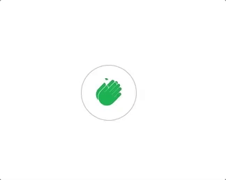
import { MediumClap, Like, Music, Heart } from "pretty-interaction-icons";MediumClap
<MediumClap
  size="medium"
  color="darkGreen"
  labelColor="darkGreen"
  clapCount={0}
  clapCountTotal={10}
/>
Like

<Like
  hasBurst
  hasRing
  hasShrink
  ringColor="purple"
  burstStrokeColor="blue"
  burstRadius="large"
  burstShape="line"
  ringRadius="extraLarge"
  burstCount={5}
  burstOpacity={0.5}
  ringOpacity={0.5}
  size="large"
  labelContent={10}
  labelPosition="bottom"
/>
Music

<Music
  hasNotes
  hasRock
  color="blue"
  noteColors={["danger", "warning", "darkGreen", "warning"]}
/>
Heart

<Heart
  size="large"
  color="danger"
  ringColor="green"
  ringSize="extraLarge"
  hasShrink
  hasRings
  labelContent={10}
  labelPosition="top"
/>
Development
clone the component-lib-playground + this repo
git clone https://github.com/hungweiwu/pretty-interaction-icons
git clone https://github.com/hungweiwu/component-lib-playground
Setup
Link the pretty-interaction-icons package to global npm node modules folder
cd pretty-interaction-icons && npm linkLink in the playground
cd component-lib-playground && npm link pretty-interaction-iconand now you can do
import { MediumClap, Like, Music, Heart } from "pretty-interaction-icons";this inside App.js in the component-lib-playground
Running
inside pretty-interaction-icons root directory run
npm run build:watch
npm run lint:watch
for live linting and re-transpiling
inside component-lib-playground root directory run
npm run devIt will serve a React app on localhost:8080
HAPPY DEVELOPING :)