postcss-speech-bubble
v1.0.12
Published
PostCSS plugin creates speech bubbles with just 1-2 lines of CSS
Downloads
26
Maintainers
Readme
postcss-speech-bubble
postcss-speech-bubble creates speech bubbles in just a couple of lines of CSS.
Installation
npm install postcss-speech-bubble
Usage
postcss-speech-bubble offers three rules that can be used to build different kinds of speech bubbles.
bubble: borderSize borderRadius type color;
- borderSize: border size in px
- borderRadius: border radius on the speech bubble
- type: solid or hollow Solid creates a speech bubble that uses the color provided here as background color. Hollow uses the color provided in this rule as the border color.
- color: Background color of the bubble and the beaker if it is solid border color on bubble and beaker if it is hollow
bubble-beaker: beakerSize positionOfBeaker;
- beakerSize: size of the speech beaker. Please provide this in px.
- positionOfBeaker: Where the beaker should be for the speech bubble. Below are possiblePosition's options:
- top-right
- top-left
- top-center
- bottom-right
- bottom-left
- bottom-center
- left-top
- left-bottom
- left-middle
- right-top
- right-bottom
- right-middle
bubble-background: color; This is necessary if you need to provide a bubble with a border and a background color. You can define these bubbles by making them hollow and providing the border color and providing a background color through this property.
Important Note: Please provide width and height for these bubbles or let the content specify the width/height. The bubbles will not look right without proper width/height.
Examples
Solid bubble (No border)

.bubble {
  bubble-beaker: 12px top-right;
  bubble: 0 0 solid lightGrey;
  width: 140px;
  height: 80px;
}
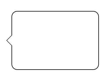
Hollow bubble

.bubble {
  bubble: 1px 10px hollow black;
  bubble-beaker: 10px left-middle;
  width: 150px;
  height: 100px;
}
Hollow bubble with a background

.bubble {
  bubble-beaker: 12px right-middle;
  bubble: 3px 0 hollow black;
  bubble-background: #E44146;
  width: 100px;
  height: 120px;
}