
po-icons
v0.0.10
Published
Use any mat-icon from any material theme
Downloads
4

Readme
Polpo-icons
This library extends MatIcons to accept icons from any material icons theme (default, outlined, two-tone, round, sharp). All of those icons listed in material design page is not working in the font-icons. Look into better alternatives for the support of more icons.
There is typescript types defined for all of the material icons(not 100% accurate).
Example:
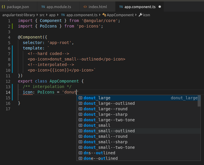
<po-icon>donut_small--outlined</po-icon>Angular content change lifecycle hook is also implemented, so it accepts angular interpolation in html
Example:
<po-icon>{{icon}}</po-icon>This library was generated with Angular CLI version 7.2.15.
How to implement
Reference css styles from Google's Material Icons.
This line should be placed into the index.html inside the <head></head> tags:
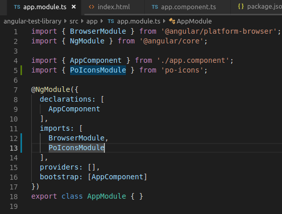
<link href="https://fonts.googleapis.com/css?family=Material+Icons|Material+Icons+Outlined|Material+Icons+Two+Tone|Material+Icons+Round|Material+Icons+Sharp" rel="stylesheet">Then import the PoIconsModule from 'po-icons' to the module you want to use it in(app.module.ts).
Now use <po-icon></po-icon> from any of your module's component.html.
Remember syntax '--theme' after icon name to apply theme.
Customization
There are 3 optional attributes to modify po-icon content:
- color: string; (color style like: '#000')
- bgColor: string; (color style like: '#000')
- size: number; (number in pixels. modifies font-size or svg width/height.)
use like following:
<po-icon [color]="#7ed321" [bgColor]="#4a4a4a" [size]="25px">account-login--open-iconic</po-icon>More details
Do not use for production. This is experimental library.
Better alternatives
- Make own svg sprite.
- Pros: most flexible (modifications, animations, extendability...).
- Cons: svg may affect performance and svg sprites are supported only by newest browsers
- Use material design's non-spec-app (.png)
- Pros: get all newest icons in use from the material-design page.
- Cons: png is not flexible.
Demo
Git repository for the source-code and demo: https://github.com/polpo93/po-icons