
pie-chart-react.js
v1.1.2
Published
The React Pie Chart component is a highly customizable and interactive charting solution designed for visualizing data in a circular pie chart format. The component supports animated arcs, hover interactions, and tooltips, making it perfect for dashboards
Downloads
340
Maintainers
 anas.alkhamis
Readme
React Pie Chart Component
Description:
The React Pie Chart component is a highly customizable and interactive charting solution designed for visualizing data in a circular pie chart format. The component supports animated arcs, hover interactions, and tooltips, making it perfect for dashboards, reports, and data visualization applications.
Installation:
npm install pie-chart-react.js
# or
yarn add pie-chart-react.js
Key Features:
- Animated Arcs: Smoothly animates the pie chart segments on load.
- Hover Tooltips: Displays additional information when hovering over chart segments.
- Customizable Appearance: Configure colors, labels, and chart size.
- Accessible: Includes ARIA roles and labels for accessibility.
- Flexible Header and Footer: Accepts both text and JSX elements to allow custom headers and footers.
Usage:
Props
The TreeProps interface defines the properties for the Tree component. Below is a detailed description of each property.
| Property | Type | Description |
| ------------- | ----------------- | ---------------------------------------------------------------------------------------------------------------------- |
| chartConfig | Array<Object> | An array of objects defining the data for each segment of the pie chart. Each object includes value, color, and label. |
| size | number | Defines the size of the pie chart in pixels (defaults to 200px). |
| header | string or JSX | (Optional) A class name to apply to each tree item. |
| footer | string or JSX | (Optional) A class name to apply to each sub-tree container. |
Example
- ./App.tsx
import React from "react";
import { PieChart } from "react.js-pie-chart";
const chartConfig = [
{ value: 30, color: "#FF5733", label: "Category A" },
{ value: 20, color: "#33FF57", label: "Category B" },
{ value: 50, color: "#3357FF", label: "Category C" },
];
function App() {
return (
<div>
<PieChart
chartConfig={chartConfig}
size={300}
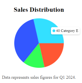
header={"Sales Distribution"}
footer={"Data represents sales figures for Q1 2024."}
/>
</div>
);
}
export default App;chartConfig Object Structure:
{
  value: number; // The numeric value that determines the size of the arc
  color: string; // The color of the arc
  label: string; // The label that appears in the tooltip when hovered
}
Props Example:
const chartConfig = [
  { value: 25, color: "#4CAF50", label: "Product A" },
  { value: 35, color: "#FF9800", label: "Product B" },
  { value: 40, color: "#2196F3", label: "Product C" },
];
Customizing Header and Footer:
<PieChart
  chartConfig={chartConfig}
  header={<h2 className="text-lg font-semibold">Product Sales</h2>}
  footer={<p className="text-sm text-gray-500">Data from Q1 2024</p>}
/>
Accessibility:
This component is designed with accessibility in mind, supporting ARIA labels and roles. The chart’s container includes role="img" and aria-label attributes for screen readers, making it accessible for all users.
Conclusion:
The React Pie Chart component provides an easy-to-use, flexible solution for displaying data in a visually appealing pie chart. It offers interactivity, customization, and performance, making it an excellent choice for data-driven React applications.
License:
This project is licensed under the MIT License.