
pebble-slate
v0.0.3
Published
Front-end framework for developing Pebble mobile configuration pages.
Downloads
5

Readme
Slate

Slate is a front-end framework for developing Pebble mobile configuration pages. It's the fastest way to make a clean UI for a Pebble app's mobile configuration page.
Getting Started
Getting Slate
There are only four files that makeup the Slate framework, a CSS file and a JavaScript file, and two fonts.
There are two quick ways to getting started with Slate.
Via Download
The CSS and JS files and fonts are also available via download.
Via Bower
The CSS and JS files and fonts are also avaliable via Bower.
bower install pebble-slateZepto.js
Slate is also bundled with Zepto.js, which is "a minimalist JavaScript library for modern browsers with a largely jQuery-compatible API."
Video Tutorial
A detailed live demo tutorial was given at the Pebble SF Meetup, and can be watched in full below.
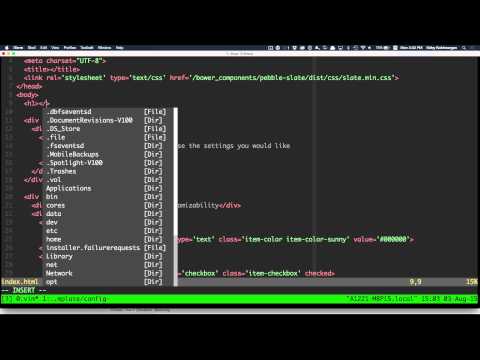
Additionally, the example app used in the video can be found here, while a second example implementation can be found here.
Documentation
Here is a list of the different components you can create with Slate.
Paragraphs
<div class="item-container">
<div class="item-container-content">
<div class="item">
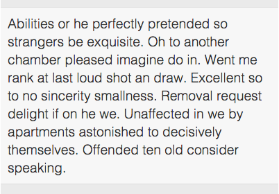
Abilities or he perfectly pretended so strangers be exquisite. Oh to
another chamber pleased imagine do in. Went me rank at last loud shot an
draw. Excellent so to no sincerity smallness. Removal request delight if
on he we. Unaffected in we by apartments astonished to decisively
themselves. Offended ten old consider speaking.
</div>
</div>
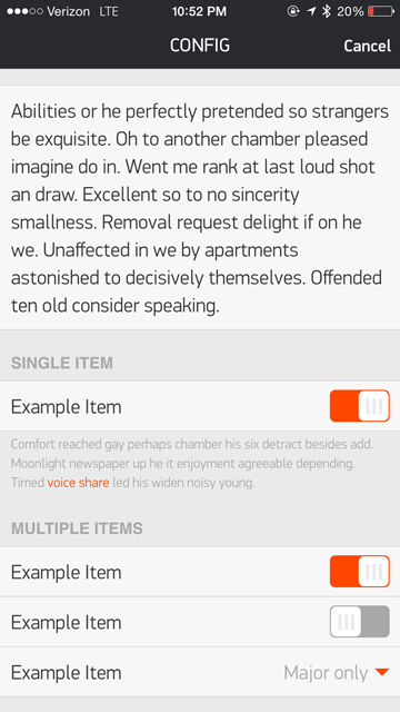
</div>Headers, Footers, and Items
<div class="item-container">
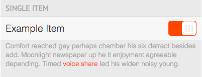
<div class="item-container-header">Single Item</div>
<div class="item-container-content">
<label class="item">
Example Item
<input type="checkbox" class="item-toggle" name="toggle-1" checked>
</label>
</div>
<div class="item-container-footer">
Comfort reached gay perhaps chamber his six detract besides add. Moonlight
newspaper up he it enjoyment agreeable depending. Timed
<a href="#">voice share</a> led his widen noisy young.
</div>
</div>Toggles and Selects
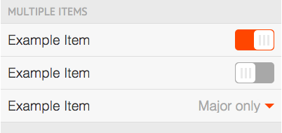
<div class="item-container">
  <div class="item-container-header">Multiple Items</div>
  <div class="item-container-content">
    <label class="item">
      Example Item
      <input type="checkbox" class="item-toggle" name="toggle-2" checked>
    </label>
    <label class="item">
      Example Item
      <input type="checkbox" class="item-toggle" name="toggle-3">
    </label>
    <label class="item">
      Example Item
      <select name="select-1" dir='rtl' class="item-select">
        <option class="item-select-option">Both</option>
        <option class="item-select-option" selected>Major only</option>
        <option class="item-select-option">Minor only</option>
      </select>
    </label>
  </div>
</div>
Checkboxes
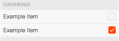
<div class="item-container">
  <div class="item-container-header">Checkboxes</div>
  <div class="item-container-content">
    <label class="item">
      Example Item
      <input type="checkbox" class="item-checkbox" name="checkbox-1">
    </label>
    <label class="item">
      Example Item
      <input type="checkbox" class="item-checkbox" name="checkbox-2" checked>
    </label>
  </div>
</div>
Radio Buttons
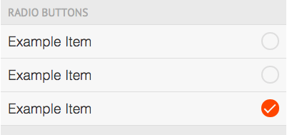
<div class="item-container">
  <div class="item-container-header">Radio Buttons</div>
  <div class="item-container-content">
    <label class="item">
      Example Item
      <input type="radio" class="item-radio" name="radio-1" value="a">
    </label>
    <label class="item">
      Example Item
      <input type="radio" class="item-radio" name="radio-1" value="b">
    </label>
    <label class="item">
      Example Item
      <input type="radio" class="item-radio" name="radio-1" value="c" checked>
    </label>
  </div>
</div>
Date, Time, and Colorpickers
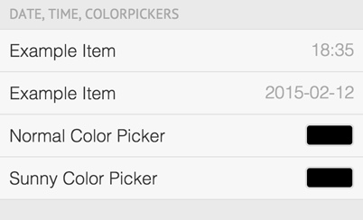
<div class="item-container">
  <div class="item-container-header">Date, Time, Colorpickers</div>
  <div class="item-container-content">
    <label class="item">
      Example Item
      <input type="time" class="item-time" name="time-1" value="18:35">
    </label>
    <label class="item">
      Example Item
      <input type="date" class="item-date" name="date-1" value="2015-02-12">
    </label>
     <label class="item">
      Normal Color Picker
      <input type="text" class="item-color item-color-normal" name="color-1" value="#000000">
    </label>
    <label class="item">
      Sunny Color Picker
      <input type="text" class="item-color item-color-sunny" name="color-2" value="#000000">
    </label>
  </div>
</div>
Input Fields
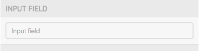
<div class="item-container">
  <div class="item-container-header">Input Field</div>
  <div class="item-container-content">
    <label class="item">
      <div class="item-input-wrapper">
        <input type="text" class="item-input" name="input-1" placeholder="Input field">
      </div>
    </label>
  </div>
</div>
Input Fields with Buttons
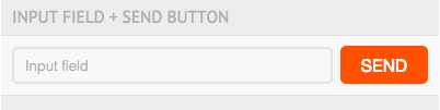
<div class="item-container">
  <div class="item-container-header">Input Field + Send Button</div>
  <div class="item-container-content">
    <label class="item">
      <div class="item-input-wrapper item-input-wrapper-button">
        <input type="text" class="item-input" name="input-2" placeholder="Input field">
      </div>
      <input type="button" class="item-button item-input-button" value="SEND">
    </label>
  </div>
</div>
Tab Buttons
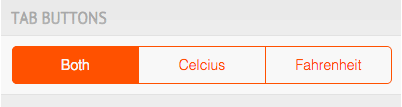
<div class="item-container">
  <div class="item-container-header">Tab Buttons</div>
  <div class="item-container-content">
    <div class="item tab-buttons">
      <a name="tab-1" class="tab-button active">Both</a>
      <a name="tab-1" class="tab-button">Celcius</a>
      <a name="tab-1" class="tab-button">Fahrenheit</a>
    </div>
  </div>
</div>
Sliders
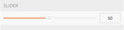
<div class="item-container">
  <div class="item-container-header">Slider</div>
  <div class="item-container-content">
    <label class="item">
      <input type="range" class="item-slider" name="slider-1" value="50">
      <div class="item-input-wrapper item-slider-text">
        <input type="text" class="item-input" name="slider-1" value="50">
      </div>
    </label>
  </div>
</div>
Draggable Lists
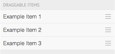
<div class="item-container">
  <div class="item-container-header">draggable Items</div>
  <div class="item-container-content">
    <div class="item-draggable-list">
      <label class="item">Example Item 1</label>
      <label class="item">Example Item 2</label>
      <label class="item">Example Item 3</label>
    </ul>
  </div>
</div>
Lists
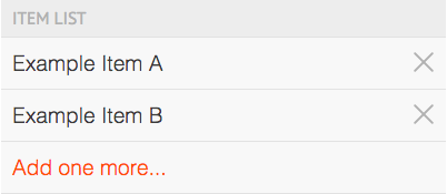
<div class="item-container">
  <div class="item-container-header">Item List</div>
  <div class="item-container-content">
    <div class="item-dynamic-list">
      <label class="item">Example Item A</label>
      <label class="item">Example Item B</label>
    </div>
  </div>
</div>
Buttons

<div class="item-container">
  <div class="button-container">
    <input type="button" class="item-button" value="SEND">
  </div>
</div>