paradeiser
v0.4.3
Published
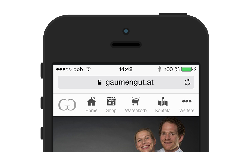
Paradeiser is an easy to use menu for mobile views
Downloads
5
Readme
Paradeiser
The only menu you will ever need to kill the hamburger.
Paradeiser is a slim package for dealing with one of the major problems in responsive webdesign: The navigation.
We all know that problem when it comes down to which navigation you might wanna use, and it is often the most comfortable way to go with any of the hamburger menus like hamburgler, but as many folks already discovered the hamburger menu is often not the best choice.
Asides from its recognition value, which is still pretty bad, it still affords to clicks to access your most important links.
On the other hand other methods like a select box (also double click needed) or displaying all the links on top like a styles ul list don't look that good.
So that's where Paradeiser comes in. You get your most important links and even your company logo in the header bar, and for less important stuff you still have an overflow right there.

And it only weighs 1.3kb gzipped.
Features
Based upon webkit, so all the links take the space they need and center themselves, therefore your may use 1, 2 or even 5 links within the navbar.
You may also adjust the sizes etc by overwriting the variables of the scss file.
Requirements
CSS Only Version
- CSS.
- Really. That's it.
Thanks to andreruffert Paradeiser is now CSS only.
Automatic Hiding on scroll
There is also basic support for hiding on scroll, which is implemented via Headroom.js, see demo 4 (Source Code) for details on the implementation.
Install via bower
bower install Paradeiser --save
Usage
Required Files
paradeiser/
└── dist/
    └── min/
	    └── paradeiser.min.css
HTML Markup
Within your head or wherever you might find it suits you, include the source file
<link rel="stylesheet" href="path-to/paradeiser.min.css">or if you feel confident to try some new stuff you could also link it through my cdn: I have not yet tested this myself enough, feel free to do so though. It should work perfectly fine.
<link rel="stylesheet" href="https://cdnjs.cloudflare.com/ajax/libs/paradeiser/0.4.2/min/paradeiser.min.css">And then place this stuff right below your <body> opening tag:
For further demonstration, visit the Demo pages
- Simple, pure CSS (Source Code)
- With basic overflow (Source Code)
- With overflow and text as Icon as well as hiding links based on device size! (Source Code)
- Automatic Hiding of Paradeiser using Headroom.js + Overflow (JS) (Source Code)
- Automatic Hiding of Paradeiser using Headroom.js (JS) (Source Code)
<nav class="paradeiser">
    <a href="#">
        <img src="http://danielwinter.at/apple-touch-icon_76x76.png" alt="Logo of Daniel Winter" class="paradeiser_logo">
    </a>
    <a href="#">
        <icon class="paradeiser_icon_canvas">
            <img src="img/menu_home.svg" alt="Navigate to Home">
        </icon>
        <span>Home</span>
    </a>
    <a href="#">
        <icon class="paradeiser_icon_canvas">
            <img src="img/menu_shop.svg" alt="Navigate to Shop">
        </icon>
        <span>Shop</span>
    </a>
    <a href="#">
        <icon class="paradeiser_icon_canvas">
            <img src="img/menu_cart.svg" alt="Navigate to Cart">
        </icon>
        <span>Cart</span>
    </a>
    <a href="#">
        <icon class="paradeiser_icon_canvas">
            <img src="img/menu_contact.svg" alt="Navigate to Contact">
        </icon>
        <span>Contact</span>
    </a>
    <!-- and include the dropdown aswell -->
    <div class="paradeiser_dropdown">
        <a href="#paradeiser-more">
            <icon class="paradeiser_icon_canvas">
                <img src="img/menu_overflow.svg" alt="">
            </icon>
            <span>More</span>
        </a>
        <ul class="paradeiser_children" id="paradeiser-more">
            <li><a href="#">Terms of Service</a></li>
            <li><a href="#">About Us</a></li>
            <li><a href="#">Yolo</a></li>
            <li class="paradeiser-hidden-desktop"><a href="#">Hidden on desktop</a></li>
            <li class="paradeiser-hidden-tablet"><a href="#">Hidden on tablet</a></li>
            <li class="paradeiser-hidden-phone"><a href="#">Hidden on phone</a></li>
            <li><a href="#!"></a></li>
        </ul>
    </div>
</nav>
Plans for the Future
- Better animations on the popout
- Support for one-page websites with automatic highlighting of the correct link
Why the heck is this called Paradeiser?
Paradeiser is Austrian for tomato, I just thought it might sound cool, and it has a nice ring to it (Paradise - eh?).
Changelog
v 0.4.0
Paradeiser is now available on my CDN as well, I will add it to the cdnjs CDN hosted by cloudflare also, maybe they'll accept it.
v 0.3.0
Changing the dropdown from span to div to act like we care about validation as proposed in #13.
Refactoring the scss again, now only one file as every variable is set to !default anyhow and can be overwritten pretty easily and documented every relevant part.
v 0.2.5.
As suggested in #9 hiding on scrolling is now implemented with Headroom.js, but there are still bugs with the overflow menu. If you don't use the overflow though, you can get a demo 4 (Source Code). I included headroom.js via the Cloudflare CDN, so no additional download is needed. Paradeiser itself stays JS free.
v 0.2.0
Paradeiser is now CSS only, thanks to andreruffert and the CSS :target selector.
Mind the reworked HTML Markup.
v 0.1.2
Added paradeiser-hidden-* classes for hiding links on different devices. This way you can move links from the navbar to the overflow menu when switching to mobile
v 0.1.0
Paradeiser is now visible on Desktop systems aswell, if you want to supress this behaviour, just set the $paradeiser-mobile-only variable to true while importing the paradeiser_variables.

