ngx-touch-keyboard
v3.3.0
Published
Virtual Keyboard for Angular applications
Downloads
921
Maintainers
Readme
AngularTouchKeyboard
What is this?
Virtual Keyboard for Angular applications.
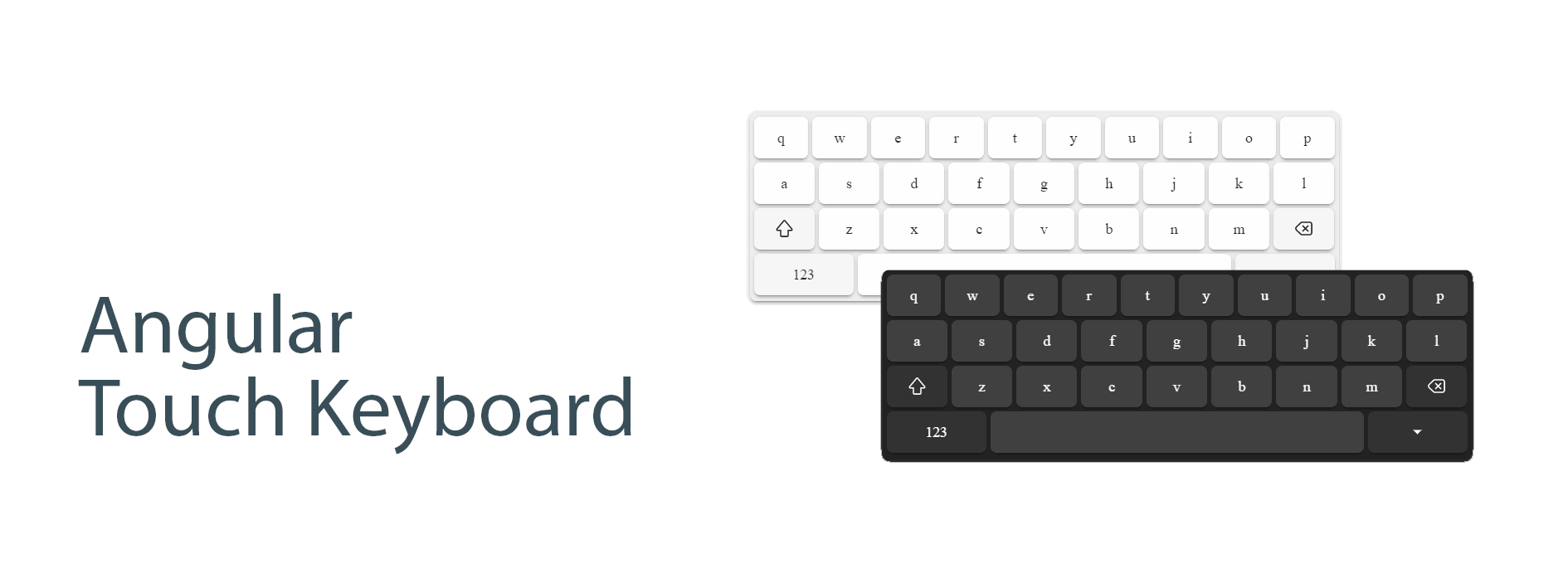
Demo
https://mohsen77sk.github.io/angular-touch-keyboard/
Install
Step 1: Install ngx-touch-keyboard
npm install @angular/cdk ngx-touch-keyboardStep 2: Import the module
Add ngxTouchKeyboardModule as an import in your app's root NgModule.
import { ngxTouchKeyboardModule }  from 'ngx-touch-keyboard';
@NgModule({
  ...
  imports: [
    ...
    ngxTouchKeyboardModule,
  ],
  ...
})
export class AppModule { }
Compatibility
Version [3.0.0]
@angular/core:^16.0.0||^17.0.0||^18.0.0@angular/cdk:^16.0.0||^17.0.0||^18.0.0
Version [2.0.0]
@angular/core:^14.0.0||^15.0.0@angular/cdk:^14.0.0||^15.0.0
Localization
AngularTouchKeyboard is localized in 7 keyboard-specific locales:
en-USEnglish (United States) (default)en-UKEnglish (United Kingdom)fa-IRPersian (Iran)he-ILHebrew (Israel)ka-GEGeorgian (Georgia)ru-RURussian (Russia)sv-SESwedish (Sweden)
Usage
Simple usage example
<input
  type="text"
  ngxTouchKeyboard
  #touchKeyboard="ngxTouchKeyboard"
  (focus)="touchKeyboard.openPanel()"
/>
Locale usage example
<input
  type="text"
  ngxTouchKeyboard="fa-IR"
  #touchKeyboard="ngxTouchKeyboard"
  (focus)="touchKeyboard.openPanel()"
/>
Material usage example
<mat-form-field>
  <mat-label>Default</mat-label>
  <input
    matInput
    type="text"
    ngxTouchKeyboard
    #touchKeyboard="ngxTouchKeyboard"
  />
  <button
    mat-icon-button
    matSuffix
    type="button"
    (click)="touchKeyboard.togglePanel()"
  >
    <mat-icon> keyboard </mat-icon>
  </button>
</mat-form-field>
Properties
| Property | Description |
| ---------------------------- | ----------------------------------------------------------- |
| ngxTouchKeyboard | Required to initialize Virtual Keyboard to specified input. |
| ngxTouchKeyboardDebug | Debug mode is on. |
| ngxTouchKeyboardFullScreen | Full screen mode is on. |
Methods
Here's the list of all available methods:
| Methods | Description |
| --------------------- | --------------------- |
| openPanel(): void | Open keyboard panel |
| closePanel(): void | Close keyboard panel |
| togglePanel(): void | Toggle keyboard panel |
Themes
Built-in themes
default: white themedark: dark theme
You must put the class dark in the body to use the dark theme.
Create custom theme
To customize the theme, you need to use css variables.
| Name | Description |
| ------------------------------- | ------------------------------------- |
| --tk-color-text | color of text button |
| --tk-background | color of background panel |
| --tk-background-button | color of background basic button |
| --tk-background-button-fn | color of background functional button |
| --tk-background-button-active | color of background active button |
Layouts
Depends on attribute inputmode, the keyboard layout is changed.
| inputmode | Screenshot |
| --------------------- | -------------------------------------------------------------------------------------------------------- |
| inputmode='text' | 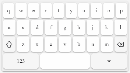 |
|
|
| inputmode='search' |  |
|
|
| inputmode='email' | 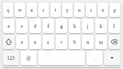 |
|
|
| inputmode='url' | 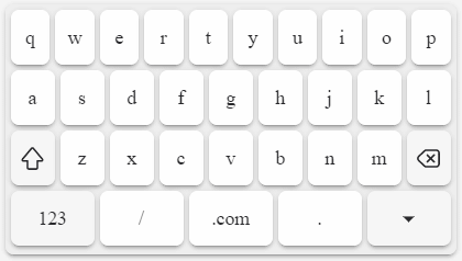 |
|
|
| inputmode='numeric' | 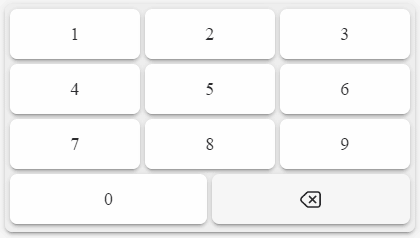 |
|
|
| inputmode='decimal' | 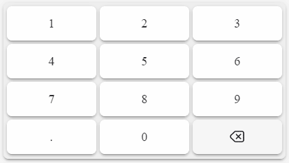 |
|
|
| inputmode='tel' | 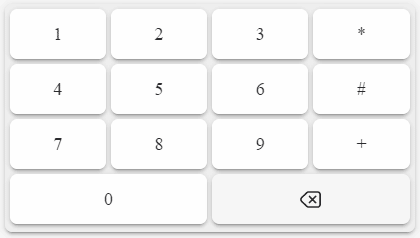 |
|
Development
The most useful commands for development are:
npm run startto start a development servernpm run build-demoto build the demo locally (it will be published automatically by GitHub Actions)

