ngx-shadow-picker
v0.3.3
Published
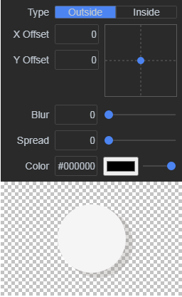
A shadow picker inspired by the Chromium devtools. This is a slight reimagining and a port of the component [react-shadow-picker](https://www.npmjs.com/package/react-shadow-picker)
Downloads
14
Maintainers
Readme

NgxShadowPicker
A shadow picker inspired by the Chromium devtools. This is a slight reimagining and a port of the component react-shadow-picker
Development server
Run yarn storybook for a dev server.

Installation
yarn add ngx-shadow-pickerUsage
The component can be used either in a Controlled or Uncontrolled way. If you pass the value back to the component, it will be controlled.
import { ShadowPickerModule } from 'ngx-shadow-picker';

...

@NgModule({
    declarations: [],
    imports: [
      ...
      ShadowPickerModule
    ],
    providers: [],
})
export class AppModule {}
Add component to the template
...
<shadow-picker [showSample]="true" [value]="value" (onChange)="value = $event"></shadow-picker>
...
Styling
Add scss style in your project
@import '~ngx-shadow-picker/styles/shadow-picker';Styling customization
There are several scss variables that can be overridden
$shadow-picker-empty-bg-size: 10px !default;
$shadow-picker-background: #2a2a2a !default;
$shadow-picker-width: 256px !default;
$shadow-picker-font-size: 14px !default;
$shadow-picker-color: #bec6cf !default;
$shadow-picker-padding: 8px !default;
$shadow-picker-offsetgrid-size: 100px !default;
$shadow-picker-control-color: #4285f4 !default;
$shadow-picker-control-border-radius: 2px !default;
Customization controls
It is possible to replace the standard controls
<ng-template #type> for Select buttons
<ng-template #input> for Input text controls
<ng-template> #slider for slider controls
<shadow-picker
    [showSample]="showSample"
    [value]="value"
    (onChange)="onChange($event);"
>
    <ng-template #type let-value="value" let-onChange="onChange">
        <p-selectButton
            [options]="[
                    {label: 'Inside', value: 'inside'},
                    {label: 'Outside', value: 'outside'}
                  ]"
            [ngModel]="value"
            (ngModelChange)="onChange.emit($event)"
        ></p-selectButton>
    </ng-template>

    <ng-template #input let-value="value" let-onChange="onChange">
        <input
            style="width: 16px; flex: 1"
            type="text"
            [ngModel]="value"
            (ngModelChange)="onChange.emit($event)"
            pInputText
        />
    </ng-template>

    <ng-template #slider let-value="value" let-onChange="onChange" let-max="max">
        <p-slider
            [ngStyle]="{flex: 1}"
            [max]="max"
            [ngModel]="value"
            (ngModelChange)="onChange.emit($event)"
        ></p-slider>
    </ng-template>
</shadow-picker>
