
ngx-range-date-select
v1.0.1
Published
NgxRangeDateSelect is an Angular component that allows selecting a range of pre-set dates and enables manual date range selection. This component emits the selected date range through an output event, making it easy to integrate and use in various Angular
Downloads
4

Readme
NgxRangeDateSelect
NgxRangeDateSelect is an Angular component that allows selecting a range of pre-set dates and enables manual date range selection. This component emits the selected date range through an output event, making it easy to integrate and use in various Angular applications.
Installation
To install the component, you can use npm:
npm install ngx-range-date-selectUsage
To use the NgxRangeDateSelect component in your Angular application, follow these steps:
Import NgxRangeDateSelectModule: Import
NgxRangeDateSelectModulein your Angular module (e.g.,AppModule).import { NgModule } from '@angular/core'; import { BrowserModule } from '@angular/platform-browser'; import { AppComponent } from './app.component'; import { NgxRangeDateSelectComponent } from 'ngx-range-date-select'; @NgModule({ declarations: [ AppComponent NgxRangeDateSelectComponent ], imports: [ BrowserModule, ], providers: [], bootstrap: [AppComponent] }) export class AppModule { }Use NgxRangeDateSelect Component: Add the
ngx-range-date-selectcomponent in your Angular template (app.component.htmlor any other component template).<ngx-range-date-select (rangeDateOut)="handleRangeDate($event)" class="p-5"></ngx-range-date-select>Handle the Output Event: Implement a method in your component to handle the
rangeDateOutevent emitted by NgxRangeDateSelect.import { Component } from '@angular/core'; @Component({ selector: 'app-root', templateUrl: './app.component.html', styleUrls: ['./app.component.css'] }) export class AppComponent { title = 'demo-app'; handleRangeDate(event: any) { console.log('Selected date range:', event); // Your custom logic here } }
Example
Here's an example demonstrating how to integrate NgxRangeDateSelect into your Angular application:
Module (app.module.ts)
import { NgModule } from '@angular/core';
import { BrowserModule } from '@angular/platform-browser';
import { AppComponent } from './app.component';
import { NgxRangeDateSelectComponent } from 'ngx-range-date-select';

@NgModule({
  declarations: [
    AppComponent,
    NgxRangeDateSelectComponent
  ],
  imports: [
    BrowserModule,
  ],
  providers: [],
  bootstrap: [AppComponent]
})
export class AppModule { }
Component Template (app.component.html)
The component template (app.component.html) is where you include the NgxRangeDateSelect component and handle its output event.
<div class="container">
  <h1>{{ title }}</h1>
  <ngx-range-date-select (rangeDateOut)="handleRangeDate($event)" class="p-5"></ngx-range-date-select>
</div>
In this example:
In the example provided:
- The
<ngx-range-date-select>component is used to display the date range selection interface within a<div>container with the classcontainer. (rangeDateOut)="handleRangeDate($event)"is an event binding that listens for therangeDateOutevent emitted by NgxRangeDateSelect. When a date range is selected within the component, this event is fired and invokes thehandleRangeDate()method in your Angular component.handleRangeDate(event: any) { ... }is a method defined in your Angular component (app.component.ts). It logs the selected date range to the console for demonstration purposes, but you can replace this logic with any custom functionality your application requires.{{ title }}displays the title of the application, which is bound to thetitleproperty defined in your Angular component class (app.component.ts).
This example illustrates how to integrate NgxRangeDateSelect into your Angular application and handle the selected date range using event binding and method invocation.
Component Class (app.component.ts)
The component class (app.component.ts) is where you define the logic for handling the selected date range and any additional functionality related to the NgxRangeDateSelect component.
import { Component } from '@angular/core';

@Component({
  selector: 'app-root',
  templateUrl: './app.component.html',
  styleUrls: ['./app.component.css']
})
export class AppComponent {
  title = 'demo-app';

  handleRangeDate(event: any) {
    console.log('Selected date range:', event);
    // Your custom logic here to handle the selected date range
    // For example, update a variable or call a service method
  }
}
In this example:
In the provided example:
- AppComponent Class: The
AppComponentclass is decorated with@Component, which defines metadata for the Angular component including its selector, template, and styles. - title Property: The
titleproperty is initialized with the value'demo-app'. This property is interpolated in the template (app.component.html) using double curly braces ({{ title }}). - handleRangeDate Method: The
handleRangeDate(event: any)method is defined to handle therangeDateOutevent emitted by the NgxRangeDateSelect component. It logs the selected date range (event) to the console. - Console Logging:
console.log('Selected date range:', event);is used for demonstration purposes. You can replace this with your own custom logic to process the selected date range, such as updating a variable, triggering an API call, or performing any other application-specific action. - Template Interpolation: The
{{ title }}syntax in the template binds the value of thetitleproperty from the component class (AppComponent) to display 'demo-app' in the rendered view.
This example illustrates how to define an Angular component (AppComponent) with properties and methods to interact with and respond to events emitted by child components like NgxRangeDateSelect.
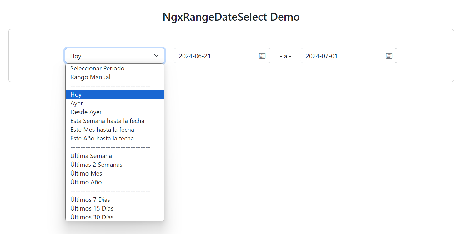
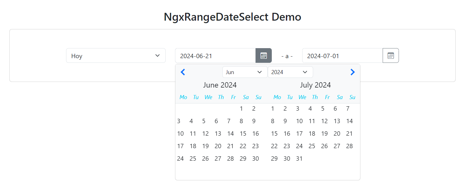
Image of the Component
Include an image of the NgxRangeDateSelect component in action:
API
Inputs
- rangeDateOut: Event emitted with the selected date range.
Outputs
- rangeDateOut: Event emitted with the selected date range.
Customization
The NgxRangeDateSelect component can be customized using CSS classes to match the look and feel of your application. For example, you can use the p-5 class to add padding around the component.
Contributing
If you would like to contribute to this project, please follow these steps:
- Fork the repository.
- Create a new branch (
git checkout -b feature/new-feature). - Make the necessary changes and commit (
git commit -am 'Add new feature'). - Push to the branch (
git push origin feature/new-feature). - Create a Pull Request.
License
This project is licensed under the MIT License. See the LICENSE file for more details.
Contact
For any questions or suggestions, feel free to contact us at [email protected].
This README provides a comprehensive guide on how to install, import, and use the NgxRangeDateSelect component in an Angular application, along with details on customization and contribution.