
ngx-filter-btn
v0.0.1
Published
Simple to implement filter button that filters your data.
Downloads
40
Maintainers
 tgawhale
Readme
Ngx Filter Btn
Simple to implement filter button that filters your data.
Index
Installation Steps
- Install by running
npm install ngx-table-operations - Add
import { NgxFilterBtnModule } from 'ngx-filter-btn'in your module class. - Add
NgxFilterBtnModulein your module class. - Add
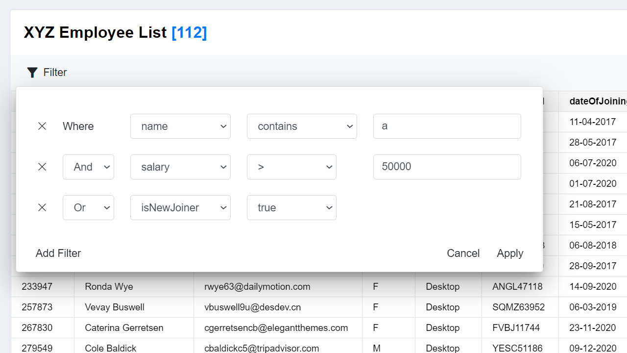
<ngx-filter-btn [data]="yourData" (filtered)="yourData = $event">Your button name</ngx-filter-btn>in your component html.
Installation Example
Install by running
npm install ngx-table-operationsIn
app.module.tsfile.import { NgxFilterBtnModule } from 'ngx-filter-btn'; @NgModule({ .... imports: [NgxFilterBtnModule, ....], .... .... })In
app.component.htmlfile.<ngx-filter-btn [data]="userList" [numberKeys]="['empId', 'salary', 'fte']" [booleanKeys]="['isNewJoiner']" [dateKeys]="['dateOfJoining']" (filtered)="userList = $event" > Filter </ngx-filter-btn>Some sample data in
app.component.tsfile.export class AppComponent { userList: SampleData[] = []; constructor() { this.userList = [ { empId: 7151, name: 'Jarret Chesson', email: '[email protected]', gender: 'M', assetType: 'Desktop', assetDetail: 'VXYJ59531', dateOfJoining: '11-04-2017', salary: 68093, isNewJoiner: true, grade: 'A3', location: 'Kolkata', skills: 'Java', billablityStatus: 'DEPLOYABLE_BENCH', accountName: 'Hudson LLC', projectName: 'Span', fte: 75, }, { ..... }, { ..... } } }
Parameters Available
| Type | Name | Description | Data Type | Example | | ------- | ----------- | ----------------------------------------------------------------------------- | --------- | --------------------------------- | | @Input | data | Pass your actual data of array in it | any[] | [data]="userList" | | @Input | numberKeys | Pass keys who has data of type number so that number filters can be applied | string[] | [numberKeys]="['empId','salary']" | | @Input | booleanKeys | Pass keys who has data of type boolean so that boolean filters can be applied | string[] | [booleanKeys]="['isNewJoiner']" | | @Input | dateKeys | Pass keys who has data of type Date so that Date filters can be applied | string[] | [dateKeys]="['dateOfJoining']" | | @Output | filtered | Returns the filtered array of your data in $event | | (filtered)="userList = $event" |
Available Conditions
- String Conditions
containsdoes not containstarts withends withisis notis emptyis not empty
- Number & Date Conditions
=!=><>=<=is emptyis not empty
- Boolean Conditions
truefalseis emptyis not empty
Styling the component
- The css class names are same as bootstrap classes.
- Customizing the css is simple.
- You can find all the css classes I used here.
- Use the same class name in
style.cssto override according to your css.
If you want to keep the css to component only, then use
:host ::ng-deepbefore declaring the css class.
Example :
:host ::ng-deep .dropdown-menu{
        background-color: white
    }