ng2-itx-datepicker
v1.0.6
Published
Angular2 date picker
Downloads
7
Maintainers
Readme
ng2-itx-datepicker
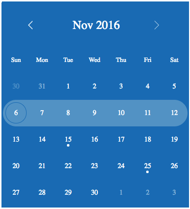
Angular 2 date picker - Angular2 reusable UI component based on mydatepicker
Installation
To install this component to an external project, follow the procedure:
npm install ng2-itx-datepicker --save
Add MyDatePickerModule import to your @NgModule like example below
import { NgModule } from '@angular/core';
import { BrowserModule } from '@angular/platform-browser';
import { MyTestApp } from './my-test-app';
import { MyDatePickerModule } from 'ng2-itx-datepicker';

@NgModule({
    imports:      [ BrowserModule, MyDatePickerModule ],
    declarations: [ MyTestApp ],
    bootstrap:    [ MyTestApp ]
})
export class MyTestAppModule {}
Use the following snippet inside your template:
<my-date-picker [options]="myDatePickerOptions"
                (dateChanged)="onDateChanged($event)"></my-date-picker>
Mandatory attributes:
- [options]="myDatePickerOptions"
- (dateChanged)="onDateChanged($event)"
Optional attributes:
- [selDate]="selectedDate" || [defaultMonth]="defaultMonth"
- [locale]="locale"
- [events] = "['2016-11-15', ...dates]"
Example of the options data (not all properties listed):
myDatePickerOptions = { todayBtnTxt: 'Today', dateFormat: 'yyyy-mm-dd', firstDayOfWeek: 'su', sunHighlight: true, height: '34px', width: '375px', inline: true };- Example of the date changed callback:
    onDateChanged(event:any) {
        console.log('onDateChanged(): ',
            event.date,
            ' - formatted: ', event.formatted,
            ' - epoc timestamp: ', event.epoc,
            ' - selected week start: ', event.start,
            ' - selected week end: ', event.end);
    }
If you are using systemjs package loader add the following mydatepicker properties to the System.config:
(function (global) {
    System.config({
        paths: {
            'npm:': 'node_modules/'
        },
        map: {
            // Other components are here...

            'ng2-itx-datepicker': 'npm:ng2-itx-datepicker',
        },
        packages: {
            // Other components are here...

            ng2-itx-datepicker: {
                main: './index.js',
                defaultExtension: 'js'
            }
        }
    });
})(this);
Usage
options attribute
Value of the options attribute is a javascript object. It can contain the following properties.
| Option | Default | Description | | :------------- | :------------- | :----- | | dayLabels | {su: 'Sun', mo: 'Mon', tu: 'Tue', we: 'Wed', th: 'Thu', fr: 'Fri', sa: 'Sat'} | Day labels visible on the selector. | | monthLabels | { 1: 'Jan', 2: 'Feb', 3: 'Mar', 4: 'Apr', 5: 'May', 6: 'Jun', 7: 'Jul', 8: 'Aug', 9: 'Sep', 10: 'Oct', 11: 'Nov', 12: 'Dec' } | Month labels visible on the selector. | | dateFormat | yyyy-mm-dd | Date format on selection area and callback. | | todayBtnTxt | Today | Today button text. | | firstDayOfWeek | mo | First day of week on calendar. One of the following: mo, tu, we, th, fr, sa, su | | sunHighlight | true | Sunday red colored on calendar. | | editableMonthAndYear | true | Is month and year labels editable or not. | | minYear | 1000 | Minimum allowed year in calendar. Cannot be less than 1000. | | maxYear | 9999 | Maximum allowed year in calendar. Cannot be more than 9999. | | disableUntil | no default value | Disable dates backward starting from the given date. For example: {year: 2016, month: 6, day: 26} | | disableSince | no default value | Disable dates forward starting from the given date. For example: {year: 2016, month: 7, day: 22} | | disableWeekends | false | Disable weekends (Saturday and Sunday). | | inline | false | Show mydatepicker in inline mode. | | height | 34px | mydatepicker height without selector. Can be used if inline = false. | | width | 100% | mydatepicker width. Can be used if inline = false. | | selectionTxtFontSize | 18px | Selection area font size. Can be used if inline = false. | | alignSelectorRight | false | Align selector right. Can be used if inline = false. | | indicateInvalidDate | true | If user typed date is not same format as dateFormat, show red background in the selection area. Can be used if inline = false. | | showDateFormatPlaceholder | false | Show value of dateFormat as placeholder in the selection area if it is empty. Can be used if inline = false. |
locale attribute
A two-letter ISO 639-1 language code can be provided as shorthand for several of the options listed above. Currently supported languages: en, fr, ja, fi and es. If the locale attribute is used it overrides dayLabels, monthLabels, dateFormat, todayBtnTxt, firstDayOfWeek and sunHighlight properties from the options.
- new locale data can be added to this file.
selDate attribute
Provide the initially chosen date that will display both in the text input field and provide the default for the popped-up selector.
events attribute
List of days that will be marked in the calentar, the date must be specified using the same format than options.dateFormat.
<my-date-picker [options]="myDatePickerOptions"
                (dateChanged)="onDateChanged($event)"
                [events] = "['2016-11-15', '2016-11-15']"></my-date-picker>
defaultMonth attribute
If selDate is not specified, when the datepicker is opened, it will ordinarily default to selecting the current date. If you would prefer a different year and month to be the default for a freshly chosen date picking operation, specify a [defaultMonth] in the same format as that for the datepicker options (yyyy.mm if not otherwise specified).
Development of this component
At first fork and clone this repo.
Install all dependencies:
- npm install
- npm install --global gulp-cli
Run sample application:
- Open a terminal and type npm start
- Open http://localhost:5000 to browser
Build dist folder (javascript version of the component):
- gulp all
Execute unit tests and coverage (output is generated to the test-output folder):
- npm test
Compatibility (tested with)
- Firefox (latest)
- Chromium (latest)
- Edge
- IE11
License
- License: MIT
Author
- Author: brauliolomeli


