ng-ls-charts-components
v0.0.8
Published
A library with chart components.
Downloads
15
Maintainers
 leandro.dev
Readme
Installing ng-ls-charts-components
Install the package using the command below:
npm i -g ng-ls-charts-components
Using
Import NgLsChartsComponentsModule and BrowserAnimationsModule in your app.module
import { NgLsChartsComponentsModule } from 'ng-ls-charts-components';
import { BrowserAnimationsModule } from '@angular/platform-browser/animations';
Declare in imports:
@NgModule({
  declarations: [...],
  imports: [
    ...
    BrowserAnimationsModule,
    NgLsChartsComponentsModule
  ],
  providers: [...],
  bootstrap: [...]
})
export class AppModule { }
ng-ls-level-bar
A bar that shows the displacement of a value based on its equilibrium point and its displacement tolerance.
What Can It Do?
Can use a level bar configuring:
- Gradient colors;
Using
Include the selector in your html file to render the level bar:
<ng-ls-level-bar></ng-ls-level-bar>
Component Inputs
The component allows some inputs, they are:
- Commons:
- [typeLevelBar] = Indicator shape. It can be 'triangle' or 'circle'. *Default value is 'circle' *
- [valueReference] = Reference value of the graph (Break-even point). Default value is 0
- [valuePercentTolerance] = Percentage of the value between the break-even point and the tolerance markers.. Default value is 0
- [currentValue] = Current bar indicator value
- [colorsBar] = Gradient colors. Minimum 2 colors. Default value is 'red , orange, yellow, greenyellow, green, greenyellow, yellow, orange, red'
- [tooltip] = The string content or a TemplateRef for the content to be displayed in the tooltip. If there is no content, the tooltip will not open.
- [placementTooltip] = The preferred placement of the tooltip. Possible values are "top", "top-left", "top-right", "bottom", "bottom-left", "bottom-right", "left", "left-top", "left-bottom", "right", "right-top", "right-bottom". Default order of preference is "auto"
Usage examples
Exemple 1
<ng-ls-level-bar [typeLevelBar]="'circle'" [valueReference] = 100 [valuePercentTolerance] =10 [currentValue]= 95></ng-ls-level-bar>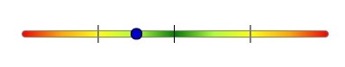
Exemple 2
<ng-ls-level-bar [typeLevelBar]="'circle'" [valueReference] = 100 [valuePercentTolerance] = 10 [currentValue]= 54></ng-ls-level-bar>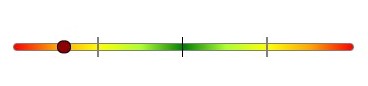
Exemple 3
indicators = [
	{percent:'100%', label:'100'},
	{percent:'50%', label:'50'},
	{percent:'25%', label:'25'}
]

progressValue = {
	percent: 63,
	valueLabel: 63,
	showLabels: false
}
<ng-ls-level-bar [typeLevelBar]="'triangle'" [valueReference] = 100 [valuePercentTolerance] = 10 [currentValue]= 125 [colorsBar]="'blue, darkgreen, #2ebf02, #b39500, yellow, #b39500, #2ebf02, darkgreen, blue'"></ng-ls-level-bar>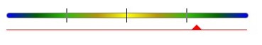
Exemple 4
<ng-ls-level-bar [valueReference] = 100 [valuePercentTolerance] = 10 [currentValue]= 102></ng-ls-level-bar>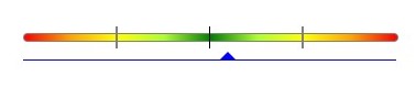
Exemple 5
<ng-ls-level-bar [typeLevelBar]="'circle'" [valueReference] = 100 [valuePercentTolerance] = 10 [currentValue]= 95 [tooltip]="'Text to show here!'"></ng-ls-level-bar>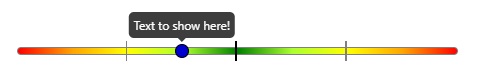
Exemple 6
   <ng-ls-level-bar [typeLevelBar]="'triangle'" [valueReference] = 100 [valuePercentTolerance] = 10 [currentValue]= 95 [tooltip]="tooltipTemplate"></ng-ls-level-bar>
  <ng-template #tooltipTemplate>
    <span>Value 1 in tooltip,</span><br>
    <span>Value 2 in tooltip,</span><br>
    <span>Value 3 in tooltip.</span><br>
  </ng-template>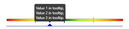
ng-ls-marker-progress-bar
A progress bar that allows you to add value markers.
What Can It Do?
Can use a progress bar configuring:
- Markers;
- Colors;
- Labels;
Using
Include the selector in your html file to render the progress bar:
<ng-ls-marker-progress-bar><ng-ls-marker-progress-bar>
Component Inputs
The component allows some inputs, they are:
- Commons:
- [foregroundColor] = Bar color that corresponds to the filled percentage. Default value is #00bbff
- [backgroundColor] = Bar color that corresponds to the container. Default value is #e8e8e8
- [tooltip] = The string content or a TemplateRef for the content to be displayed in the tooltip. If there is no content, the tooltip will not open.
- [placementTooltip] = The preferred placement of the tooltip. Possible values are "top", "top-left", "top-right", "bottom", "bottom-left", "bottom-right", "left", "left-top", "left-bottom", "right", "right-top", "right-bottom". Default order of preference is "auto"
- [markers] = An object that contains the progress indicator settings.:
Usage examples
Exemple 1
markers = [
	{'percent': 80, label: '$100.00', type: ''}
]

progressMarker = {
	'percent':100,
	'marker-color': '',
	'type': 'top-line',
	'height':'',
	'width':'',
	'prefix': '',
	'prefix-color': '',
	'prefix-signal': '',
	'prefix-signal-color': '',
	'label': '$125.00',
	'label-color': '',
	'label-background-color': '',
	'sufix': '$25.00',
	'sufix-color': 'red',
	'sufix-signal': '+',
	'sufix-signal-color': 'red'
}
<ng-ls-marker-progress-bar [progressMarker]="progressMarker" [markers]="markers" [foregroundColor]="'red'"></ng-ls-marker-progress-bar>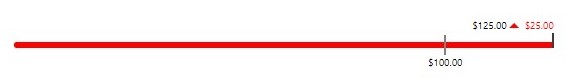
Exemple 2
markers = [
	{'percent': 0, label: '$0.00', type: 'bubble', 'marker-color': 'red'},
	{'percent': 100, label: '$100.00', type: 'bubble', 'marker-color': 'red'}
]

progressMarker = {
	'percent':75,
	'marker-color': '',
	'type': 'top-line',
	'height':'',
	'width':'',
	'prefix': '',
	'prefix-color': '',
	'prefix-signal': '',
	'prefix-signal-color': '',
	'label': '$75.00',
	'label-color': '',
	'label-background-color': '',
	'sufix': '$25.00',
	'sufix-color': 'green',
	'sufix-signal': '-',
	'sufix-signal-color': 'green'}}
<ng-ls-marker-progress-bar [progressMarker]="progressMarker" [markers]="markers" [foregroundColor]="'green'"></ng-ls-marker-progress-bar>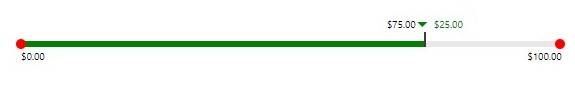
Exemple 3
markers = [
	{'percent': 25, label: '25', type: 'bubble', 'marker-color': '#fc7b03'},
	{'percent': 50, label: '50', type: 'bubble', 'marker-color': '#fc7b03'},
	{'percent': 100, label: '100', type: 'bubble', 'marker-color': '#fc7b03'}
]

progressMarker = {
	'percent':75,
	'marker-color': '#fc7b03',
	'type': 'bubble',
	'height':'',
	'width':'',
	'prefix': '',
	'prefix-color': '',
	'prefix-signal': '',
	'prefix-signal-color': '',
	'label': '63',
	'label-color': '',
	'label-background-color': '',
	'sufix': '',
	'sufix-color': '',
	'sufix-signal': '',
	'sufix-signal-color': ''
}
<ng-ls-marker-progress-bar [progressMarker]="progressMarker" [markers]="markers" [foregroundColor]="'#fc7b03'"></ng-ls-marker-progress-bar>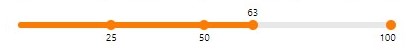
Exemple 4
markers = [
	{'percent': 0, label: '$0.00', type: 'square', 'marker-color': ''},
	{'percent': 100, label: '$100.00', type: 'square', 'marker-color': ''}
]

progressMarker = {
	'percent':39,
	'marker-color': '',
	'type': 'center-line',
	'height':'',
	'width':'',
	'prefix': '',
	'prefix-color': '',
	'prefix-signal': '',
	'prefix-signal-color': '',
	'label': '$39.00',
	'label-color': '#f0f0f0',
	'label-background-color': '#1f1f1f',
	'sufix': '$61.00 (-61%)',
	'sufix-color': '#f0f0f0',
	'sufix-signal': '-',
	'sufix-signal-color': '#f0f0f0'
}
<ng-ls-marker-progress-bar [progressMarker]="progressMarker" [markers]="markers"></ng-ls-marker-progress-bar>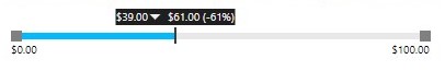
Exemple 5
markers = [
	{'percent': 80, label: '$100.00', type: ''}
]

progressMarker = {
	'percent':100,
	'marker-color': '',
	'type': 'top-line',
	'height':'',
	'width':'',
	'prefix': '',
	'prefix-color': '',
	'prefix-signal': '',
	'prefix-signal-color': '',
	'label': '$125.00',
	'label-color': '',
	'label-background-color': '',
	'sufix': '$25.00',
	'sufix-color': 'red',
	'sufix-signal': '+',
	'sufix-signal-color': 'red'
}
<ng-ls-marker-progress-bar [tooltip]='tooltipTemplate' [progressMarker]="progressMarker" [markers]="markers" [foregroundColor]="'red'"></ng-ls-marker-progress-bar>
<ng-template #tooltipTemplate>
<span>Value 1 in tooltip,</span><br>
<span>Value 2 in tooltip,</span><br>
<span>Value 3 in tooltip.</span><br>
</ng-template>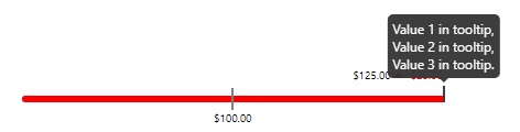
Exemple 6
markers = [
	{'percent': 80, label: '$100.00', type: ''}
]

progressMarker = {
	'percent':100,
	'marker-color': '',
	'type': 'top-line',
	'height':'',
	'width':'',
	'prefix': '',
	'prefix-color': '',
	'prefix-signal': '',
	'prefix-signal-color': '',
	'label': '$125.00',
	'label-color': '',
	'label-background-color': '',
	'sufix': '$25.00',
	'sufix-color': 'red',
	'sufix-signal': '+',
	'sufix-signal-color': 'red'
}
<ng-ls-marker-progress-bar [tooltip]="'Text to show here!'" [placementTooltip]="'bottom'" [progressMarker]="progressMarker" [markers]="markers" [foregroundColor]="'red'"></ng-ls-marker-progress-bar>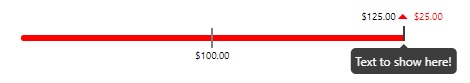
ng-ls-simple-progress-bar
A simple progress bar with two types of view and fully configurable.
What Can It Do?
Can use a simple progress bar configuring:
- Type view;
- Colors;
- Label;
- Sizes;
Using
Include the selector in your html file to render the progress bar:
<ng-ls-simple-progress-bar></ng-ls-simple-progress-bar>Component Inputs
The component allows some inputs, they are:
Commons:
- [steps] = Setting the number of segments that the progress bar will have; Default is 5
- [percent] = Setting the percent of filling progress bar. The min value is 0 and the max value is 100. Any value outside of this range will be ignored. Default is 0
- [foregroundColor] = Color of segments that's corresponding the percent filled. Default is #1890ff
- [backgroundColor] = Color of segments that's corresponding the percent not filled. Default is #f3f3f3
- [typeBar] = Type of shape segments of progress bar. They can be "square", "bubble" or "rounded". Default is 'square'
- [showLabel] = Define if the label of the percent value is showed. Default is 'true'
- [tooltip] = The string content or a TemplateRef for the content to be displayed in the tooltip. If there is no content, the tooltip will not open.
- [placementTooltip] = The preferred placement of the tooltip. Possible values are "top", "top-left", "top-right", "bottom", "bottom-left", "bottom-right", "left", "left-top", "left-bottom", "right", "right-top", "right-bottom". Default order of preference is "auto"
Type "Square" and "Rounded":
- [whidthSegment] = Setting the width of segments of progress bar. The unity used is pixels. Default is 14
- [heightSegment] = Setting the height of segments of progress bar. The unity used is pixels. Default is 8
Type "Bubble":
- [radiusSegment] = Setting the radius of segments of progress bar. The unity used is pixels. Default is 15
Usage examples
Exemple 1
<ng-ls-simple-progress-bar [typeBar]='"bubble"' [radiusSegment]='10' [steps]="10" [percent]="50"></ng-ls-simple-progress-bar>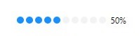
Exemple 2
<ng-ls-simple-progress-bar [steps]="10" [percent]="50"></ng-ls-simple-progress-bar>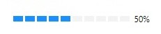
Exemple 3
<ng-ls-simple-progress-bar [typeBar]='"square"' [radiusSegment]='10' [steps]="10" [percent]="75" [heightSegment]="4" [foregroundColor]="'#02cf39'"></ng-ls-simple-progress-bar>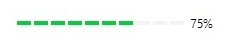
Exemple 4
<ng-ls-simple-progress-bar [typeBar]='"bubble"' [radiusSegment]='5' [steps]="10" [percent]="43" [foregroundColor]="'#e39b17'"></ng-ls-simple-progress-bar>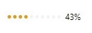
Exemple 5
<ng-ls-simple-progress-bar [typeBar]='"rounded"' [steps]="10" [percent]="89" [foregroundColor]="'#9500a8'"></ng-ls-simple-progress-bar>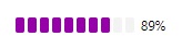
Exemple 6
<ng-ls-simple-progress-bar [steps]='5' [percent]='75' [tooltip]="'Text to show here!'"></ng-ls-simple-progress-bar>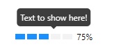
Exemple 7
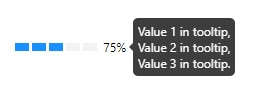
	<ng-ls-simple-progress-bar [steps]='5' [percent]='75'  [tooltip]='tooltipTemplate' [placementTooltip]="'left'"></ng-ls-simple-progress-bar>

	<ng-template #tooltipTemplate>
		<span>Value 1 in tooltip,</span><br>
		<span>Value 2 in tooltip,</span><br>
		<span>Value 3 in tooltip.</span><br>
	</ng-template>