nft-collection-gallery
v0.5.1
Published
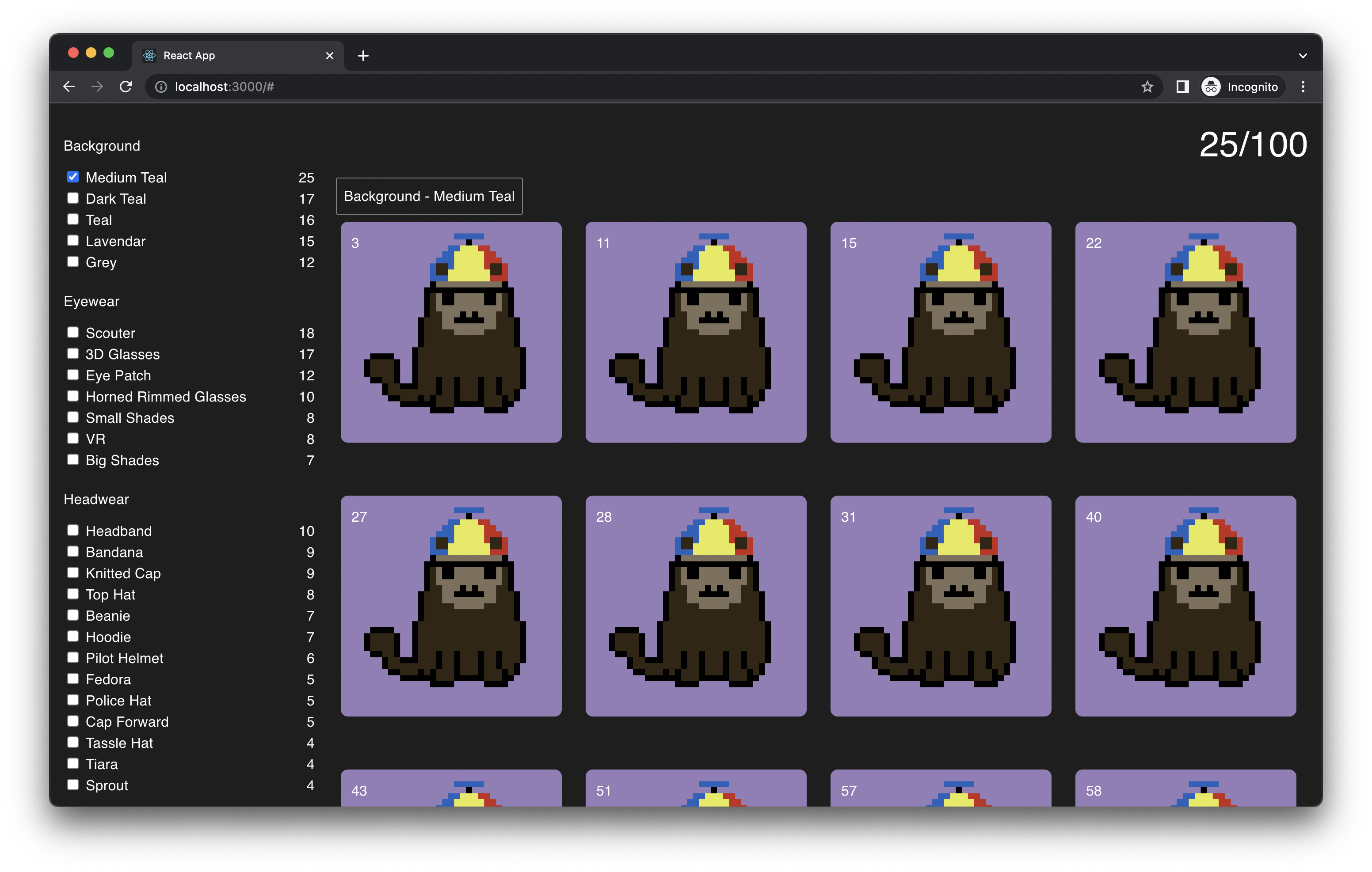
This is a codebase spun out from GENGEN for viewing all your tokens in a gallery with Trait Filters. The default design is basic HTML/CSS and allows easy customization.
Downloads
34
Readme
NFT Collection Gallery
This is a codebase spun out from GENGEN for viewing all your tokens in a gallery with Trait Filters. The default design is basic HTML/CSS and allows easy customization.


You can find a demo here: https://nft-collection-gallery-demo.vercel.app/
Install
npm:
npm install nft-collection-galleryyarn:
yarn add nft-collection-galleryUsage
Here's how to call the component in React:
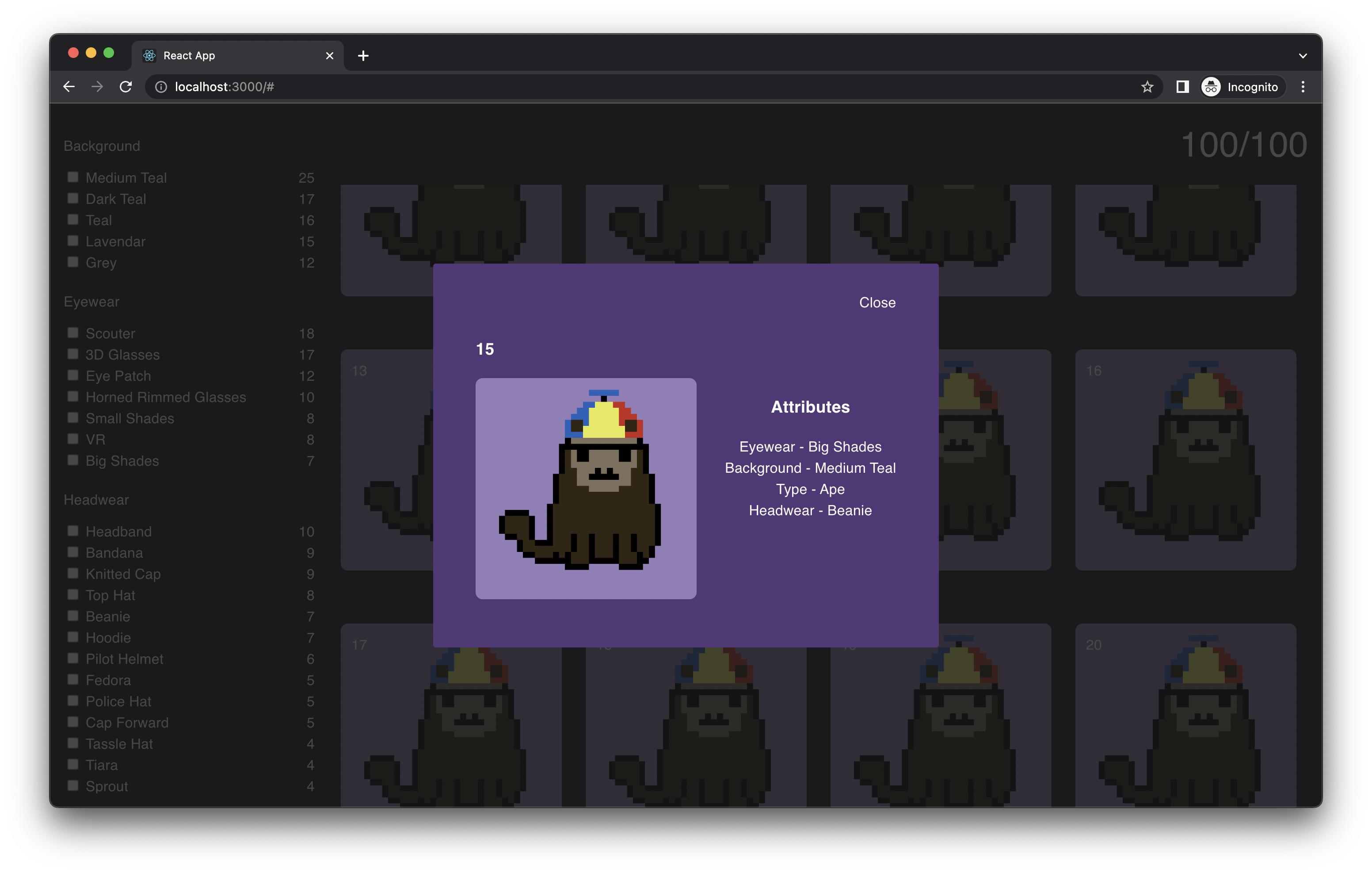
<CollectionGallery tokens={tokens} />Here is an example of what data structure expected from tokens:
[
  {
    "name": 1,
    "image": "larva-neko.png",
    "attributes": [
      {
        "trait_type": "Eyewear",
        "value": "Small Shades"
      },
      {
        "trait_type": "Background",
        "value": "Lavendar"
      },
      {
        "trait_type": "Type",
        "value": "Ape"
      },
      {
        "trait_type": "Headwear",
        "value": "Beanie"
      }
    ],
  },
  ...
]
Trait Filter

Terminology
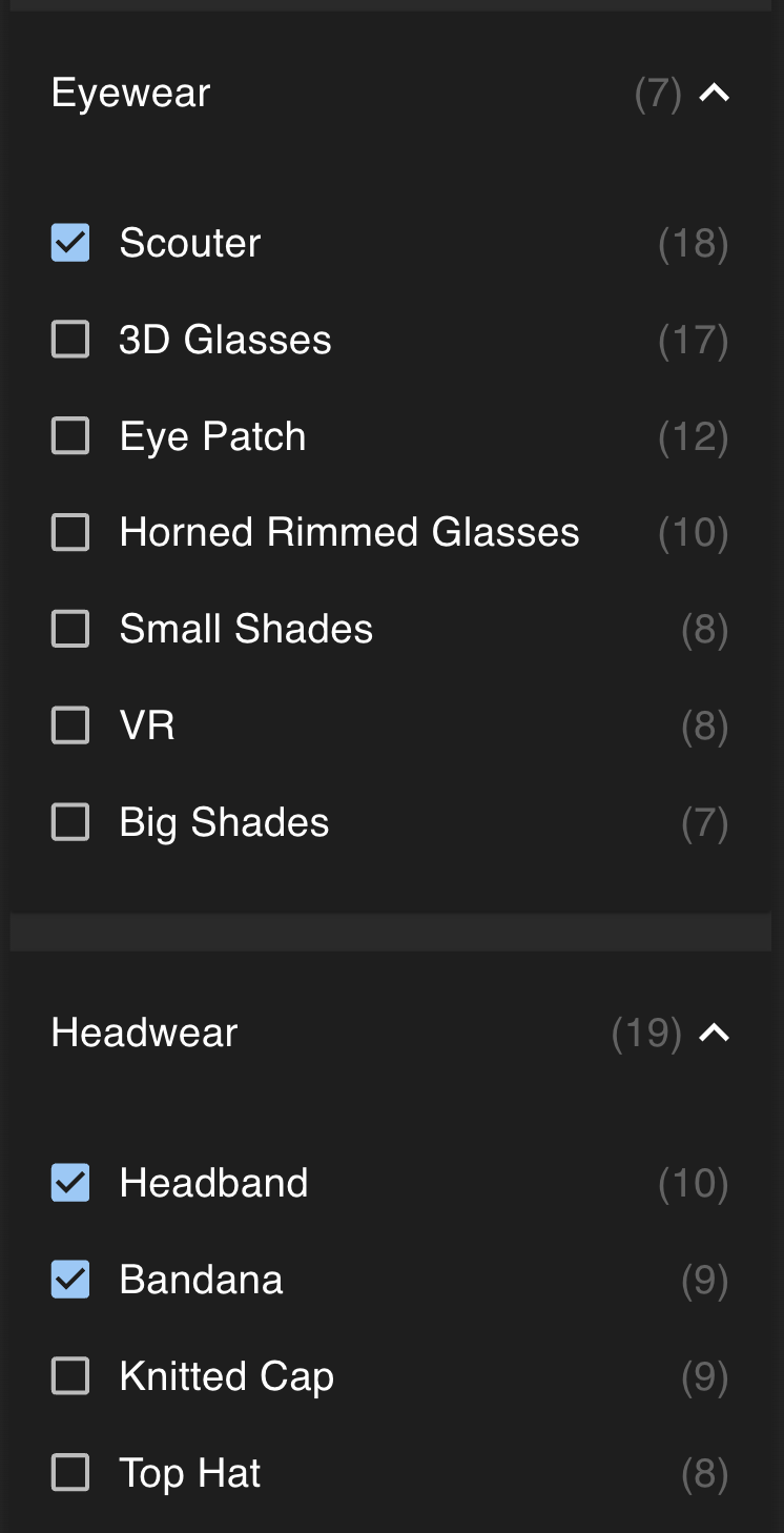
Eyewear is a Trait. Scouter is a Variation.
Filter Logical Conjunctions
The filters use a logical AND between each Trait. Within each Trait, the filter uses a logical OR for each Variation.
For example, let's assume only Headband and Bandana were selected then it would show all tokens with one or the other.
Taking that example further, if Scouter in Eyewear were also selected then then it would show all tokens with the Scouter AND one of the Headwear selected.
Here is a formula expression for how it works:
Trait A = [Variation A, Variation B]
Trait B = [Variation C]
Trait C = [Variation D, Variation E]

Trait A && Trait B && Trait C = (Variation A || Variation B) && (Variation C) && (Variation D || Variation E)
Customization
There are 4 props available in CollectionGallery for you to customize your gallery.
- GalleryLayout
- FiltersLayout
- TokensLayout
- CurrentFiltersLayout
Here is an oversimplified usage example. If you pass in a basic "hello world" into GalleryLayout then you will complete overwrite everything. Obviously, you wouldn't do that, but it should help you understand how the basic idea of customization. I would suggest looking at the respective default components as examples.
const HelloWorld = () => "HelloWorld"

<CollectionGallery GalleryLayout={HelloWorld} />
You can refer to the default components of each one to get an idea for how to customize. It should be very straight forward for any React developer.
- DefaultGalleryLayout
- DefaultFiltersLayout
- DefaultTokensLayout
- DefaultCurrentFiltersLayout
Gallery Themes
WIP - I will be extracting out the original MUI theme into a separate repo and then updating this readme with instructions.
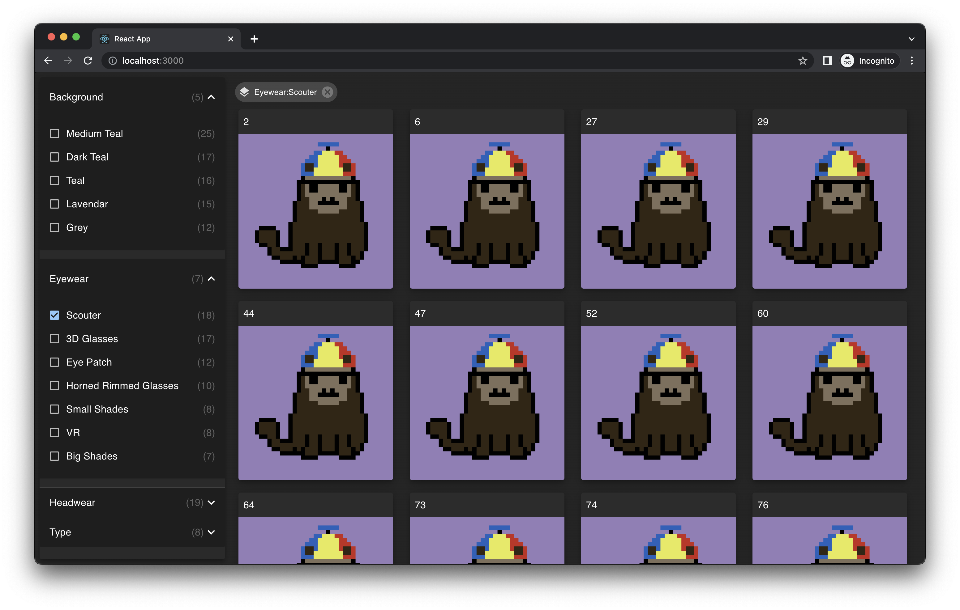
Here's how the gallery would look like with MUI.

Contribution
There is an example create-react-app that you can use in example/ to help test the build files locally. You must link certain packages for it to work.
Build
You have to run the commands to build the files locally for testing. To do so,
npm run buildLinking
In order to develop locally against your local build using the example/ directory, you will need to symlink certain node_module/ packages.
# ./
yarn link-all
Unlinking
If you want to pull the packages for example/ as normal after linking:
yarn unlink-all
yarn install --check-files