
navbar-for-react
v0.2.1
Published
Navbar for react is an open source NodeJs module that tries to make creating websites much easier, with a super practical and responsive navbar.
Downloads
13

Readme
Navbar for React
A simple way to create a navigation bar in your React projects.
Installation
You can install the package using npm or yarn:
npm install navbar-for-reacto
yarn add navbar-for-reactUsage
import React from 'react';
import NavBar from 'navbar-for-react';
const App = () => {
return (
<NavBar
style="common"
logoText="MyLogo"
link1="Home"
link2="About"
link3="Services"
link4="Contact"
link1_direction="/"
link2_direction="/about"
link3_direction="/services"
link4_direction="/contact"
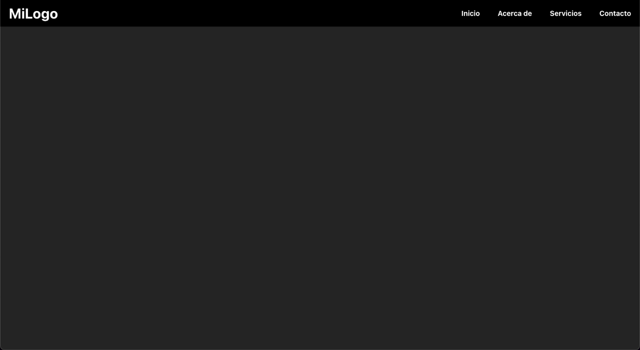
backgroundColor="#000"
textColor="#fff"
/>
);
};
export default App;Your page should look like this:
NOTE:
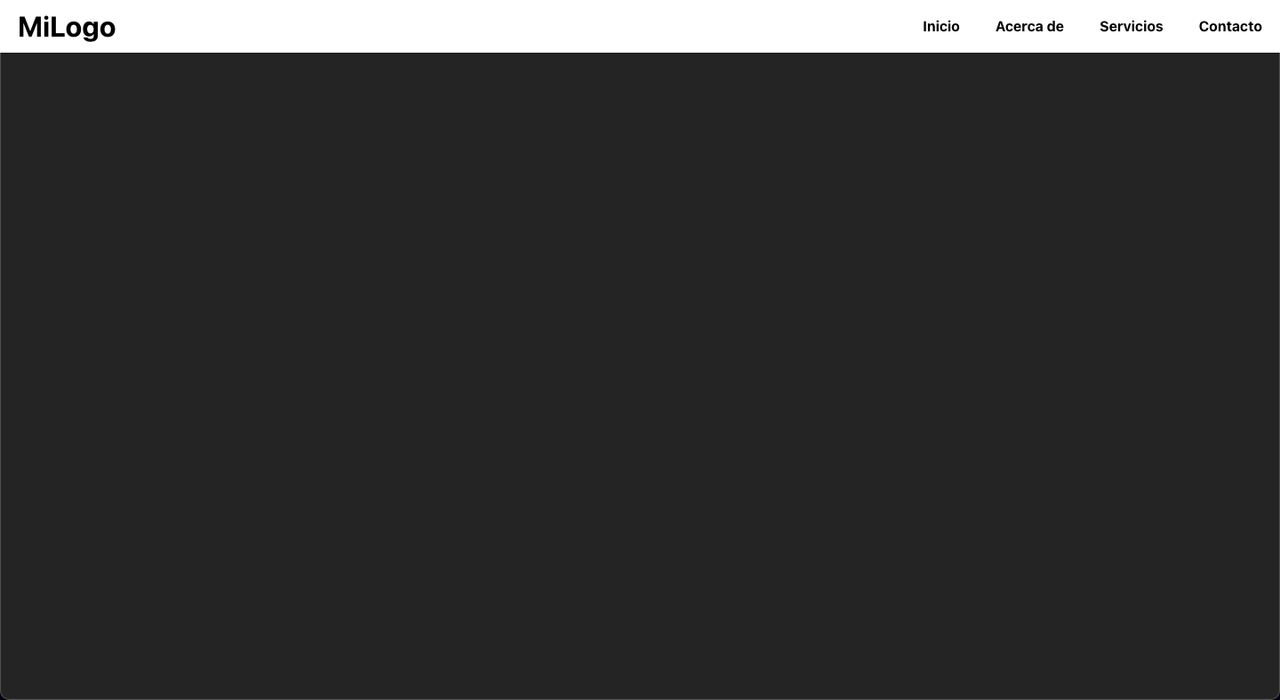
Remember to use hex color codes. If you don't specify colors or specify them incorrectly, the NavBar will have a white background and black text by default.
Your page would look like this:
You can also use the logoImg property, which will show an image instead of text for the logo, but you have to choose between the image and the text, you can't use both.
If you follow the steps correctly, your code would look like this:
import React from 'react';
import NavBar from 'navbar-for-react';
import logoImg from './path/to/image.png'

const App = () => {
  return (
    <NavBar
      style="common"
      logoImg={logoImg}
      link1="Home"
      link2="About"
      link3="Services"
      link4="Contact"
      link1_direction="/"
      link2_direction="/about"
      link3_direction="/services"
      link4_direction="/contact"
      backgroundColor="#000"
      textColor="#fff"
    />
  );
};

export default App;
And your page would look like this:

Version 0.1.1 has brought with it the new property: Style. With this property, you can change how your NavBar will look.
At the moment we only have two styles: common and withoutLogo. If you do not specify a style, the default style will be: common, the NavBar style that we all know.
If you specify the style you want, you can choose between: common and withoutLogo. If you choose withoutLogo, your code would look like this:
import React from 'react';
import NavBar from 'navbar-for-react';
import logoImg from './path/to/image.png'
const App = () => {
return (
<NavBar
style="withoutLogo"
link1="Home"
link2="About"
link3="Services"
link4="Contact"
link1_direction="/"
link2_direction="/about"
link3_direction="/services"
link4_direction="/contact"
/>
);
};
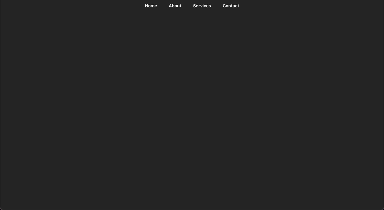
export default App;Here you will not be able to add logos.
From first hand, your page would look like this:
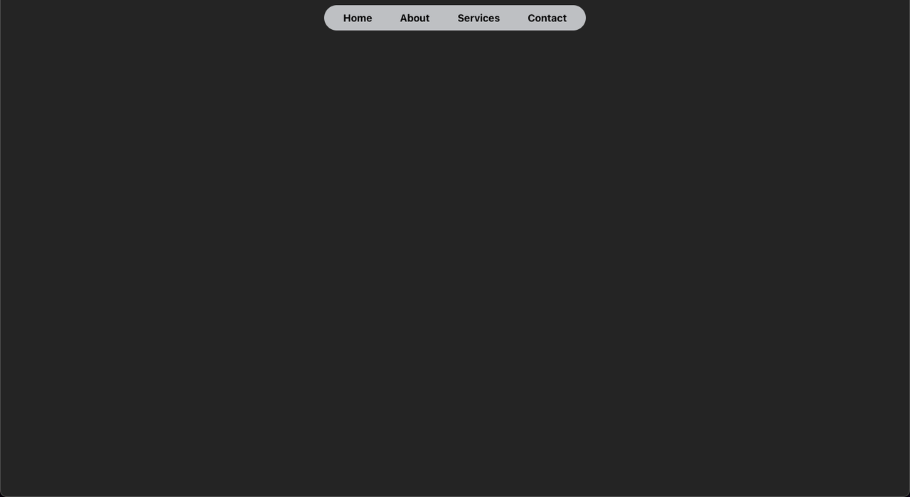
If you scroll a little, your page would look like this:
Props
| Prop | Type | Required | Default | Description |
|--------------------|----------|----------|---------|-----------------------------------------------------------------------------|
| style | string | No |common | The Style of NavBar. Options are common or withoutLo |
| logoText |string| No | - | The text to be displayed as the logo. |
|logoImg |string| No | - | The URL of the image to be displayed as the logo. |
|link1 |string| Yes | - | Text of the first navigation link. |
|link2 |string| Yes | - | Text of the second navigation link. |
|link3 |string| No | - | Text of the third navigation link. |
|link4 |string| No | - | Text of the fourth navigation link. |
|link1_direction |string| No | - | URL of the first navigation link. |
|link2_direction |string| No | - | URL of the second navigation link. |
|link3_direction |string| No | - | URL of the third navigation link. |
|link4_direction |string| No | - | URL of the fourth navigation link. |
|backgroundColor |string| No |#fff | Background color of the NavBar. |
|textColor |string| No |#000 | Text color of the NavBar. |
|hoverColor |string| No |blue` | Hover color for the links. |
HELP:
If you need help, you can visit our Discord channel forum: