my-lunar-calendar
v1.1.22
Published
This is for Vue.
Downloads
6
Readme
Lunar Calendar
This is for Vue.
For React version please go to lunar-calendar-react.
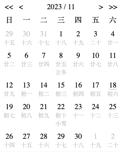
Supports both solar and lunar calendar displaying.
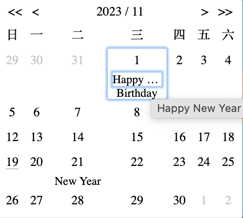
Displaying events is supported.
Please see the configurations below.
Configurations
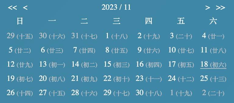
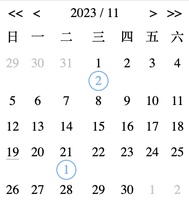
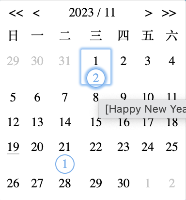
| Name | Data Type | Default | Description | Example | |---|---|---|---|---| | wrapperStyles | Object | {} | Root element styles | { paddingTop: '10px' } | | rowStyles | Object | {} | Row styles | { paddingTop: '10px' } | | cellStyles | Object | {} | Cell styles | { paddingTop: '10px' } | | lunarTextStyles | Object | {} | Lunar text styles | { paddingTop: '10px' } | | toolbarStyles | Object | {} | Toolbar styles | { paddingTop: '10px' } | | selectedCellStyles | Object | {} | Selected date styles | { backgroundColor: 'blue' } | | hideToolbar | Boolean | false | If true will hide toolbar | true | | autoHideToolbar | Boolean | false | If true only show toolbar when mouse hover on it. The layout won't change, use css visibility | true | | showLunar | Boolean | false | If true will show lunar date and term | true | | alwaysShow | Boolean | false | It's suitable for read mode or put it anywhere for customization | true | | showWeeksInEn | Boolean | false | Show weeks in English | true | | showTime | Boolean | false | Show both date and time, only show hours and minutes by default | true | | showSeconds | Boolean | false | Show seconds | true | | noBg | Boolean | false | If true the background will be transparent without border | true | | selectedDate | Date | now | Current date | new Date() | | lunarSameRow | Boolean | false | If true will put solar and lunar text in the same row | true | | showEvents | Boolean | true | If no events, then no difference with false | false | | showEventsOnlyCount | Boolean | false | Only show event numbers | true | | eventStyles | Object | {} | Set maxWidth, etc | { maxWidth: '40px'} | | eventCountStyles | Object | {} | Event numbers style | { width: '20px', color: 'blue'} | | events | Object Array | [] | Events array, name is required. Any other properties are accepted | [{ date: '2023-11-01', events: [{ name: 'Happy New Year' }, { name: 'Birthday' }]},] |
event: selectDate(data, e), result as below
Data
{
    "year": 2023,
    "month": 11,
    "date": 16,
    "lunarYear": 2023,
    "lunarMonth": "十月",
    "lunarDate": "初四",
    "lunarWeek": "星期四",
    "animal": "兔",
    "gzDay": "戊寅",
    "gzMonth": "癸亥",
    "gzYear": "癸卯",
    "isLeap": false,
    "week": 4,
    "term": null,
    "fullDate": "2023-11-16"
    "hour": 18,
    "minute": 6,
    "second": 25,
    "fullTime": "18:06:25",
    "fullDateTime": "2023-11-16 18:06:25"
}
Event
Event objectevent: selectEvent(eventData, dateData, e), result as below
Event data
{ "name": "Happy New Year" }Date data
{
  "year": 2023,
  "month": 11,
  "date": 1,
  "label": 1,
  "lunarDate": "十八",
  "events": [{ "name": "Happy New Year" }, { "name": "Birthday" }],
  "term": null,
  "fullDate": "2023-11-01"
}
Click event
Event objectevent: selectEventCount(dateData, e), result as below
Date data
{
  "year": 2023,
  "month": 11,
  "date": 1,
  "label": 1,
  "lunarDate": "十八",
  "events": [{ "name": "Happy New Year" }, { "name": "Birthday" }],
  "term": null,
  "fullDate": "2023-11-01"
}
Click event
Event objectusages
Import css and component anywhere you need
import 'my-lunar-calendar/style.css';
import { LunarCalendar } from 'my-lunar-calendar';
Use it in the html part
<LunarCalendar :showLunar="true">
    <template v-slot:default="{ onTrigger }">
        <span @click="onTrigger">Some text</span>
    </template>
</LunarCalendar>
<LunarCalendar
@selectDate="onSelectDate(data, event)"
:alwaysShow="true"
:noBg="true"
:autoHideToolbar="true"
:wrapperStyles="{ color: '#fff' }"
/>Examples
Wrapped by custom element without bg
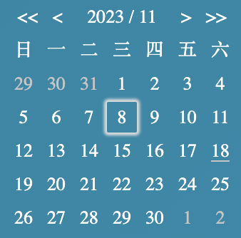
Lunar calendar
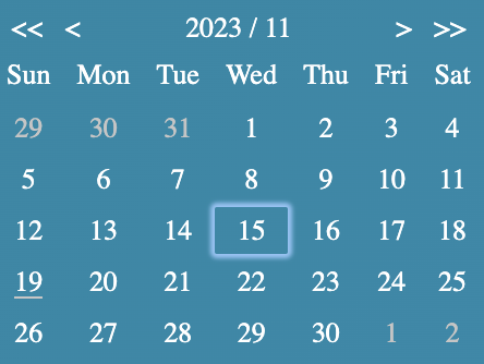
Show weeks in English
Show time
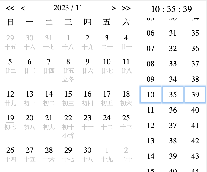
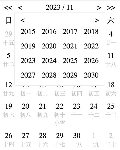
Select year panel
Lunar same row
Event count
Event count tooltip
Event text
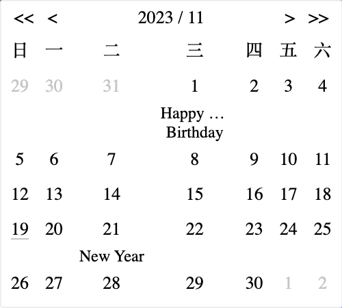
Event text tooltip
Support
For customizations, please send email to [email protected].
