
mui-bottom-sheet
v1.0.3
Published
> 👆 A delightful bottom sheet component for react up to material design spec
Downloads
115
Maintainers
 harelpls
Readme
mui-bottom-sheet
👆 A delightful bottom sheet component for react up to material design spec
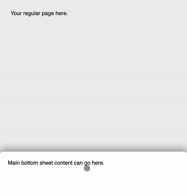
The bottom sheet in the Google Maps app for a location is really nice. I set out to recreate that level of UX detail with a modern BottomSheet for React. Try it in the storybook.
Under the hood it uses react-spring for delightful animations and react-use-gesture to handle dragging. This is still a work in progress - let me know features you'd like and I'll add them in.
Installation
yarn add mui-bottom-sheetUsage
import React from 'react';
import { BottomSheet } from 'mui-bottom-sheet';

export const App = () => {
  return <BottomSheet>Add your content here</BottomSheet>;
};
Props (options)
| prop | type | description | default |
| --------------- | -------------------------------------------- | ---------------------------------------------------------------------------------------------------------------------------------------------------------------------- | -------------------------------------------- |
| backdrop | boolean? | Whether to show the transparent backdrop that fades in as you pull up. | true |
| background | React.ReactElement? | Background element that slides up behind the main bottom sheet. | null |
| currentIndex | number? | Pass in an index to control which stop height the sheet is at. Number should be in range of total stops: [defaultHeight, ...peekHeights, fullHeight?]. | undefined |
| defaultHeight | number? | Default height when the sheet is closed. | 100 |
| hidden | boolean? | When true, the sheet will completely hide at the bottom of the screen. | false |
| fullHeight | boolean? | Whether to allow the sheet to go 100% of the screen height. If false, the highest it can go is the maximum of peekHeights. Otherwise it'll stick to defaultHeight. | true |
| onIndexChange | (index:number) => void? | This will be fired when the user interacts with the sheet and moves it to a position other than the current one. | undefined |
| peekHeights | number[]? | Progressive peek heights for the bottom sheet to stop at. Use this to reveal more detailed information as the sheet is pulled up. | [] |
| springConfig | Record<string, any>? | The react-spring config used when snapping to heights. | config.stiff |
| styles | { root: {}, backdrop: {}, background: {} } | Pass additional styles to either the sheet, the backdrop or the background components. | { root: {}, backdrop: {}, background: {} } |
| threshold | number? | The threshold for over-dragging the sheet above its maximum height before it snaps to the highest position. | 70 |
Upcoming
- [ ] Cypress tests - Jest doesn't play nicely with dragging and dropping. Help appreciated.
- [ ] Hooks API for binding custom components instead of a prescribed
animated.div - [x] ~~Programatically set stop height~~ see
currentIndexandonIndexChange - [x] ~~Access to current stop index~~
- [x] ~~
open()andclose()for programatic interaction~~ - [ ] passing custom
react-springconfig - [ ] anything else?