
modal-simple
v1.0.19
Published
This is a simple quick and customizable modal component that you can use in your App. The modal is based on bootstrap.
Downloads
41
Maintainers
 veensy
Readme
Modal-Simple
This is a simple quick and customizable modal component that you can use in your App. The modal is based on bootstrap.
Installation
npm i modal-simple react-bootstrap and don't forget to add the bootstrap's stylesheet <link> into your <head> before all other stylesheets to load CSS :
Demo
Examples
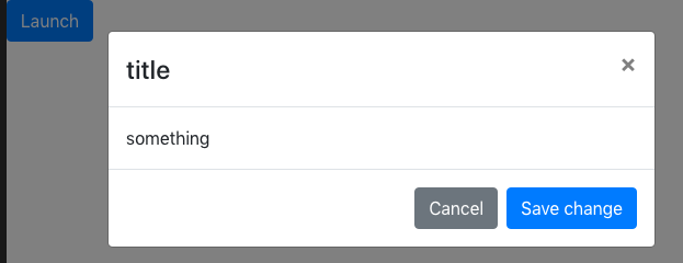
Simple use
<Modal title={{ text: "title" }} bodyText="something" />
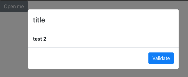
Simple Custom
<Modal
  open={{
    text: "Open me",
    className: "open",
    variant: "secondary"
  }}
  title={{ text: "title" }}
  closeBtn={{ show: false }}
>
  <strong>test 2</strong>

  <Modal.Footer validate={{ text: "Validate", variant: "primary" }} />
</Modal>
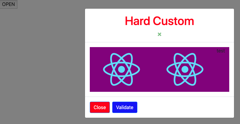
Hard custom
state = { show: false };
modalState = () => {
this.setState({ show: !this.state.show });
};
render() {
    return (
    <div className="App">
        <button className="open" onClick={this.modalState}>
        "Open"
        </button>
        <Modal
            show = {this.state.show}
            onHide = {this.modalState}
            closeBtn = {{ show: true, className: "btn-close" }}
            className = {{
                modal: "modal-block-App",
                header: "header-block",
                body: "body-block",
                footer: "footer-block"
            }}
            <Modal.Header>
                <h1 className='title'>Hard Custom</h1>
            </Modal.Header>
            <Modal.Body>
                <div className="d-flex flex-row body-block">
                    <img src={logo} alt="logo"/>
                    <img src={logo} alt="logo"/>
                    test
                </div>
            </Modal.Body>

            <Modal.Footer
                validate = {{
                    text: "Validate",
                    action: this.modalState,
                    className: "btn-valid"
                }} ,
                cancel = {{
                    text: "Close",
                    action: this.modalState,
                    className: "btn-cancel"
                }}
            />
        </Modal>
    </div>
    )
}
API
Modal
| Name | Type | Default | Description | | :-------: | :------: | :-------------------------------------------------------------------: | :--------------------------------------------------------------------------------------------------------------------------: | | show | boolean | false | When true the modal willshow itself. | | onHide | function | | A callback fired when theheader closeButton or non-static backdrop is clicked. Required if either specified. | | title | object | text: string className: string | Specify the header title and className. | | closeBtn | object | show : Boolean className : string | Specify if you need the close button appear and apply a class. | | className | object | modal: stringheader: stringbody: stringfooter: string | Add a className to each part to be able to custom them. | | footer | boolean | true | if you don't want the block footer appear set it to false. | | open | object | text: string className: stringvariant: string | You can custom the provide button by your own text and style. |
Modal.Footer
| Name | Type | Default | Description | | :------: | :----: | :---------------------------------------------------------------------: | :-------------------------------------------------------------------: | | validate | object | text: string action: functionclassName:stringvariant:string | You can custom the provide button by your own text and style. | | cancel | object | text: string action: functionclassName:stringvariant:string | You can custom the provide button by your own text and style. |