
material-ui-mix-icon
v0.2.6
Published
<ComposedIcon> component for material-ui
Downloads
65
Maintainers
 kadarka
Readme
material-ui-mix-icon - <CombineIcon>
Combine 2 icons for extra status display, exception notation or variance presentation.
WHY: When having a simple icon to describe one element, sometimes, the element being flavored in specific ways needs a consistent way to describe complex states; e.g:
- User vs User with Admin Privileges
- Server vs Server provisioned with K8s
- Email vs Email with Priority
- ...
Installation & Usage
npm install --save material-ui-mix-iconClass React Component
import React, { Component } from 'react';
...
import ComposedIcon from 'material-ui-mix-icon';

class ExampleComponent extends Component {
    render() {
        return (
            <React.Fragment>
            ...
                <ComposedIcon
                    position="bottom-end"
                    size="medium"
                    icon='keyboard'
                    extraIcon='key'/>
            ...
            </React.Fragment>
        );
    }
}
export default ExampleComponent;
Functional React Component
import React from 'react';
...
import ComposedIcon from 'material-ui-mix-icon';

const ExampleComponent = ({..., position, ...}) => (
    <React.Fragment>
        ...
            <ComposedIcon
                position={position}
                size="medium"
                icon='keyboard'
                extraIcon='key'/>
        ...
    </React.Fragment>
)
...
export default ExampleComponent;
Integration
The simple-embedded way (CDN reliant)
NOTE: Example based on the default project structure provided by facebook/create-react-app project
In public/index.html in the <head> section add:
<link rel="stylesheet" href="https://use.fontawesome.com/releases/v5.12.0/css/all.css" />eventually should look like this:
<meta
    name="description"
    content="Web site created using create-react-app"
/>
<link rel="apple-touch-icon" href="%PUBLIC_URL%/logo192.png" />
...
    <link rel="stylesheet" href="https://use.fontawesome.com/releases/v5.12.0/css/all.css" /> --- add this line
...
<link rel="manifest" href="%PUBLIC_URL%/manifest.json" />
Configuration
Variables supported by the library and available knobs for customization. All enforced by PropTypes.
Required Properties
- icon - Supporting a string or a non
faobject type - extraIcon - Supporting a string or a non
faobject type
Optional Properties
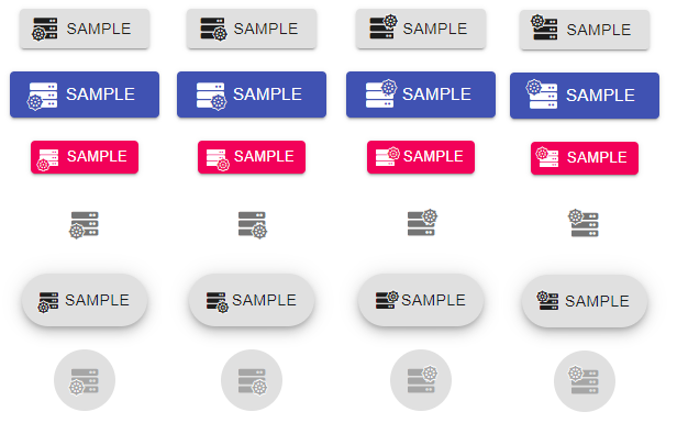
- size - selection from Material UI standard values: small, medium or large. Default: small
- color - inherited property from Material UI. Possible values: inherit, primary, secondary. Default: inherit
- position - Placement of extra icon. Possible values: top-start, top-end, bottom-start, bottom-end. Default: bottom-end
- disabled - Boolean to mark the disabled flag for the icon presentation. Default: false
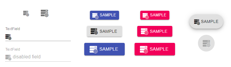
Sample Usage
Simple usage in Material UI elements, as child element or startIcon or start/endAdornment:
Self contained component with example values:
<ComposedIcon
    position='bottom-end'
    color="primary"
    size="large"
    icon='server'
    extraIcon='dharmachakra'
/>
Embedded in a button
 <Button
    variant="contained"
    color="primary"
    size="small"
    startIcon={
        <ComposedIcon
            position={props.position}
            color="primary"
            size='small'
            icon='server'
            extraIcon='dharmachakra'
        />}
    >
    Sample
</Button>
Icon button usage:
<IconButton aria-label="sample-icon-button">
    <ComposedIcon
        position={props.position}
        size="large"
        icon='server'
        extraIcon='dharmachakra'
    />
</IconButton>
Fab button usage:
 <Fab disabled aria-label="like">
    <ComposedIcon
        position={props.position}
        size="large"
        disabled
        icon='server'
        extraIcon='dharmachakra'
    />
</Fab>
And also in a field with adornment
 <TextField
    id="input-with-icon-textfield"
    label="TextField"
    disabled
    defaultValue="disabled field"
    InputProps={{
    startAdornment: (
        <InputAdornment position="start">
        <ComposedIcon
            position={props.position}
            size="small"
            icon='server'
            extraIcon='dharmachakra'/>
        </InputAdornment>
    ),
    }}
/>