material-tabs
v0.0.8
Published
A simple React package that provides the Material Design tab component.
Downloads
403
Maintainers
Readme
material-tabs
What is it?
A simple React package that provides the Material Design tab component.
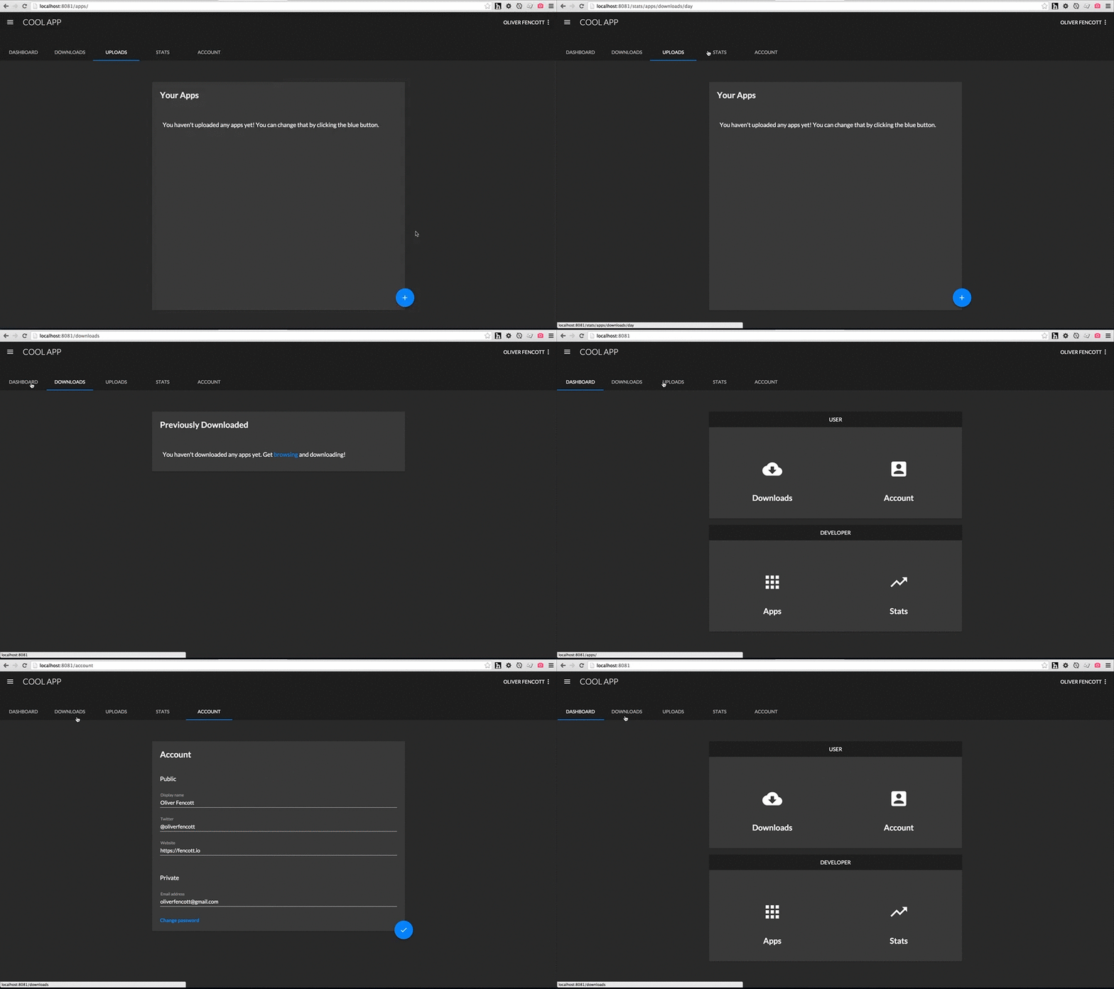
This is what they look like:

Gifs, because open source, because Internet.
Get started
npm install --save material-tabsExample
The code in the above example looks like:
import {TabGroup, Tab} from 'material-tabs';

const tabs = [
  {linkTo: 'dashboard', label: 'Dashboard'},
  {linkTo: 'downloads', label: 'Downloads'},
  {linkTo: 'uploads', label: 'Uploads'},
  {linkTo: 'totalStats', label: 'Stats'},
  {linkTo: 'account', label: 'Account'}
];

const Layout = React.createClass({
  render: function() {
    return (
      <div>
        <div style={{backgroundColor: '#212121'}}>
          <div style={{width: 700}}>
            <TabGroup style={{indicator: {color: '#2196f3'}}}>
              {this.renderTabs()}
            </TabGroup>
          </div>
        </div>

      // Rest of layout

      </div>
    );
  },

  renderTabs: function() {
    return tabs.map((tab, index) => {
      return (
        <UnstyledLink to={tab.linkTo} key={index}>
          <Tab>
            {tab.label}
          </Tab>
        </UnstyledLink>
      );
    });
  }
});
Components
The package provides 2 components: Tab and TabGroup, used together like so:
import {Tab, TabGroup} from 'material-tabs';

const NavigationTabs = React.createClass({
  render: function() {
    return (
      <TabGroup>
        <Tab>
          One
        </Tab>
        <Tab>
          Two
        </Tab>
      </TabGroup>
    );
  }
)};
The following aspects are determined as a result of the number of children TabGroup has:
- The position of the indicator (underline), highlighting which tab was clicked and
- The width of each
Tab.
Meaning each Tab will always be identical in width.
TabGroup
By default, the following styles are applied:
TabGroupis 100% width of it's parent,- The indicator is #FFFFFF (white).
- Background colors are default (inherit).
TabGroup accepts the following style prop:
style={{ indicator: { color: '#FF5722' } }}TabGroup accepts an onChangeTab prop which passes the index of the newly selected Tab back up, used like so:
render: function() {
  return (
    <TabGroup onChangeTab={this.handleChange}>
      <Tab>
        One
      </Tab>
      <Tab>
        Two
      </Tab>
    </TabGroup>
  );
},

handleChange: function(index) {
  console.log(index); // 1
}
It also accepts a defaultSelectedTab prop, which should be the index of the tab to be selected on initial render, which by default is of course 0. This would be used to make sure the correct tab is selected when arriving from an external link.
Because the TabGroup component only cares about how many children it has (as opposed to what the children are), it's very easy to use the Tabs nested inside links (such as when using the very excellent and highly recommended React-router). For example:
render: function() {
  return (
    <TabGroup>
      <Link to='home'>
        <Tab>
          Home
        </Tab>
      </Link>
      <Link to='favourites'>
        <Tab>
          Favourites
        </Tab>
      </Link>
    </TabGroup>
  );
}
will render exactly the same without links (save for default link styling).
Tab
By default, the following styles are applied:
- The currently selected
Tabtext color is #FFFFFF (white), - Unselected
Tabs are the same color, with an opacity of 0.7 applied, - Background colors are default (inherit).
All other styles follow the spec, such as text styling, spacing, heights, and animation.
Tab accepts the following style prop:
style={{ color: '#FF5722' }}Tab accepts a regular onClick prop as you would expect.
Todo
- Add support for icons with text
- Add touch animations
