mat-timepicker
v5.5.1
Published
Angular Material timepicker component with clock view dialog, min/max validation, and support for both 12h/24h formats
Maintainers
Readme
Angular Material Timepicker
Version Compatibility
| mat-timepicker | Angular | Notes |
| -------------- | ------- | ------------------------------------------------ |
| 5.5.x | 19.x | Standalone components |
| 5.4.x | 18.x | |
| 5.3.x | 17.x | |
| 5.2.x | 16.x | Added matTimepickerToggle directive |
| 5.1.x | 15.x | |
| 5.0.x | 14.x | i18n no longer requires @angular/localize/init |
Installation
npm install mat-timepicker||yarn add mat-timepicker
Features:
- Clock view dialog for selecting hour and minutes and options for dialog toggle customizations.
- Input time editing.
- Validations: minDate / maxDate (options: strict - datetime check / non-strict - time check).
- The timepicker can be used with template and reactive forms.
Configuration and usage
Keep in mind that the selector for the timepicker directive is input[matTimepicker]
Standalone Components (Angular 19+, recommended)
You can import the MatTimepickerModule or import the directives directly:
import { Component } from "@angular/core";
import { MatTimepickerDirective, MatTimepickerToggleDirective } from "mat-timepicker";

@Component({
  selector: "app-example",
  standalone: true,
  imports: [MatTimepickerDirective, MatTimepickerToggleDirective],
  template: `
    <input matTimepicker #t="matTimepicker" />
    <mat-icon [matTimepickerToggle]="t">access_time</mat-icon>
  `,
})
export class ExampleComponent {}
NgModule (traditional approach)
import { MatTimepickerModule } from 'mat-timepicker';

@NgModule({
  declarations: [...],
  imports: [MatTimepickerModule],
  ...
})
export class YourModule { }
Simple Case
<input matTimepicker />With Toggle Button (v5.2.0+)
Using the new matTimepickerToggle directive for cleaner syntax:
<mat-form-field appearance="fill">
  <mat-label>TIMEPICKER</mat-label>
  <input matTimepicker #t="matTimepicker" mode="24h" placeholder="Select time..." />
  <mat-icon matSuffix [matTimepickerToggle]="t">access_time</mat-icon>
</mat-form-field>
More Complex Case
<mat-form-field appearance="fill">
  <mat-label>TIMEPICKER</mat-label>

  <input matTimepicker #t="matTimepicker" #time="ngModel" [minDate]="minValue" [maxDate]="maxValue" [strict]="false" id="timepicker-example" mode="24h" [ngModel]="defaultValue" placeholder="Please select time..." name="time" [errorStateMatcher]="customErrorStateMatcher" required (timeChange)="timeChangeHandler($event)" (invalidInput)="invalidInputHandler()" />

  <!-- Option 1: Using the toggle directive (v5.2.0+) -->
  <mat-icon matSuffix [matTimepickerToggle]="t">access_time</mat-icon>

  <!-- Option 2: Or manually call showDialog() -->
  <!-- <mat-icon matSuffix (click)="t.showDialog()">access_time</mat-icon> -->

  <mat-error *ngIf="time.touched && time.invalid">Invalid Date</mat-error>
</mat-form-field>
MatTimepickerToggle Directive (v5.2.0+)
The matTimepickerToggle directive provides a simple way to open the timepicker dialog:
<!-- On any element (button, icon, etc.) -->
<button [matTimepickerToggle]="timepickerRef">Open</button>
<mat-icon [matTimepickerToggle]="timepickerRef">access_time</mat-icon>
This automatically:
- Opens the timepicker dialog on click
- Sets cursor to pointer
- Stops event propagation
MatTimepicker Directive API
@Input() required = false;
@Input() disabled = false;
@Input() placeholder = null;

/* Use a custom template for the ok button */
@Input() okButtonTemplate: TemplateRef<MatTimepickerButtonTemplateContext> | null = null;
/* Use a custom template for the cancel button */
@Input() cancelButtonTemplate: TemplateRef<MatTimepickerButtonTemplateContext> | null = null;
/* Where:
  export interface MatTimepickerButtonTemplateContext {
    $implicit: () => void; <--- The click handler for each the button (either okClickHandler/closeClickHandler)
    label: string; <--- The label that was provided to the mat-timepicker directive (either okLabel/cancelLabel)
  }
  In order to use this check out the bottom of the template driven form inside the example app
*/

/* Override the label of the ok button. */
@Input() okLabel = 'Ok';

/* Override the label of the cancel button. */
@Input() cancelLabel = 'Cancel';

/** Override the ante meridiem abbreviation. */
@Input() anteMeridiemAbbreviation = 'am';

/** Override the post meridiem abbreviation. */
@Input() postMeridiemAbbreviation = 'pm';

/* Sets the clock mode, 12-hour or 24-hour clocks are supported. */
@Input() mode: '12h' | '24h' = '24h';

/* Set the color of the timepicker control */
@Input() color: ThemePalette = 'primary';

/* Set the value of the timepicker control */
/* ⚠️(when using template driven forms then you should use [ngModel]="someValue")⚠️ */
@Input() value: Date = new Date();

/* Minimum time to pick from */
@Input() minDate: Date;

/* Maximum time to pick from */
@Input() maxDate: Date;

/* Disables the dialog open when clicking the input field */
@Input() disableDialogOpenOnClick = false;

/* Input that allows you to control when the control is in an errored state */
/* (check out the demo app) */
@Input() errorStateMatcher: ErrorStateMatcher;

/* Strict mode checks the full date (Day/Month/Year Hours:Minutes) when doing the minDate maxDate validation. If you need to check only the Hours:Minutes then you can set it to false */
@Input() strict = true;

/* Emits when time has changed */
@Output() timeChange: EventEmitter<any> = new EventEmitter<any>();

/* Emits when the input is invalid */
@Output() invalidInput: EventEmitter<any> = new EventEmitter<any>();
Check out the Demo App! (Please note that stackblitz sometimes fails to run Angular applications properly and that doesn't mean that the library is broken)
What's New in v5.2.0
- ✨ New
matTimepickerToggledirective - Simpler syntax for toggle buttons/icons - 🐛 Fixed meridiem conversion bugs - Correctly handles PM times and 12 AM (midnight)
- 🐛 Improved validation - Invalid values no longer saved to model
- ✅ Enhanced test coverage - 95% code coverage with comprehensive tests
- 🧹 Code quality improvements - Removed dead code and improved maintainability
i18n (v5.0.0+)
In versions before v5.0.0 putting import '@angular/localize/init'; inside polyfills.ts was mandatory. From v5.0.0 it is no longer mandatory (which is useful for users that are not using i18n). In order to use i18n you have to use the inputs: okLabel, cancelLabel.
Please note that you need to provide both the input attribute and the value (e.g. okLabel="Ok") and the i18n attribute (e.g. i18n-okLabel="|@@") for more info check out this
Example:
<div>
  <mat-form-field appearance="fill">
    <mat-label i18n="Timepicker 1 Title">24 TIMEPICKER</mat-label>
    <input matTimepicker #t1="matTimepicker" i18n-okLabel="Timepicker 1 Ok Label" okLabel="Ok" i18n-cancelLabel="Timepicker 1 Cancel Label" cancelLabel="Cancel" #time1="ngModel" [minDate]="minValue" [maxDate]="maxValue" id="timepicker-example-1" mode="24h" ngModel placeholder="Please select time..." name="time-1" required />
    <mat-icon matSuffix [matTimepickerToggle]="t1">access_time</mat-icon>
    <mat-error *ngIf="time1.touched && time1.invalid">Invalid Date</mat-error>
  </mat-form-field>
</div>
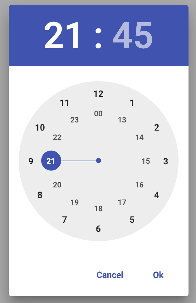
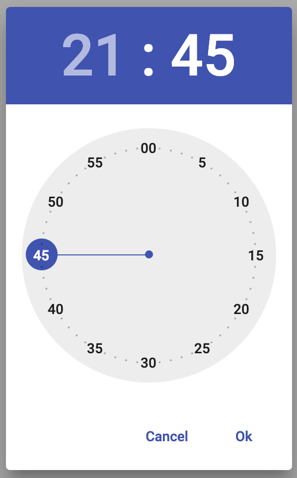
Dialog View
Hour Select (24h):

Minutes Select:


