mannai-components1
v4.0.1
Published
A reusable login component for React
Downloads
30
Readme
Login-HTTP
1. Normal Login
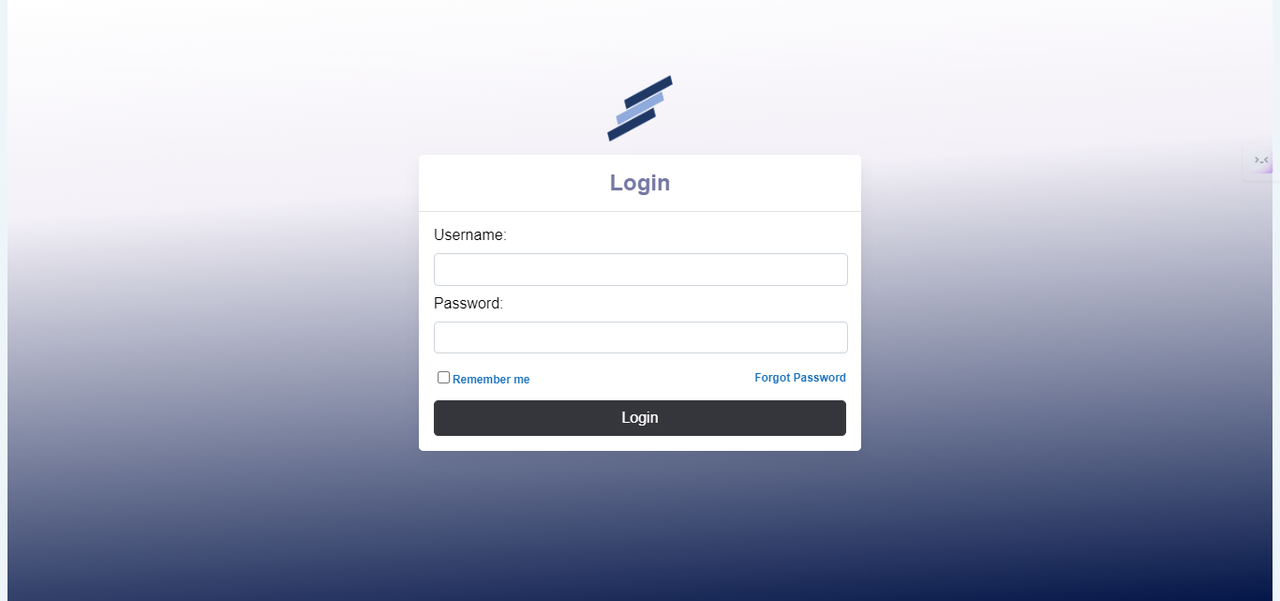
Description: This Widget enables us to add a normal Login functionality which connects with server.This is the traditional method where a user logs in using a username and password.
User Interface:

Implementation Steps
1.Install the NPM Package
npm install mannai-components
2.Import the below components to your implementation page
import Login from 'mannai-components'; import { createRoot } from "react-dom/client"; import './Theme.scss'; import logo from './images/logo.png'; import axios from 'axios';
3.Create a div where this component should be placed and add the tag to load it.
<Login.LoginComponent onLogin={handleLogin}/>
Normal Login Configuration
const handleLogin = async (username, password) => {
try {
const params = new URLSearchParams();
params.append('username', username);
params.append('Password', password);
const response = await axios.post('', params, {
headers: {
'Content-Type': 'application/x-www-form-urlencoded'
}
});
console.log(response.data);
} catch (error) {
setError('Login failed. Please check your credentials and try again.');
console.error(error); // Handle error response
}
};
Backend Process:
The form data is sent to the server via a POST request.
The server validates the credentials against the stored user data.
If valid, the user is authenticated and a session is created.
Response:
Success: User is redirected to the dashboard or home page.
Failure: An error message is displayed indicating invalid credentials.
2. Login with Token Authentication ID
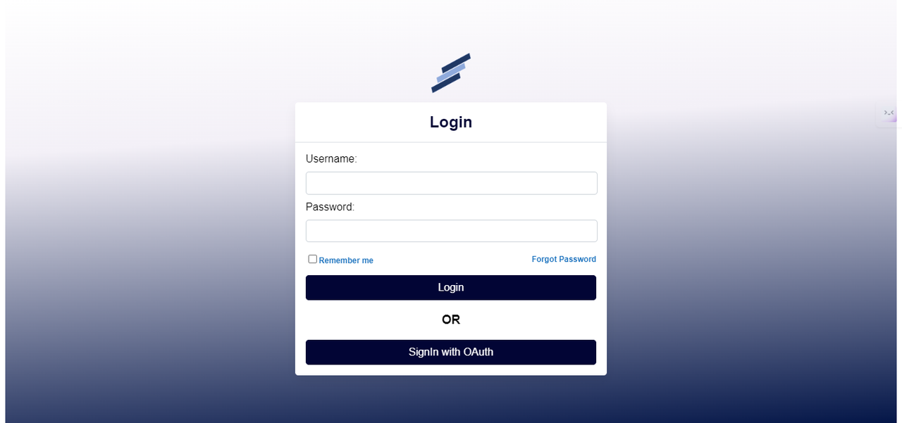
Description: This method uses a token generated by the server to authenticate the user. The token is usually provided after an initial login and can be used for subsequent logins.
User Interface:

Implementation Steps
1.Install the NPM Package
npm install mannai-components
2.Import the component to your implementation page
import React, { useState } from 'react'; import Login from 'mannai-components'; import { createRoot } from "react-dom/client"; import { Route, Routes, BrowserRouter } from "react-router-dom"; import axios from 'axios'; import Home from "./components/Home.jsx"; import Failed from './components/Failed.jsx'
3.Create a div where this component should be placed and add the tag to load it.
<LoginTokenAuth onLogin={handleLogin} onOAuth={getOAuthCode} />
Authorization Code Grant Flow
Client Request Authorization Code:
The client redirects the user to the authorization server with the following parameters:
response_type: code
client_id: [Client ID]
redirect_uri: [Redirect URI]
scope: [Requested Scopes]
state: [CSRF Token]
User Authentication and Consent:
- The user authenticates and consents to the requested scopes.
Authorization Code Issued:
- The authorization server redirects the user back to the client with an authorization code.
Exchange Authorization Code for Access Token:
The client makes a POST request to the token endpoint with the following parameters:
grant_type: authorization_code
code: [Authorization Code]
redirect_uri: [Redirect URI]
client_id: [Client ID]
client_secret: [Client Secret]
How to use Theme.scss for styling and how to pass a logo (with adjustable size) to your component’s library from App.js.
Theme.scss and Logo in App.js
In this setup, we will:
- Import and use Theme.scss for global styling.
- Pass a logo image (with adjustable size) to the Login component from the mannai-components-package.
Explanation
- Theme.scss:
- This is your custom stylesheet for applying global styles to your application.
- Logo:
- The logo image is imported and passed as a prop to the Login component. You can also pass a logoSize prop to adjust the size of the logo.
Detailed Breakdown
- Import Theme.scss:
import "./Theme.scss"; imports your custom SCSS file for global styles.
- Import Logo:
import logo from "./images/logo.png"; imports the logo image from the images folder.
- Pass Logo and Logo Size:
The logo and logoSize props are passed to the Login component. Here, logo={logon} passes the image, and logoSize={100} sets the size of the logo to 100 pixels.
- Passing the logo and logoSize as props:
<Login.LoginComponent onLogin={handleLogin} logo={logo} logoStyle={logoSize} />
Theme.scss
Theme.scss file can contain any global styles to apply across the application. Here’s an example:
// src/Theme.scss
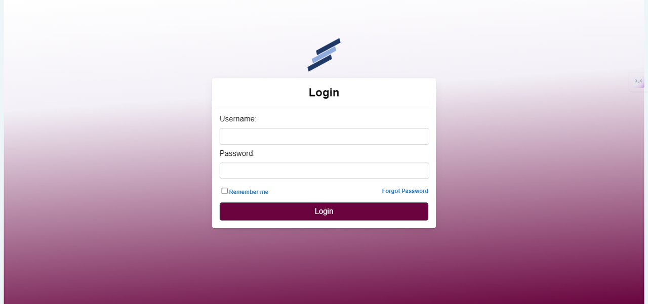
:root { --primary-color: #12074e; --font-family: Arial, sans-serif; --background-gradient: linear-gradient(356deg,rgb(34, 35, 94) 0%, rgba(240,247,246,1) 68%, rgba(255,255,255,1) 100%); --container-height: 100vh; }
Example

Summary
- Theme.scss: This file is used to define global styles that are applied throughout your application.
- Logo: Any logo can be imported and passed as a prop to the Login component, with an additional logoSize prop to adjust its size.
By following this setup, you can effectively manage global styles and dynamically pass and size a logo within your React application.
